
Tags
Bernard Lancy, Dolores Del Rio, France, King Vidor, L'oiseau de Paradis, Polynesia, Poster of the week
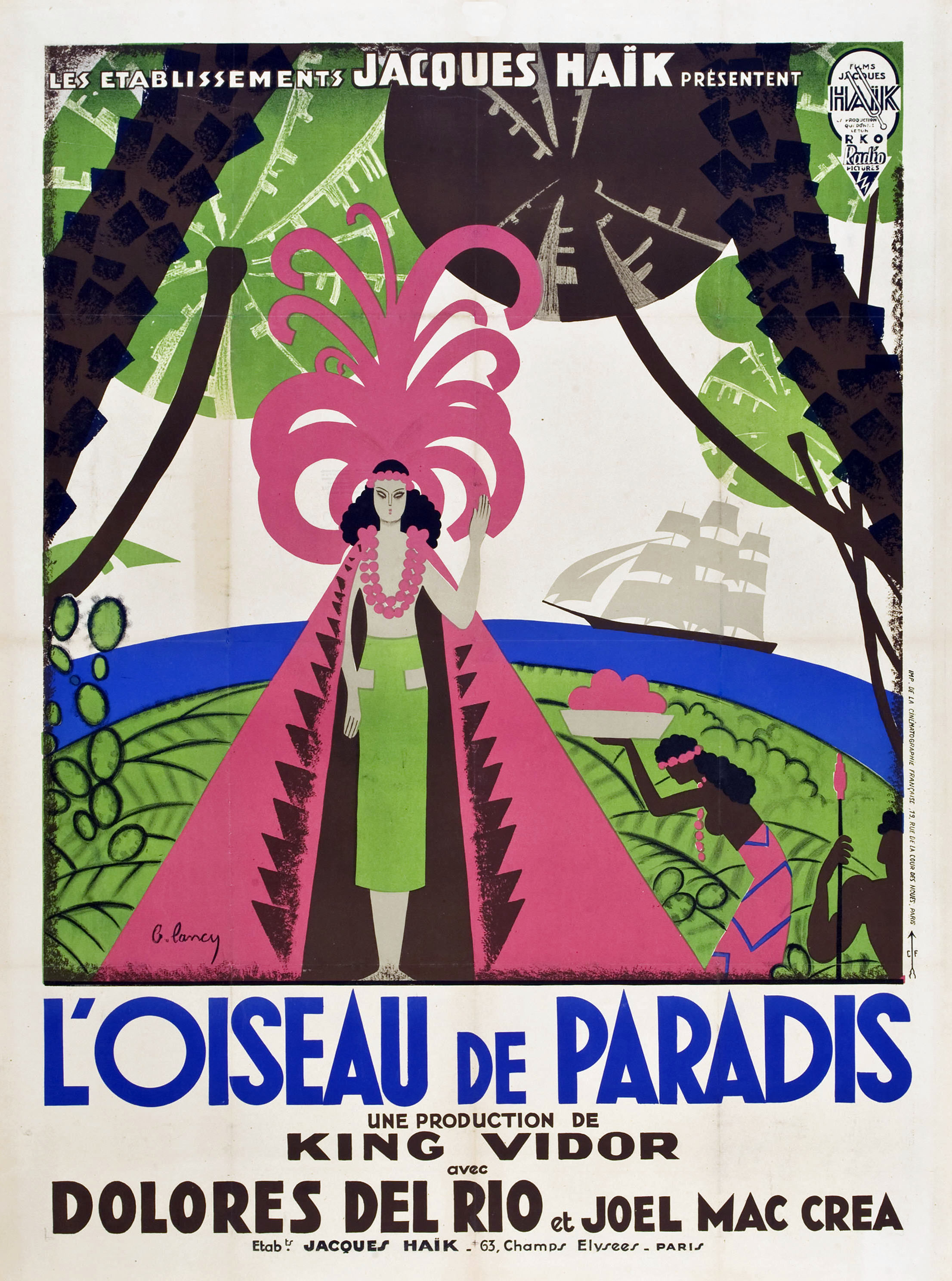
Created for its release in France (n’est-ce pas), this poster for Bird of Paradise features the kind of design that US poster designers of the time wouldn’t have attempted, even if a gun was put to their heads. If you’re not sure why, then here are two words for you: green and pink. The two colours aren’t always complementary, but in the hands of the poster’s creator, Bernard Lancy, they become an arresting combination that draws the eye and maintains a connection with the viewer. The featured cape and head-dress are boldly displayed, statements in themselves, and again a challenge to the conventions of the period. The softness of the head-dress with its sprouting, curving, and questing fronds is in contrast to the hard lines and shark’s teeth pattern of the cape. Together they act as a costume for the character played by Dolores Del Rio, and they also represent the volcano that she is to be sacrificed to. It’s not often that you see such dual representation, but Lancy has carried it off with a great deal of skill, and without making it blatantly obvious.
Del Rio’s character, Luana, is the poster’s main focus, and as the movie is set on a Polynesian island and this is a pre-Hays Code feature, the poster accurately depicts Del Rio’s modesty being protected by a couple of garlands. For once this isn’t an attempt at titillation, or a sexploitative approach by Lancy, but though it could be viewed that way, Lancy’s depiction isn’t evocative at all, and entirely because he doesn’t draw attention to her state of semi-nudity in the way that some designers would have done (and besides, the movie does that job pretty well all by itself). However, he’s not so careful with the handmaiden to Luana’s left; it may be a sideways representation but she isn’t afforded the same modesty (and is featureless to boot). It’s interesting to see this kind of “double standard” in a poster: it’s not always deliberate, but it does make you wonder if the designer was trying to sneak in something that couldn’t be depicted openly (a bare breasted Del Rio wouldn’t have been allowed under any circumstances).
The ground is a swirl of leaf patterns and what look like cactus leaves, while the tree trunks are solid and thrusting (and yes there is an unspoken meaning in that), but there’s also a swathe of blue representing the sea. These colours – green, brown and blue – work well together, stanching the effect of the pink and creating a visual counterpoint. They’re also reflective of the island setting, and its status as a place where paradise can be found. The grey sails of the schooner that brings Joel McCrea’s character to the island is a neat touch, emphasising the way in which change has come to the island and by extension, what history has taught us about such arrivals in the past.
It’s a shame then, that with such a complex and wonderful image, the French distributors chose to highlight their involvement with a banner strapline at the top of the image. Jacques Haïk may have been proud to be the movie’s distributor, but the place for that information is at the bottom of the poster, and outside of the central image. After all, it’s where the title, the director and principal cast credits are located; if it’s good enough for them…? The Haïk/RKO logo in the top right hand corner is also intrusive and unnecessary, but Lancy wouldn’t have had a say in the matter, and the shortsightedness is annoying. Spare a thought for McCrea, though. Only in France was his surname misspelt. At least that wasn’t Lancy’s fault, something that serves as a reminder that Lancy and his fellow designers were hired chiefly for their skills as artists, and that the final decisions about overall content were made by somebody else. Would that it had been different.
