Tags
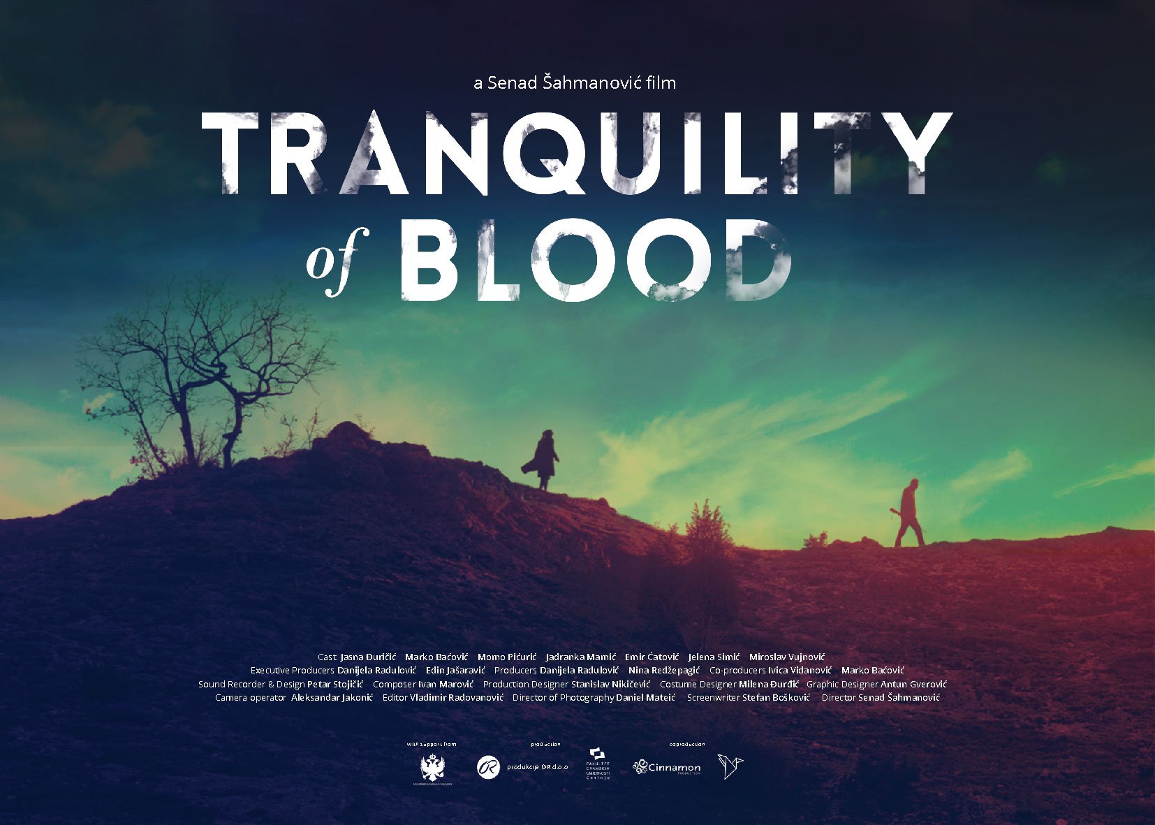
Bruce Willis, Glass (2019), James McAvoy, M. Night Shyamalan, Poster of the week, Samuel L. Jackson
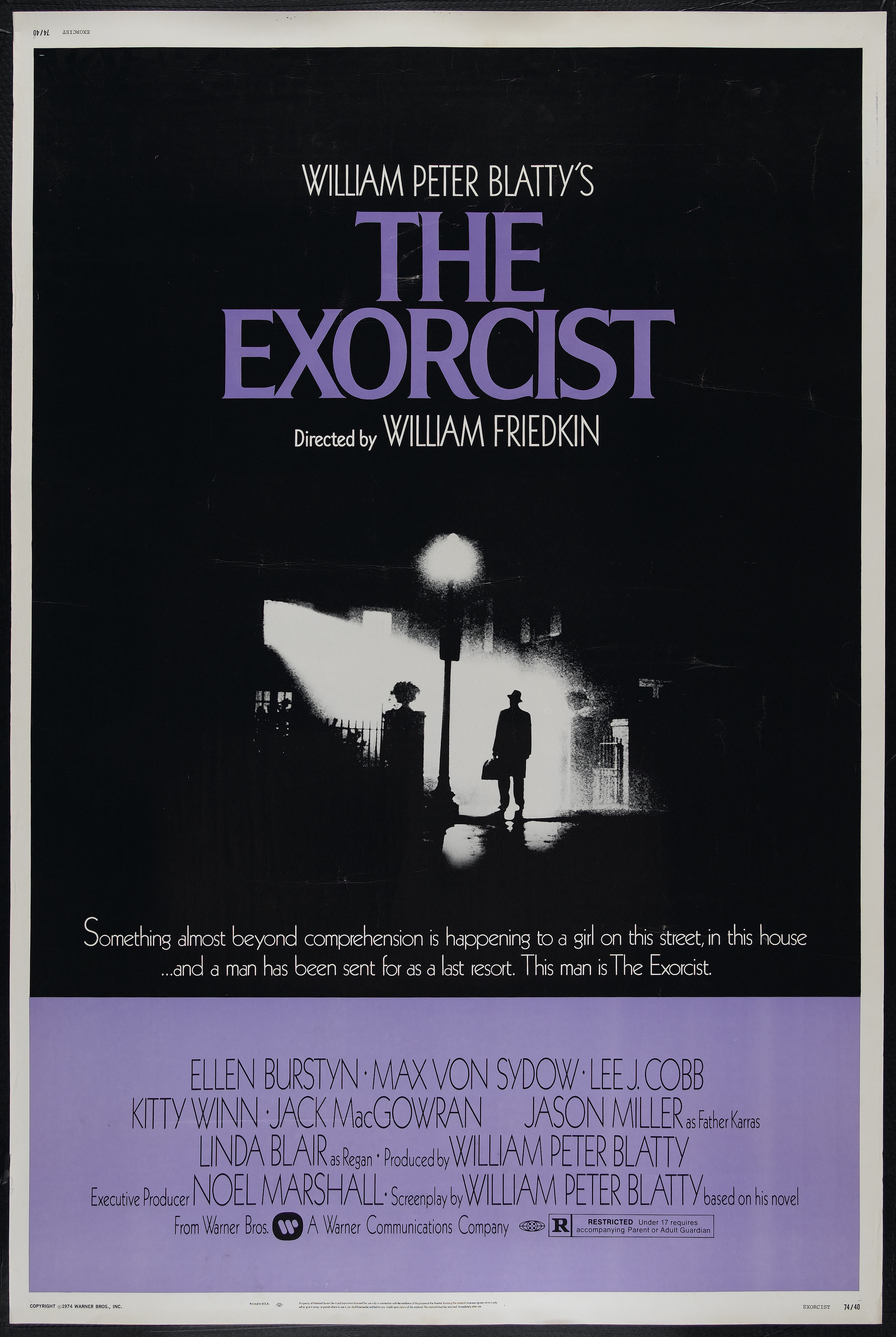
For once, the poster really does say it all…
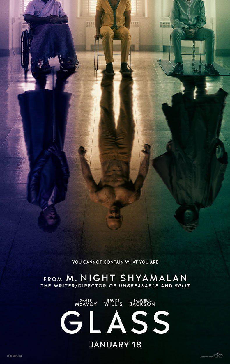

29 Friday Jun 2018
Posted in Movies
Tags
Bruce Willis, Glass (2019), James McAvoy, M. Night Shyamalan, Poster of the week, Samuel L. Jackson
For once, the poster really does say it all…
23 Wednesday May 2018
Posted in Movies
If you had to identify a link between Casablanca (1942) and A Clockwork Orange (1971) – other than that they’re both classics – it’s unlikely that you’d opt for the graphic designer Bill Gold. But Gold designed the posters for both movies as part of a career that began in 1942 with Yankee Doodle Dandy and continued until 2011 with J. Edgar (for which he came out of retirement at the age of ninety).
He began his design career in 1941, working in the advertising department at Warner Bros., and eventually becoming head of poster design in 1947. When the New York offices of Warner Bros. advertising unit was disbanded in 1962, Gold created his own company, Bill Gold Advertising, and continued designing posters for movies as varied as Camelot (1967), Diamonds Are Forever (1971), Breathless (1983), and In the Line of Fire (1993). He designed the posters for pretty much every Clint Eastwood movie from Dirty Harry (1971) onwards, and when he was awarded a Lifetime Achievement Award from The Hollywood Reporter in 1994, it was Eastwood who presented him with the award. Involved in the design and creation of around two thousand movie posters during his near seventy year career, Gold passed away on 20 May 2018 aged ninety-seven. In tribute to Gold and his work, here are ten posters that sum up both his talent and the reason why he was held in such regard by the likes of Laurence Oliver, Elia Kazan, and Ridley Scott.

05 Thursday Apr 2018
Posted in Movies
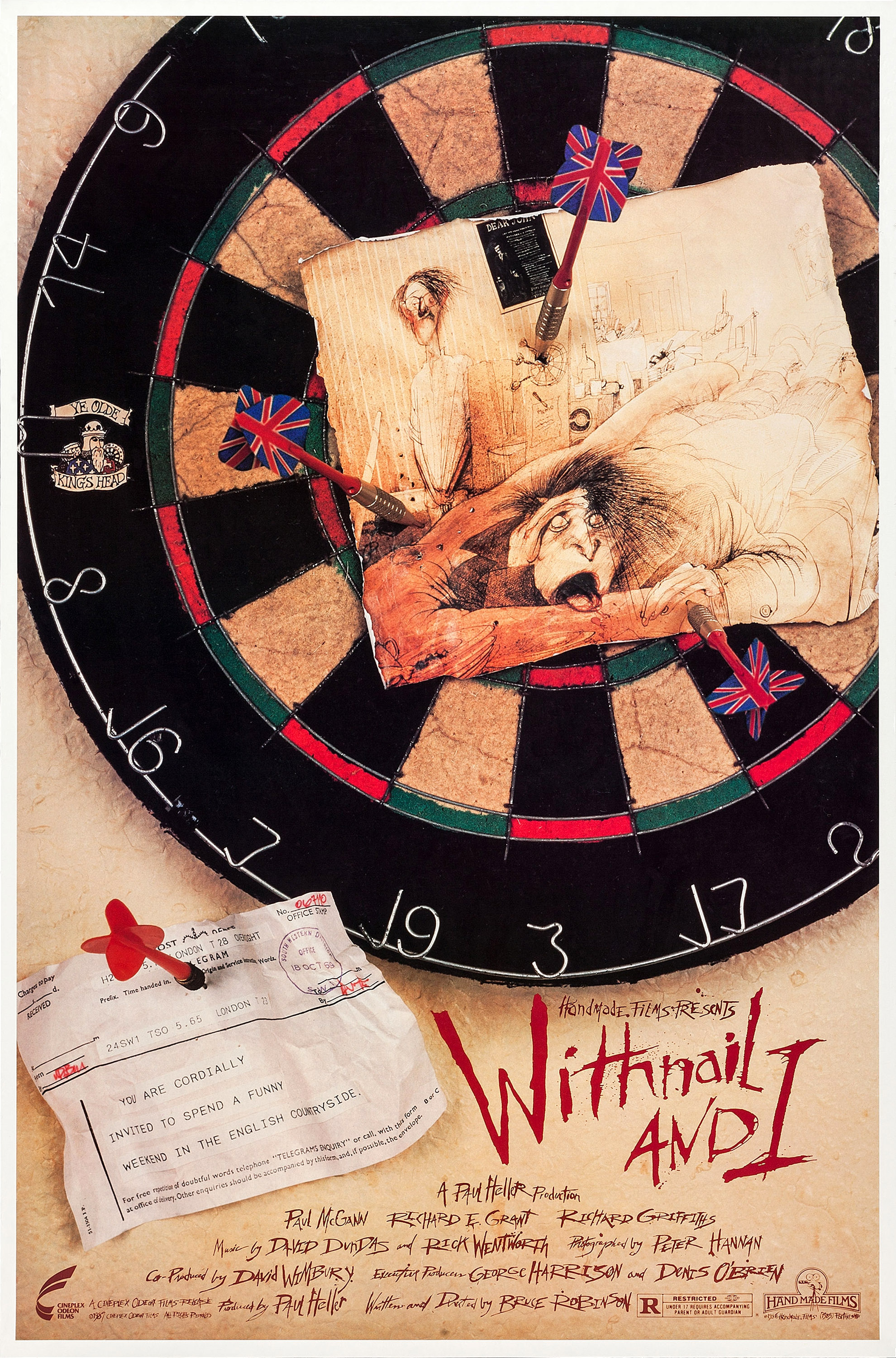
Almost the very definition of a cult movie, Withnail & I is a movie with a number of virtues, and one that remains as consistently entertaining today as it did when it was first released (if you haven’t tried the drinking game yet, then shame on you). It’s fitting then that the poster for the movie should be as iconic as the movie itself, and thanks to the involvement of the artist Ralph Steadman, that’s exactly what it is. It speaks to a very specific kind of British mentality, the kind that operates independently of any other cultural affectation or belief system. It’s an amazing mix of image and graphics, and of the time period the movie takes place in, referencing a bygone era represented by two distinct elements: a classic British dartboard, and a telegram. Both of these elements have a role to play in the movie, but while their importance on screen is negligible, their inclusion and their placement within the poster help to consolidate the tone and feel of the movie itself. It’s the perfect accompaniment – or appetiser, perhaps – for Bruce Robinson’s tale of ribaldry and conspicuous excess.
The dartboard hints at so much of what the movie is about: the passing of an age, an age in which Withnail and I, in their own way, are becoming just as obsolete. Despite the vivid colours and the depth that goes with them, look closer and you’ll find that the board is cracked and weathered. It’s a clever indication that what can be seen at first glance can be deceptive, that there’s an acknowledgement of past glories, of better times gone by, but also that a decisive moment has passed. The same is true of the arrows holding Steadman’s unflattering drawing of the pair to the board. With their Union Jack feathers, the arrows also represent the end of a bygone era. They’re ineluctably tied to the board, a last reminder that things were better – or at least they seemed that way. The drawing itself, featuring Steadman’s trademark artistic style and wildly expressive depiction of Withnail (while I stands diffidently in the background), perfectly expresses the different natures of the two characters. And if you look closely you can see another dartboard in the background with three darts in it, and below that another telegram pinned by another dart.
The telegram is another symbol of a bygone era, a form of communication that has been surpassed by newer technologies; its time is almost up (as is Withnail’s dream of becoming a star). The fact that it contains an invitation to “spend a funny weekend in the English countryside” is the one aspect that strays from the poster’s overall theme, and is the nearest it has to a promotional tagline. But it still somehow fits the tone of the poster (and the movie), that slightly off-centre British attitude that has its own rules and conventions. The whole thing is rounded off by Steadman’s unique graphic style with words, the credits assembled in fractured lines one atop the other but still in deference to the title itself. Boldly highlighted in red, the title is like a challenge: do you dare watch Withnail and I? And perhaps more importantly, if you do, will you like what you find?
22 Thursday Mar 2018
Posted in Movies
Tags
Australian Outback, Costumes, Draq queens, Guy Pearce, Hugo Weaving, Poster of the week, Terence Stamp, Tour bus
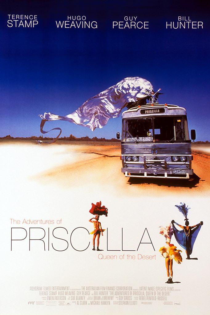
When considering this particular poster for The Adventures of Priscilla, Queen of the Desert, one thing is obvious: it’s so much subtler than some of the other versions out there. It takes one of the movie’s most iconic images and makes it the centrepiece, and does so in such a way that it highlights the exuberance contained within the movie itself, and the striking nature of the costumes. That massively extended, billowing train of silver fabric is also a bold statement of intent, a signal to prospective viewers that, just as they haven’t seen this kind of imagery before, so the movie will offer other sights they won’t have witnessed before (not the least of which will be the sight of Hugo Weaving in full on drag queen make up). This vision of excess and casual effrontery is impressive for its juxtaposition with the rather more solid and slightly battered presence of Priscilla herself, the tour bus seen making its way across the Australian Outback. By providing an apparent contrast between the expressive freedom of the costume, and the bulky shell of the tour bus, it’s takes a second to realise that in terms of the overall image there’s a connection that allows each to be an extension of the other; after all, they are both silver in colour.
Above them both is the poster’s boldest and most dramatic element: the dark blue sky against which the costume is framed. That much blue – taking up over a third of the poster – seems like it should be a bad idea, but with the principal cast members’ names arraigned across the top of the poster, their presence undercuts and softens the harsh nature of the blue sky. It also draws the attention to the sloping nature of Terence Stamp’s name, something that is at odds with the uniformity of the other three names. It’s a slight difference, and one that would probably go unnoticed at first glance, but it’s there, and little quirks such as this one always make a poster that much more interesting. In contrast, the lettering used for the title is split in such a way that the overlong (and somewhat clunky) title is rendered more palatable to the eye than if it had taken up more space. The reduction of all the words except for Priscilla works despite their almost being lost against the white sandy backdrop. And with the name Priscilla being given “star billing”, the importance of the tour bus to the story is reinforced by its name being on its own destination panel as well.
However, and despite the very good work on display across much of the poster, it does get some things wrong – three of them to be precise. The inclusion of what amounts to tiny doll representations of the characters played by Terence Stamp (black head-dress), Hugo Weaving (red head-dress), and Guy Pearce (tanned legs and shiny buttocks), is something of a design faux pas (darlings). Each image looks like the kind of scale size action figure available in a collector’s set, or as an offer from a cereal packet (send in six tokens to get the set!). Two are awkwardly placed and detract from the overall effect the poster is aiming for, and appear to have been included as a way of filling what would otherwise have been more blank space. Weaving’s place as the second I in Priscilla at least gives his figure a purpose, but it’s still an unnecessary one; it would have been better not to have included them at all. It’s still an evocative and attractive poster, though, and it uses its other elements to better, and more persuasive effect. (And better still, there aren’t any ping pong balls to explain away.)
15 Thursday Mar 2018
Posted in Movies
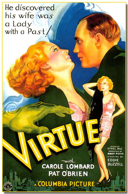
Passion, torment, fear, distrust, regret – all these are present in the poster for Virtue, a pre-Code potboiler that uses an already well-worn theme to tell its sexploitation story. The wife with an embarrassing past was already a movie staple by 1932, and the poster for Virtue is a good example of the way in which the studios – here it’s Columbia – tried to be both exploitative and responsible in their promotion of a “racy” picture. (Which concept do you think they were more interested in?) What’s interesting about this poster is its combination of disparate and not immediately complementary elements – and to modern eyes – the rather dated and slightly humorous sexual overtones.
The top part of the poster is given over to what would have been regarded as a shocking tagline, one given extra emphasis by an exaggerated exclamation mark. Make no mistake, this tagline is saying, this is going to be strong stuff (and you won’t be disappointed). The euphemism is clear, but as usual it’s the kind of hyperbole that promises a lot, but which the movie itself won’t be able to provide. Then there’s the swirling blue background, something of a miasma designed to represent the turmoil the characters will find themselves battling. But as we travel down the poster, this murky miasma gives way to depictions of the two main characters, and the jarring use of orange and yellow hues to depict the passion that exists between them. A closer inspection, however, reveals something else, something revealed in their expressions. O’Brien’s character is looking at Lombard with apprehension, while Lombard returns his gaze with a concerned look of her own. It’s almost as if she’s asking herself, does he know? With this dynamic in place,it’s then that the poster decides it’s time to highlight the suggestive nature of the movie, and gives us Lombard’s exposed throat and the hint of a swelling breast.
Sometimes, when you see posters from the pre-Code era, it’s interesting to see just what was regarded as “racy” or “provocative”. Here we have the unflattering sight of Lombard (sadly not provided with the best of representations) in a pink chemise with a black shawl over one shoulder, her right hand behind her head in what was no doubt intended to be a sultry pose reflecting the kind of “past” O’Brien doesn’t know about. It’s the pose of someone with a disreputable character, but too awkwardly designed and executed to have quite the effect required. More startling is the spectral hand reaching out as if attempting to touch Lombard’s right breast, or perhaps to clutch at the more sultry embodiment further to the right. It’s a clumsy expression of the past life that’s about to catch up with her, and would be better off on the poster for a Forties’ horror movie. And then there’s the movie’s title, highlighted in blatant yellow, and a counterpoint to the rest of the imagery – as well as being something of a challenge. Virtue? you might ask? Really?
The rest of the poster, with its strong yet ugly shade of green used as a backdrop for the stars’ names and an unnecessary city landscape, is perfunctory if a little brutal. Judged as a whole, though, this is a poster that works surprisingly well, its contrasting colour scheme and pictorial stylings somehow coming together to make an effective piece of advertising. You could argue that it’s not pretty, and you could argue that it’s too inconsistent in its composition, but while all that may be true, what can be said with absolute authority is that this is a poster that captures the attention and has a lot to offer – and in spite of its diverse components.
07 Wednesday Mar 2018
Posted in Movies
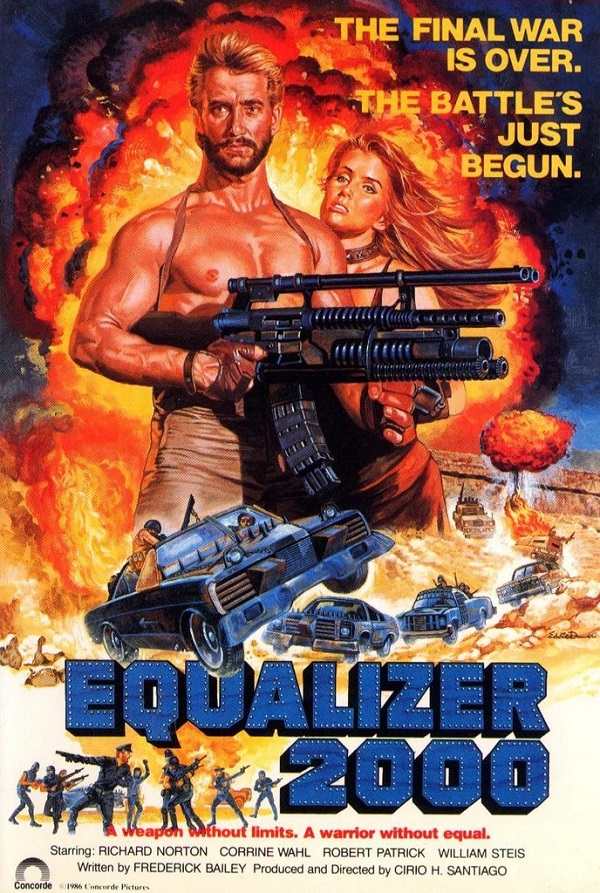
Wait a minute (you may be thinking). What’s this? A poster for a low-budget Eighties Mad Max rip off? Has Poster of the Week been hijacked by someone with a fetish for beefcake and outsized weaponry? (Not this week.) No, the truth is, sometimes a poster can be enjoyed – admired, even – for what it gets wrong, just as much as for what it gets right. The poster for Cirio H. Santiago’s Equalizer 2000 is one such example: on the face of it, absurdly generic for the time, but upon closer inspection revealing a variety of unexpected pleasures. It’s a poster that’s not just saying, “Watch this movie!”, it’s also a poster that’s saying, “My designer was bored when they got this job, and they decided to have some fun with it!” Of course, this last may not be true at all, but the alternative is even worse: this is the best the artist could do.
First up is the volcanic explosion erupting behind our hero and his significant other. It’s an enormous fireball, sending out smoke and flames and debris in every direction. But is this the work of the title weapon, or is this a case of visual hyperbole? Will there really be an explosion of this magnitude actually in the movie (and will everyone run away from it in the poorly composited foreground?). The obvious answer is, you have to ask? So, already the artist is making the movie seem bigger and more impressive than it actually is. But this is what he or she is meant to do. Should we be blaming them straight away for such blatant misrepresentation? Well, to be fair, no. It’s a big explosion used to fill a large part of the poster and to provide the hero and the girl he just met at the beach with an exciting backdrop against which to pose. But there are subtle things wrong with both of them, things that again make you wonder if the artist was having a bad day at the easel.
The woman’s face is worrying. It’s an odd mix of angles and curves, hinting that she was perhaps a forceps baby, but definitely looking as if the artist completed one side, went away for a few drinks, and then came back to finish off a little the worse for wear. And then there’s the blond-maned, chiselled hero, clutching the titular weapon like a model posing for the front cover of American Hunter. But hold on a minute. Doesn’t his right breast look a little feminine, a little too rounded to be – you know – his? The more you look at it, the more it looks like it’s not meant to be there. It’s as if the artist, unable to provide cleavage for the woman looking to enter a 21st century beauty pageant, decided there was going to be at least one exposed breast in this poster – and if it had to be on the man then so be it.
The best has been saved for last, though. Below the beginning of the title is a group of people caught in various poses. Some are pointing with rifles, some seem to be playing their rifles like guitars, and the figure on the far left could well be playing air drums. But if anything, they look like they’re anticipating Madonna’s plea from Vogue (released in 1990): “Don’t just stand there, let’s get to it/Strike a pose, there’s nothing to it”. They’re a post-apocalyptic dance group with a hint of camp (that cap) and a striking lack of co-ordination. They’re also the most obvious indication that the artist, whoever he or she may be, wasn’t approaching this particular assignment with all the dedication and skill that they (hopefully) possessed. And for that, Poster of the Week salutes them all the more.
01 Thursday Mar 2018
Posted in Movies
Tags
Bernard Lancy, Dolores Del Rio, France, King Vidor, L'oiseau de Paradis, Polynesia, Poster of the week
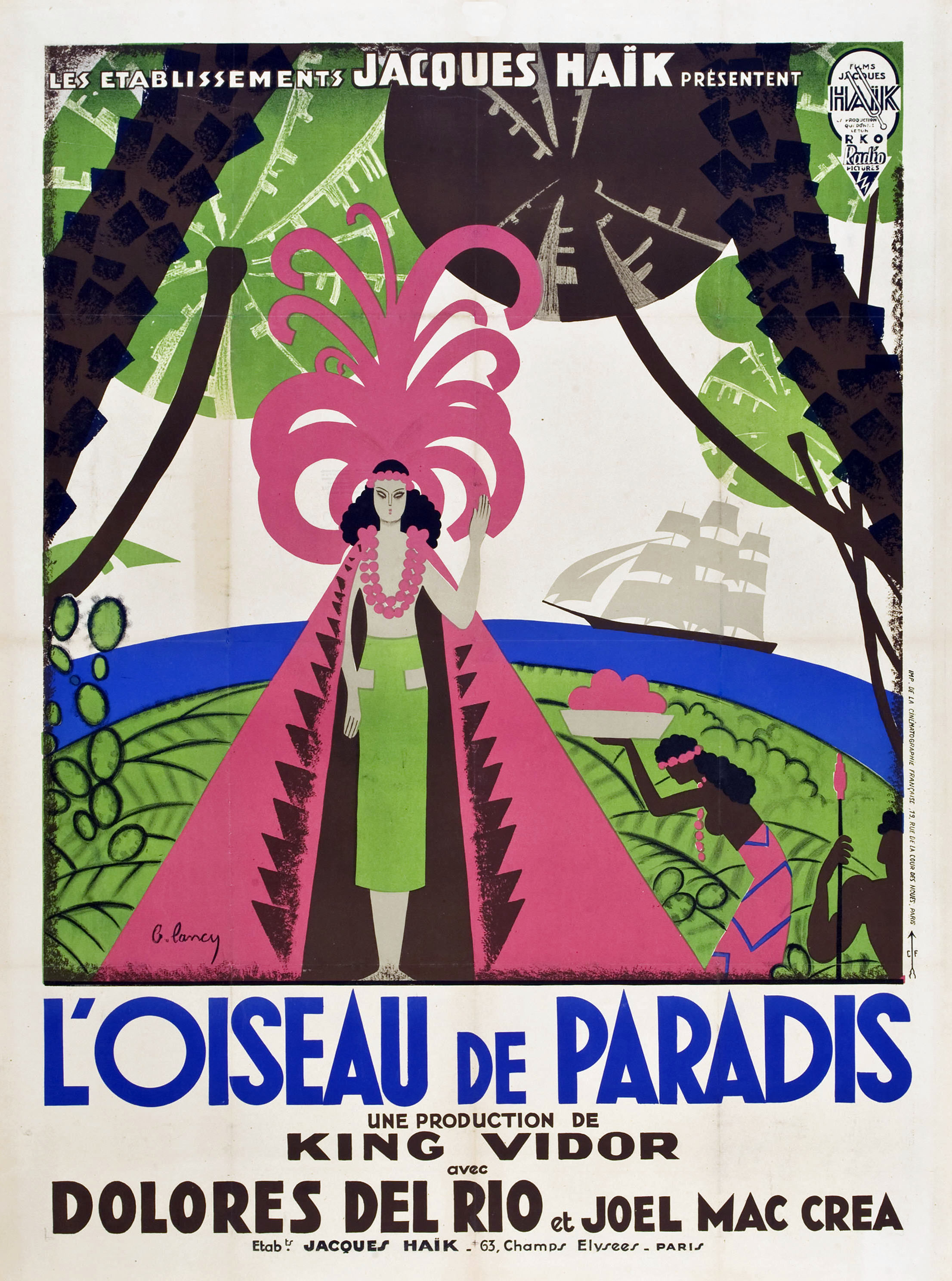
Created for its release in France (n’est-ce pas), this poster for Bird of Paradise features the kind of design that US poster designers of the time wouldn’t have attempted, even if a gun was put to their heads. If you’re not sure why, then here are two words for you: green and pink. The two colours aren’t always complementary, but in the hands of the poster’s creator, Bernard Lancy, they become an arresting combination that draws the eye and maintains a connection with the viewer. The featured cape and head-dress are boldly displayed, statements in themselves, and again a challenge to the conventions of the period. The softness of the head-dress with its sprouting, curving, and questing fronds is in contrast to the hard lines and shark’s teeth pattern of the cape. Together they act as a costume for the character played by Dolores Del Rio, and they also represent the volcano that she is to be sacrificed to. It’s not often that you see such dual representation, but Lancy has carried it off with a great deal of skill, and without making it blatantly obvious.
Del Rio’s character, Luana, is the poster’s main focus, and as the movie is set on a Polynesian island and this is a pre-Hays Code feature, the poster accurately depicts Del Rio’s modesty being protected by a couple of garlands. For once this isn’t an attempt at titillation, or a sexploitative approach by Lancy, but though it could be viewed that way, Lancy’s depiction isn’t evocative at all, and entirely because he doesn’t draw attention to her state of semi-nudity in the way that some designers would have done (and besides, the movie does that job pretty well all by itself). However, he’s not so careful with the handmaiden to Luana’s left; it may be a sideways representation but she isn’t afforded the same modesty (and is featureless to boot). It’s interesting to see this kind of “double standard” in a poster: it’s not always deliberate, but it does make you wonder if the designer was trying to sneak in something that couldn’t be depicted openly (a bare breasted Del Rio wouldn’t have been allowed under any circumstances).
The ground is a swirl of leaf patterns and what look like cactus leaves, while the tree trunks are solid and thrusting (and yes there is an unspoken meaning in that), but there’s also a swathe of blue representing the sea. These colours – green, brown and blue – work well together, stanching the effect of the pink and creating a visual counterpoint. They’re also reflective of the island setting, and its status as a place where paradise can be found. The grey sails of the schooner that brings Joel McCrea’s character to the island is a neat touch, emphasising the way in which change has come to the island and by extension, what history has taught us about such arrivals in the past.
It’s a shame then, that with such a complex and wonderful image, the French distributors chose to highlight their involvement with a banner strapline at the top of the image. Jacques Haïk may have been proud to be the movie’s distributor, but the place for that information is at the bottom of the poster, and outside of the central image. After all, it’s where the title, the director and principal cast credits are located; if it’s good enough for them…? The Haïk/RKO logo in the top right hand corner is also intrusive and unnecessary, but Lancy wouldn’t have had a say in the matter, and the shortsightedness is annoying. Spare a thought for McCrea, though. Only in France was his surname misspelt. At least that wasn’t Lancy’s fault, something that serves as a reminder that Lancy and his fellow designers were hired chiefly for their skills as artists, and that the final decisions about overall content were made by somebody else. Would that it had been different.
20 Tuesday Feb 2018
Posted in Movies
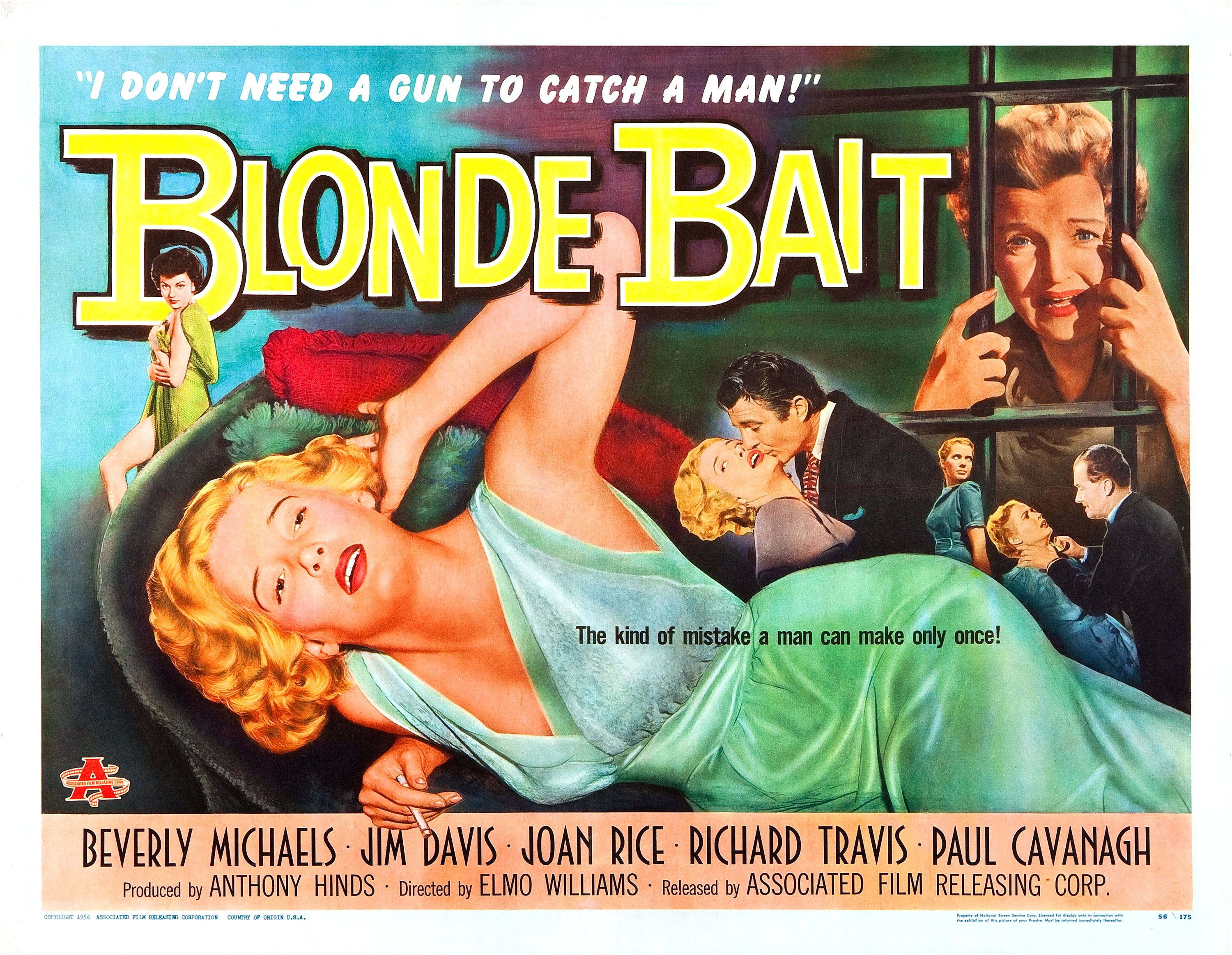
Blonde Bait was the US title given to a re-edited version of Women Without Men, a Hammer production about three women who escape from prison, each for their own reason. While the movie itself isn’t particularly memorable, the US poster is anything but, and for a number of reasons. It’s another terrific design from the Fifties that’s doing its best to promote its female cast and characters as having an earthy sensuality, and the kind of loose morals that come about from lounging decoratively on soft furnishings. It’s also another poster that’s packed with incident, from the central image of star Beverly Michaels reclining awkwardly on a chaise longue and trying not to burn a hole in it, to the shocked countenance of Avril Angers staring out from behind bars.
It’s a busy poster, and one that’s making a lot of different statements all at the same time. Aside from Michaels’ attempt at looking sultry while fluffing her hair, behind her head there’s the smaller image of Joan Rice looking defiant as she clutches what looks like the remains of a dress – remains that still allow her to show off a shapely leg. She may be in some kind of trouble, but that doesn’t mean she’s not going to look fabulous while she deals with it all. A girl’s gotta do… and all that. Then there’s the image perched above Michaels’ hip, a one-sided clinch that looks as if the #MeToo movement should get involved. Michaels is trying to get away from her would-be Lothario (actually Jim Davis), but has the look of someone who’s trying to remember if they left the stove on, or if they locked the front door on their way out.
To their immediate right is a classic image, that of a woman pressed against something that helps emphasise the curvature and fullness of her breasts. Here it’s the bar of a cage, an appropriate choice given the movie’s opening backdrop, but in its own way it’s the least subtle image within the whole poster. Moving further to the right, and we have the poster’s most awkward component, with Michaels being doubly threatened by her near-namesake Ralph Michael. With his left hand he’s attempting to strangle her, but what’s going on with his right hand? Is he grabbing her lapel or trying to punch her? (Make up your mind, man.)
The title is represented in clunky chunky yellow lettering that makes for an eye-catching alternative to the other primary colours on display, but it’s not so bold that it distracts from the various images it has to contend with. Its positioning is also effective in terms of the overall composition, but the same can’t be said for the horrendous tagline that begins at Michaels’ left breast and spreads across to the top of her leg. And to make matters worse, the font makes it look like a last-minute addition, and the wording itself doesn’t make any sense. “The kind of mistake a man can make only once”? Really? How about, “The kind of mistake movie posters should never make” instead? At least the poster’s other tagline, “I don’t need a gun to catch a man!’ is a little more in keeping with the movie’s subject matter.
The poster is rounded off with the usual round of credits, expressed in a nice Roman-style font, and reflecting the inclusion of three stars who didn’t appear in the original British version (Davis, Travis and Cavanagh). The inclusion of Associated Film Releasing Corp in the credits helps explain the logo towards the bottom left hand corner, and further reinforces the notion that this is an exciting, passion-filled American movie (and not some stuffy British crime drama – Heaven forbid). Though there’s a fair degree of misrepresentation going on in this particular poster, it’s hard to complain about it too much as pretty much everyone was doing the same in the mid- to late Fifties. As always, sex is the selling point, though for once there’s no image of some exaggerated, gravity defying cleavage. Now, that’s where the designer went wrong…
31 Sunday Dec 2017
Back on 12 December, I wrote a post that talked about my lack of enthusiasm for new movies. The post made it sound like I didn’t care for all new movies, when in fact I was voicing my dislike for the constant diet of mainstream, Hollywood produced movies we’re fed each year, and their repetitive nature. In recent weeks I’ve watched and reviewed the likes of Daddy’s Home Two and Flatliners, movies that reinforce the notion that their makers didn’t really care what they were doing, or even how their movies would be received as long as they made enough money at the box office. Call me cynical, but as I’ve said before on thedullwoodexperiment, the people that make these movies are all highly regarded and all highly talented, but they make the same mediocre/rubbish/moronic (I’m talking about you, Baywatch) movies over and over. And we all rush to see them. Now I’m not saying that movies should be boycotted per se, but if certain movies didn’t do well at the box office then perhaps the studios would take the hint and start making better movies (unlikely, I know, but hey, I have enough optimism for ten people some times).
Anyhoo, what this all means for thedullwoodexperiment is that from 1 January 2018, this blog will no longer provide full-length reviews of the majority of mainstream movies, those tentpole movies that seem able to disappoint us year after year, and which are still likely to do so in the next twelve months. I’ll still be watching them – I’m still a movie addict when all’s said and done – but any reviews will be relegated to each month’s Monthly Roundup. Part of my “issue” with these movies is that they are the ones that everybody will be talking about, and everyone will be posting reviews on them, and the big, unwieldy machine that keeps churning them out will continue to be fed no matter what my opinion is. And I’ve strayed a little from my original intention in setting up this blog, which was to bring non-mainstream movies to people’s attention. I do still do that, but not as often as I should be.
So, what does this mean for thedullwoodexperiment going forward? In terms of the reviews, not a lot. They’ll continue in the same format, but there will be more reviews of foreign movies, and older movies, and there’ll be a British Classics series. For One Week Only will return in the guise of weeks that focus on a particular genre, or star, or director, and in February Poster of the Week will take up permanent residence on a Tuesday. Following on from Mandrake the Magician (1939), there will be a new serial beginning in March, more Brief Words about various subjects as they crop up throughout the year, and more Catch Up movies too. There’s a lot more to come, but you’ll have to wait until later in the year to find out just what “a lot more” amounts to. Hopefully, those of you who are regular followers, or even those of you who just dip in and out of the site as it suits you, will enjoy the changes coming up, and continue on this incredible journey with me. With so many movies out there, it seems to me that broadening our horizons isn’t such a bad thing at all. So here’s to 2018, and discovering more wonderful movies together.
13 Saturday May 2017
Posted in Movies
Tags
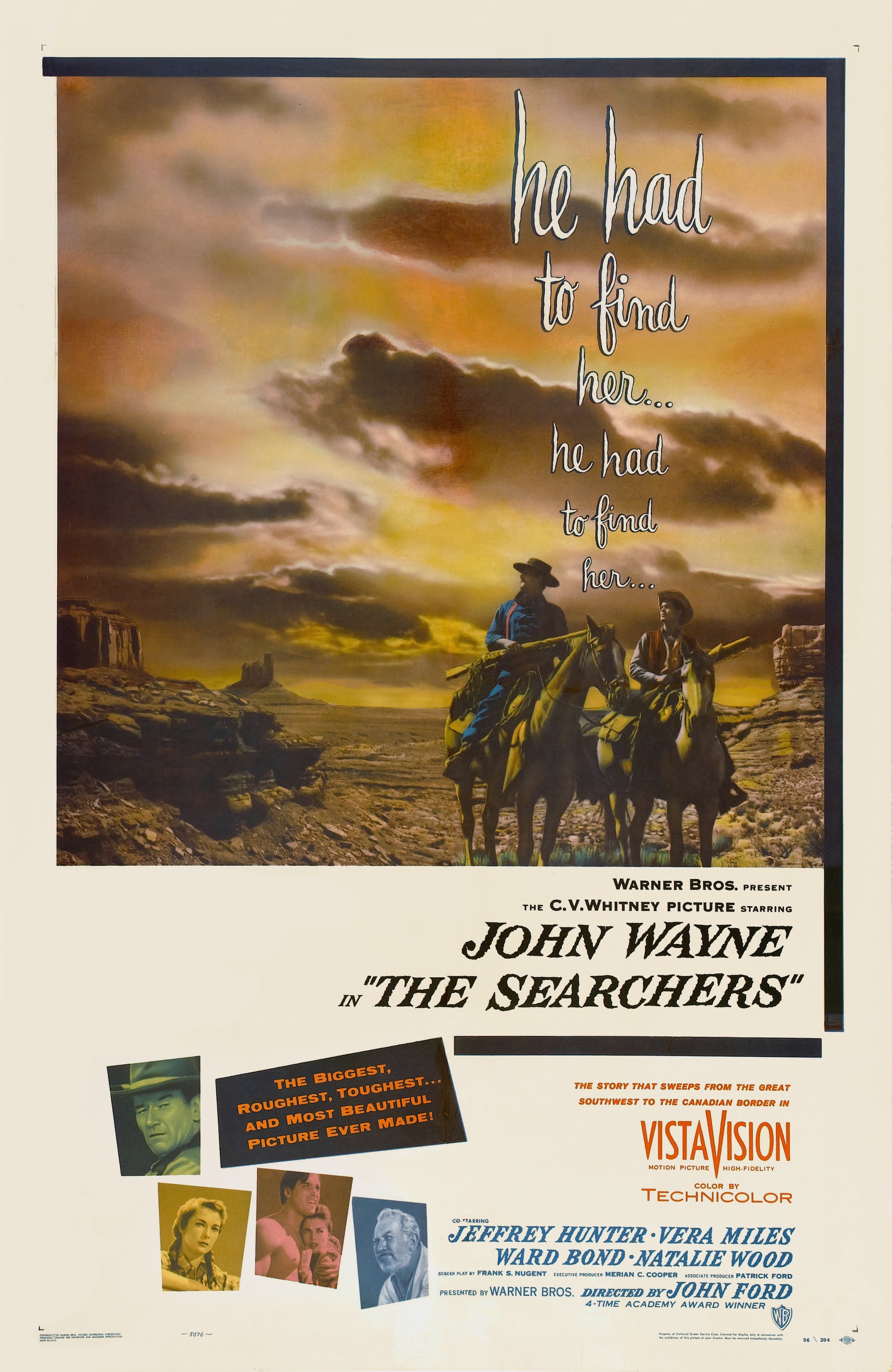
Get Carter (1971), Landscape, Portrait, Poster of the week, Posters, Shaun of the Dead, Steamboat Bill Jr, The Bridge on the River Kwai, The Discreet Charm of the Bourgeoisie, The Searchers, Tranquility of Blood
When choosing the posters for this particular thread, it’s always the landscape format that I aim for. There’s something so appealing about the format that I can’t help but be drawn to it. In comparison, the portrait format – for me, at least – lacks something I can’t quite put my finger on, which is ironic when you consider that my reviews feature exactly that style of poster. It’s also very difficult at times to do a poster sufficient justice, and though this is a category/thread that is one of my favourites, choosing the right poster is often more of a struggle than it needs to be. As a result, what was meant to be a regular weekly feature has become very hit and miss during 2017, something that I intend to address – though, sadly, not just yet.
In the meantime, here are seven landscape movie posters that are particular favourites of mine. A couple of them are also posters of movies that I have a specific liking for, but all the rest are here on their own merits. So, no commentary or examination of the posters’ and their relative pros and cons, and no other context either. I just think they’re damn good posters.

05 Sunday Mar 2017
Posted in Movies
Way back on 1 February 2017, Poster of the Week looked at Der Januskopf (1920), a lost movie by F.W. Murnau. At the end of the post there was this:
NOTE: There’ll be more from Josef Fenneker throughout February 2017.
The idea was to show off more of Fenneker’s distinctive work, and provide some very basic information about the movies themselves. There were meant to be four such posts, but somewhere along the way, what with all the lead-up to the Oscars, and it proving suprisingly difficult to pick out just four posters, the idea got pushed back and back until February was over and done with. But a good idea is still a good idea, even if it gets delayed, and a rethought idea is even better. So instead of four movie posters to admire (or not, Fenneker is something of an acquired taste), here are eight examples of his work, all startling in their own right, and all testaments to Fenneker’s skill as a graphic artist.

Nerves (1919) / D: Robert Reinert
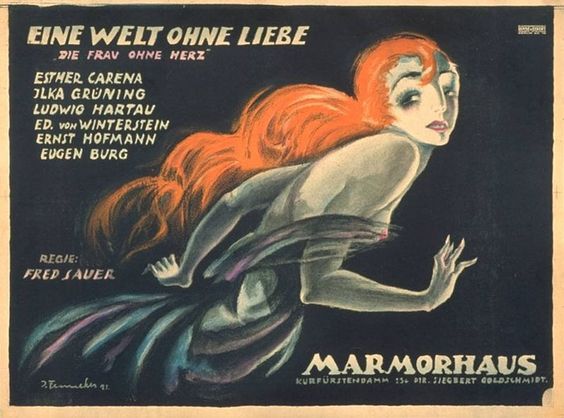
The Dictatorship of Love Part 2: The World Without Love (1921) / D: Fred Sauer
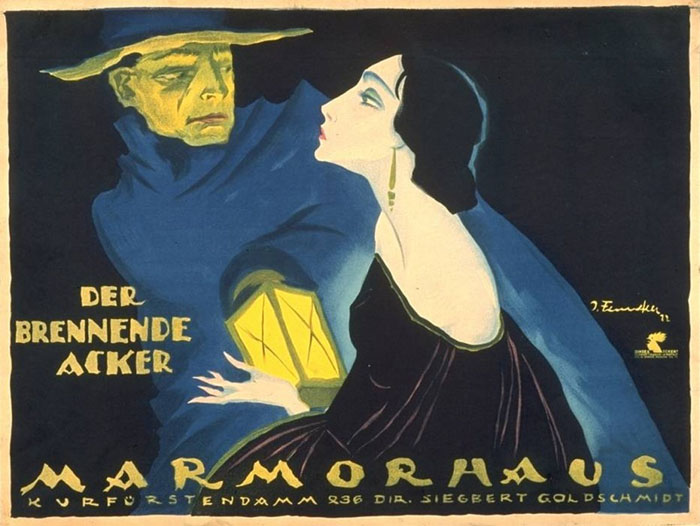
The Burning Soil (1922) / D: F.W. Murnau
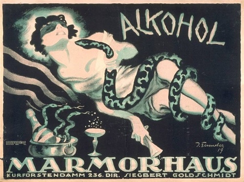
Alcohol (1920) / D: Ewald André Dupont, Alfred Lind
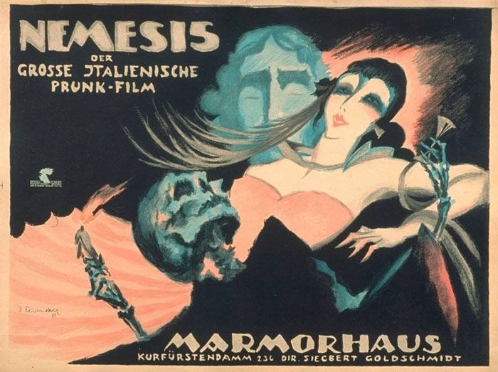
Nemesis (1920) / D: Carmine Gallone
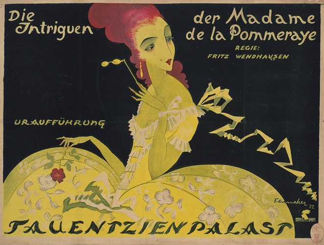
Madame de La Pommeraye’s Intrigues (1922) / D: Fritz Wendhausen

A Debt of Honour (1921) / D: Paul L. Stein

The Devil and Circe (1921) / D: Adolf Gärtner
NOTE: If you’re wondering what “Marmorhaus” (literally “marble house”) refers to, it was a cinema built in Berlin in 1912-13. It was for Marmorhaus that Fenneker designed these and over two hundred and fifty more posters.
01 Wednesday Feb 2017
Tags
Conrad Veidt, Der Januskopf, F.W. Murnau, Horror, Josef Fenneker, Lost movie, Poster of the week, Silent movie
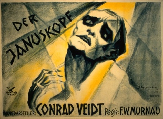
If you haven’t heard of Der Januskopf, then it’s not entirely surprising. Despite being directed by F.W. Murnau, with cinematography by Karl Freund, and starring Conrad Veidt (all at the height of their powers), this thinly disguised version of Robert Louis Stevenson’s The Strange Case of Dr. Jekyll and Mr. Hyde hasn’t been seen since its initial release, and is now considered a lost movie. While we’re unlikely to ever see the movie, especially after all this time, what we do have is its poster, and one that shows another creative artist working at the peak of their powers.
Josef Fenneker – whose signature can be seen near the bottom right hand corner – was a prolific designer and illustrator whose work in Berlin had already won him great acclaim before he was approached to create the poster for Murnau’s “appropriation” of Stevenson’s novel. It’s a typical Fenneker poster, with Veidt’s already angular features highlighted and exaggerated by sharp, slashing lines and deep, troubling shadows. His eyes are distorted so that they don’t look fully formed, or are undergoing some kind of violent transformation (hmmm…). Veidt’s forehead, usually curving and soft, is represented by two angular planes of flesh that look as if they’ve been joined together haphazardly, with no regard for symmetry. Or maybe the bones beneath them are splitting and fusing, and that’s causing the distortion. Whichever it is, one thing is clear from Veidt’s anguished expression: it’s painful.
And yet, Veidt’s face isn’t all tortured flesh and bone. His lips, fully bee-stung and tapering at one corner to a point that could impale someone if they weren’t careful. They’re full, tempting, at odds with the rest of Veidt’s features, inviting even, a feminine pout that tempers Veidt’s expression of pain and which proves hard to avoid looking at. But then his jaw line reflects that agony again, jagged in its delineation, and almost as if Fenneker has made slicing motions with his brush in order to get the full effect.
Below that jaw line is a surprise, a throat so distended and goitre-like it acts as a further horrible reminder that Veidt – or at least his character, Dr Warren – is undergoing a terrible change in appearance. It’s almost as if his alter ego, the villainous Mr O’Connor, is making his way up and out, and will be forcing Veidt’s strikingly realised lips wide apart in his efforts to be free (what kind of monster is going to be revealed?). But almost as if this amount of horror isn’t enough, there’s also the shock of seeing Veidt’s hand, reduced to cadaverous bones and reaching out as if to claw his throat open and release the beast within.
With Veidt’s on-screen character so grotesquely depicted – contemporary audiences would most likely have been horrified by Fenneker’s creation – all that’s left is to provide a suitable background for the central image. Using swathes of yellow and grey to paint an unhealthy miasma around Veidt, the effect is of a man not only enduring a terrible (and terrifying) physical transformation, but having to do so while surrounded by an atmosphere that seems to exemplify sickness and disease. Or maybe it’s meant to represent that curiously German concept of schadenfreude, and the colours have been chosen to represent the character’s emotional and intellectual turmoil. Whichever view is right – indeed, if either of them are – Fenneker’s poster remains a startling, arresting work of art, and a testament to his prowess as an interpreter of German silent cinema.
NOTE: There’ll be more from Josef Fenneker throughout February 2017.
27 Friday Jan 2017
Posted in Movies
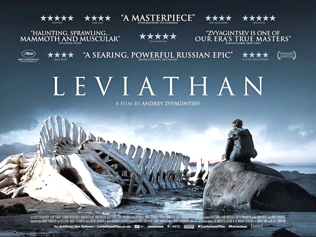
For the most part, movie posters only need one direct or striking image to grab the attention and turn someone from a potential viewer into someone whose interest is so piqued they’ll want to see the movie as soon as possible (well, mostly – there’s always someone who’ll resist). One such poster is for the Russian movie Leviathan.
From the start, it’s easy to see why this poster is so effective. A man sits on a rock on the edge of the sea. His back is turned to us, and if this was the only part of the image we could see, then we could assume that he’s looking out across the water, perhaps watching the mountains we can see in the distance, or the horizon. We might think he’s looking wistfully, or anxiously, or even desperately, but still we wouldn’t know for sure. But the wider image – the whole image that we can see at once – tells us he’s looking at the remains of a large sea creature, in all likelihood a whale. He’s looking at this giant collection of bones, but the best part is: why can’t he still be looking at it wistfully, or anxiously, or even desperately?
Of course, none of these things might apply, but it’s still a lonely, melancholy image to look at, and a reflection of the tone of the movie perhaps. It prompts many questions as well. Why is the man there in the first place? What has brought him to this spot? And why are the whale’s remains still there so long after the flesh and muscle and sinew has been picked from it? Why haven’t the bones been removed? (Perhaps it doesn’t matter if they’re there or not; are they worth so much attention?) Is the man fascinated or horrified, or unmoved even, by this display of the apparent complacency of nature? Is he there out of curiosity, or respect? Does he see himself, or his future perhaps, there in the jutting bones of a once-proud sea creature? Or is it a more immediate reflection of the man’s life and circumstances?
Of course, it could all be none of these things; none of them might be relevant. But that’s the beauty of the poster: it provokes so many ideas about what the image might mean, both in terms of the character, and the movie itself. So the movie becomes a challenge: to see if any of these ideas are correct. And if they aren’t it doesn’t matter, because it’s important enough to enagage with the poster and give it that much thought. It’s a thought-provoking image, very carefully chosen (make no mistake about that), and in some way it speaks to everyone that sees it. And yes, it is haunting, but for reasons that may only become apparent if you watch the movie.
Otherwise, it’s quite a straihgtforward poster, design-wise, with a handful of fulsome, praiseworthy quotes above the title, all indicating just how good is the movie, and reinforcing the potential viewer’s need to see it, and how well they’ll be rewarded for doing so. These kinds of critical soundbites emphasise how well recieved the movie has been amongst the critics, and promise an exceptional viewing experience, and on a par with the poster’s salutary effectiveness. Add the regular formatted credits aong the bottom of the image and you have another poster that acts as an intriguing reference to the movie it’s promoting, and an arresting, complex, mysterious image all by itself.
11 Wednesday Jan 2017
Posted in Movies
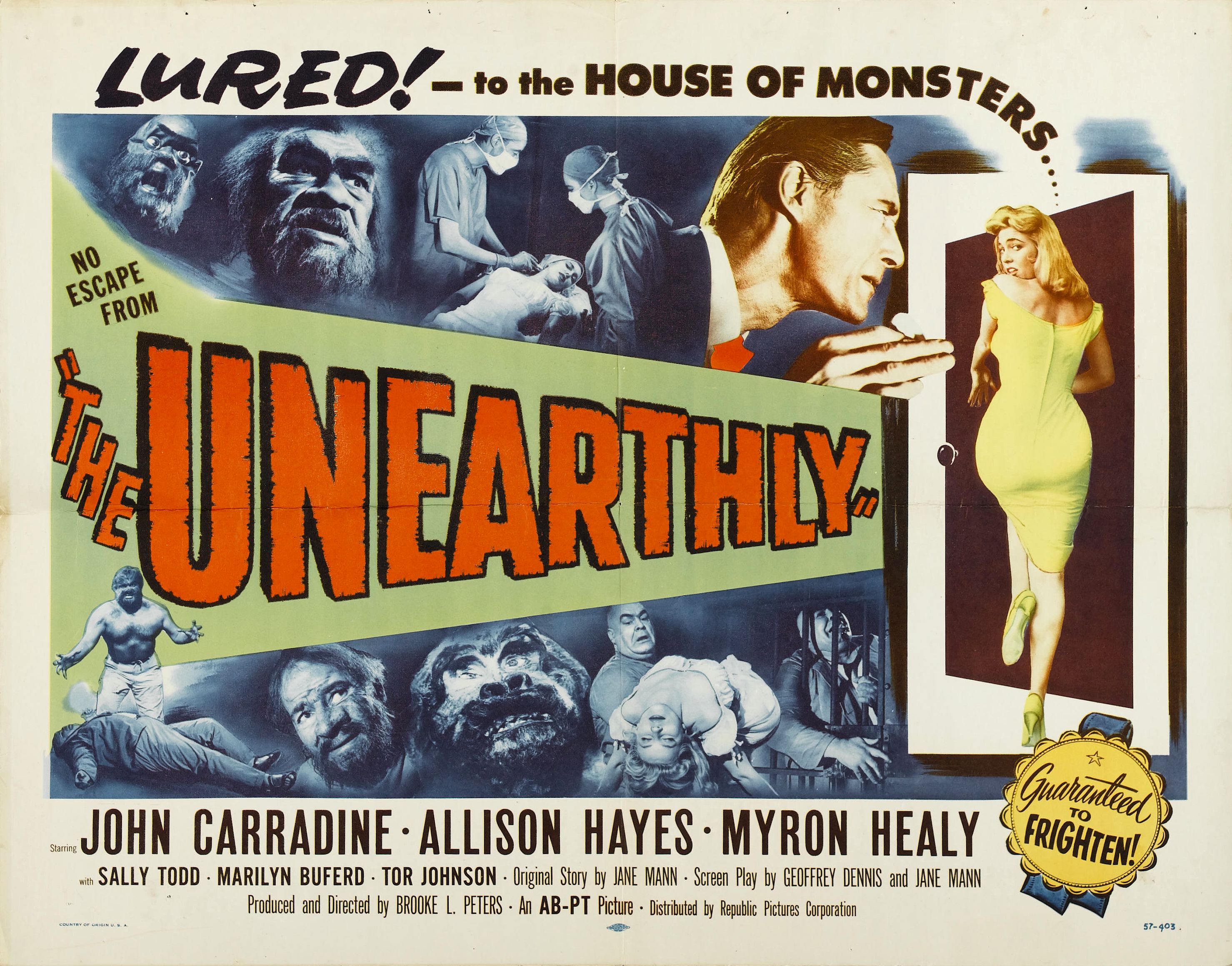
Another jam-packed poster from the Fifties, this tells you all you need to know about the movie it’s promoting in so many sections it’s a wonder they had room for the title. A ghastly horror movie made on a B-movie budget and with Z-movie aspirations, The Unearthly has to be seen to be believed (yes it’s that bad/good), and yet, this particular broadsheet once again confirms that often enough, the humble poster has more to offer than the movie it’s advertising.
The eye literally has too many places it can go at first glance, but the top left hand corner is a good place to start. “Lured!” it says, a comment that is at once alluring itself – lured? lured by what exactly? – and also slightly dangerous in intent. Lured – that can’t be good. And so it proves: the rest of the strapline makes it clear with its reference to monsters. But the poster’s designer then adds something that’s a little bit clever and unexpected. He or she drags the word “monsters…” down towards the doorway that an amply proportioned woman is about to enter. While John Carradine looks in her direction, almost urging her through the doorway, the woman looks uncertainly, and worriedly, behind her. (Modern day audiences might wonder if she’s thinking, does my bum look big in this? She probably isn’t, though.) It’s a neat way of drawing the viewer’s attention in a specific direction, and having a shapely damsel in imminent distress is always an attention grabber.
Across the middle of the poster is the title, with its large, uneven lettering and promise that “there’s no escape from…” The red letters against the sickly green background make for an effective colour counterpoint, and there’s definitely no escaping that. And then there are those eight images from the movie itself, several of which feature men transformed into hairy beasts with wild, staring eyes (Carradine’s evil Dr Conway performs illegal experiments to prolong life but for some strange, inexplicable reason they always go wrong; talk about persistence over experience). These identikit Mr Hydes look like the special effects department raided the Cro-Magnon man exhibit at the nearest natural history museum, and as such are about as frightening as hairy mannequins can get.
Other images display one of Dr Conway’s ill-fated operations, a man trying to embrace the bars of his cell, and dear old Tor Johnson carrying a bosomy starlet. If for no other reason than that the movie featured Tor Johnson, you’d know it was bad; he played the same character in every one of his movies and, sad to say, he was awful in all of them. With Tor’s expression-free features on the poster, any remaining likelihood that the movie will be worth watching is despatched immediately. And further evidence that suspicions about the movie should be encouraged lie with the credits and the director’s name: Brooke L. Peters. Never heard of him? That’s no surprise, as it’s a pseudonym for Boris Petroff. Never heard of him? That’s no surprise either.
While the credits occupy a modicum of space and focus on the leading actors, the poster manages to include one last “surprise”: a rosette declaring that the movie is “guaranteed to frighten”. Similar claims were foisted on dozens of low budget horrors during the Fifties, almost as if the makers were daring people to come and watch their movie. But the rosette is a nice touch – if a trifle over-confident – and as a final flourish to the poster and its overall effectiveness, it’s a little like having a piece of cake with a cherry on top. The Unearthly may not be the best movie in the world – it’s probably not even the best movie released on 28 June 1957 – but this poster has far more going for it than the movie, and has too many elements that work well individually and taken as a whole. A deceptively clever poster then, and one where its design and construction can be rightly celebrated.
And for fans of dear old Tor Johnson, here’s a lobby card where he features more prominently:

28 Wednesday Dec 2016
Posted in Movies
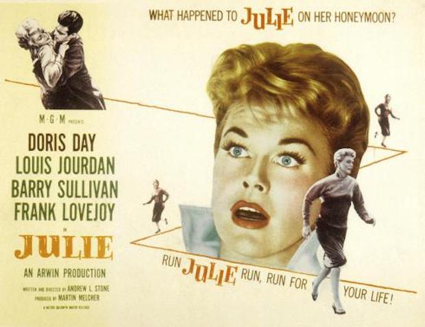
At first glance, the poster for Julie appears to lack anything that would make the movie a must-see, but that would be doing it a disservice, because while it does seem like it’s not even trying, there’s much more going on than you might be aware of.
A thriller where Day’s terrified wife tries to escape the murderous clutches of her husband (played by Louis Jourdan), the poster adopts a psychological approach to the plot that actually makes the movie a more enticing prospect than it actually is. First, there’s the image of Julie and husband Lyle shown in the top left hand corner. There’s a possibility that they’re enjoying a romantic clinch, but upon closer inspection it’s clear that Day is trying to resist Jourdan’s “advances”. It’s all you need to realise that something’s not quite right between them, and it acts as a kind of shorthand for the central dynamic that the movie will expand on.
But where the poster really excels is with its depiction of Day running – for her life – along the zigzag line that dominates the poster (even more so than Day’s shocked face). With her efforts to escape Jourdan precipitated by that dangerous embrace, the poster shows her running away from him, and getting further and further away, but it also highlights her fear and distress at the situation she’s found herself in. Her body language makes it all too obvious. This is the crux of the movie: Julie’s attempt to escape from Lyle, to save herself, and the poster and its kinetic imagery perfectly encapsulates the urgency of the character’s need to find safety.
Less successful – or necessary – is the inclusion of Day’s face and its shocked expression. There’s a phrase: “over-egging the pudding” that applies perfectly here, as Day’s head takes up too much room on the poster as a whole, and almost takes attention away from the clever inclusion of the fleeing Julie and her descent of the zigzag line. She looks like she’s just been told something so shocking that she doesn’t know quite how to respond to it, and while it’s easy to understand the image’s inclusion, it dampens the carefully constructed impact of the rest of the poster.
For the rest of the poster, it’s business as usual, with the four main cast members listed on the left and Day’s name given a slight twist to differentiate her from everyone else (black lettering not green). The title is given a pleasing orange tone to temper the awkward font used, and there’s the unsurprising highlighting of Arwin Productions, Doris Day’s own production company. And only then do writer/director Andrew L. Stone and producer Martin Melcher get a look in.
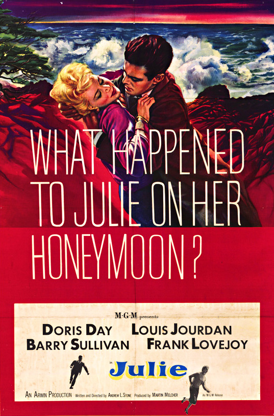
Lastly, there’s the tagline, a question designed to pique the potential audience’s interest, and one whose answer can be construed as “something bad” (as though the images of Day running for her life weren’t a big enough clue). It’s the kind of question that will always get people thinking, and hopefully intrigued enough to watch the movie. Overall it’s a poster that successfully advertises the movie it’s been tasked with promoting, and it does so in a far more subtle, and impressive way than this one:
21 Wednesday Dec 2016
Posted in Movies
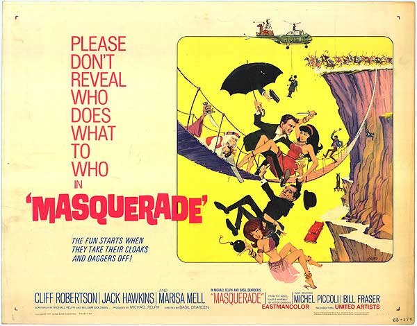
In the Sixties, there were a plethora of adventure comedies born out of the success of the James Bond movies, and Masquerade was one of them. The movie itself is a spirited, engaging romp that takes a while to get going, but once it does, it’s hugely enjoyable. There are no such problems with the poster, though, as it happily tells you all you need to know about the movie and right from the first glance.
Like many similar-themed movies of the period, Masquerade‘s poster revels in a sense of uproarious fun that it hopes will attract viewers to its cause. There’s a lot going on, both here and in the movie, and the poster is a more than adequate reflection of the exploits that Cliff Robertson, Marisa Mell etc. get up to. From the very top of the image where we find an Arab sheik astride a camel settled on the tail of a helicopter, to the bottom where we see a dangling belly dancer juggling a bomb, the poster is practically yelling at us, “This movie is so much fun!” By carefully recreating the mood of the movie, the poster acts as an extension of the movie, and reinforces the idea that the viewer will have a whale of a time.
But there are plenty of strange things going on in the poster as well, things that easily draw the eye and furrow the brow. For one there’s the hand with the gun appearing from within the umbrella held by Cliff Robertson. Then there’s the disembodied arm seen to the right of the image and emerging from the bridge brandishing a blade. Why both of these elements are present is a puzzle as they have no equivalent in the movie, and their very random nature seems to point to the artist having a) free rein over the poster’s content, or b) been given some very bizarre, but specific instructions (or maybe he saw a different version of the movie).
There are other strange elements, all of which – when taken by themselves – leads to the inevitable conclusion that no small measure of anarchy was required in the creation of the poster. There’s the man plummeting head first (from the bridge?) whose identity is too obscure to recognise. There’s the man dangling from the helicopter, who’s equally hard to identify; the rush of horsemen seemingly intent on hurtling over the edge of the cliff; the red car that has left the cliff road; and the man hanging off the bridge and seemingly about to join the horsemen and the red car. All humorous elements, and all in service to the notion that there will be an awful lot of unintentonal and accidental deaths in the movie (which is funny, right? Well, of course it is).
But hang on, there’s romance on display as well, represented by Robertson’s deferential, protective attitude towards his glamorous co-star, Miss Mell. And yet, once again, malice and potential death aren’t too far away: she’s trying to stab him! The poster hints at a love/hate relationship (even though it’s obvious she’ll fall into his arms by the end of the movie), and Robertson’s grin surely means he’s not worried by her attempt to kill him, but again, it’s all part of the fun.
The various elements that go to making up the main image are crammed together in a relatively small space, but with enough space deployed to stop it all from looking too messy. To the left is one of those requests that were born in the Fifties, a plea from the producers meant to play on the goodwill of the audience, but also meant to imply that there was something so strange/wonderful/impressive that the audience would want to tell everyone about it. But here this intention is undermined by the completion of the tagline (or the second part), that mentions the removal of “cloaks and daggers”. It’s a smart and witty line, and again serves as a reminder: “this movie is so much fun!”
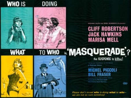
The text is an awkward mix of styles and colours, but fortunately the main credits and the way they’re listed don’t detract from the overall effect of the poster, although it would have been nice to see Michael Relph and Basil Dearden – the co-conspirators if you like on this project – given more prominence. But this poster isn’t bothered about the dry, academic stuff, this poster is all about giving its target or expected audience as good a time looking at it, as they’ll have a good time watching the movie. And for the most part, it succeeds, unlike this British example from the same year:
13 Tuesday Dec 2016
Posted in Movies
Tags
Avant garde, Edy Darclea, Helen of Troy, Historical epic, Movie poster, Paris, Poster of the week, Russia, Vladimir Gajdarov

The oldest item yet to feature on Poster of the Week, this Russian-made poster for the German silent epic, Helena (1924, aka Helen of Troy), is a great example of avant garde design, and features the bold use of a limited range of colours. It’s striking, grabs the attention, and offers lots of detail that draws the viewer’s attention (and a little unwillingly at that).
The image is the key factor in the poster’s design, with Vladimir Gajdarov’s Paris posing regally as if bathed in the rays of the setting sun, his handsome, aquiline features made all the more dramatic by his closed eyes and proud bearing. He’s like a god, his striking countenance offering no doubt that here is the movie’s hero in all his costumed splendour. His tanned, sun-blessed skin tones and wavy brown hair complement each other perfectly, and they blend seamlessly into the burnt orange flare of his tunic, and then on down into his right arm. Only the silver-grey of his breastplate breaks up the effect, but its presence there works, the juxtaposition of the deep reds and the shiny silver-grey proving arresting.
As we pan across the bottom half of the poster, there’s Paris’s helmet, an almost isolated pocket of silver-grey that features strange whorls and curlicues. It’s as if there should be a pattern there, something to occupy the eye as it lingers on the helmet, but the effect isn’t that considered or organised. Each swirl is independent of the others, and each has its own flow and purpose (even if, ultimately, we don’t know what that purpose is). Paris holds his helmet in place with rigid formality, an extension of his pose to the left.
But what’s this? There’s something odd going on in the poster’s centre. There’s something keeping Paris and Helen of Troy apart. At one end, by Paris’s left hand, it looks like it could be a fur, but it’s clearly attached to some kind of material that at its other end is too sharply defined to be from an animal (it also looks as if Paris would impale himself on it if he leans forward too far). This part of the image doesn’t make any sense, even if you accept that it’s the cockade to Paris’s helmet, and especially with the way that Edy Darclea’s Helen is leaning over it in her efforts to be closer to Paris. She looks both uncomfortable and awkward in her positioning. Her gaze, such as it is with her eyes being closed, isn’t even in line with that of Paris’ gaze, and her smile seems both unlikely and inappropriate.
Helen is further let down by the artist’s choice of hat wear. With its truncated top and red circles it’s the Ancient Greek equivalent of a bobble hat, but without the telltale bobble to give it all away. Her skin tone is problematical as well, with its light orange appearance looking too pale against the reds and greys near to her. And what we can see of her tunic reveals a distinct “peasant blouse” effect, an unlikely choice given the period. All this – and let’s forget about the lone ringlet allowed to drape itself over her shoulder – serves to make Helen a less effective component of the overall image than her lover, Paris. Deliberate? We’ll never know, but it’s strange that one side grabs the attention for all the right reasons, and the other side does the same but for all the wrong reasons.
Of course, this being a Russian poster, the text is in Cyrillic, with the main title given prominence near to the top right hand corner. Down in the right hand corner we have the movie’s two sub-titles: Part 1 – The Elopement of Helen, and Part 2 – The Fall of Troy, while crammed into the space below Paris’s right hand is what appears to be details of a limited engagement at one of Moscow’s cinemas. But if you have to spare a thought for anyone connected with this production, then it’s the principal cast of Darclea, Gajdarov, and Albert Steinrück that come off worst: they’re the names squashed between the back of Paris’s head and the edge of the poster. However, the text does make for a nice counterpoint to the main image, and even if it’s been added wherever there’s a space, it’s still effective in terms of the overall image.
This type of avant garde poster was a common sight in Russia during the 1920’s and while there are issues with the depiction of Helen, this is still a poster that draws you in and rewards on several levels. The colours are a pleasing mix of saturated and restrained, and despite Paris’s rigid bearing, contains enough “fun” elements to make it an enjoyable poster to look at, and much, much better than this French version (apologies for the grainy resolution):
06 Tuesday Dec 2016
Posted in Movies
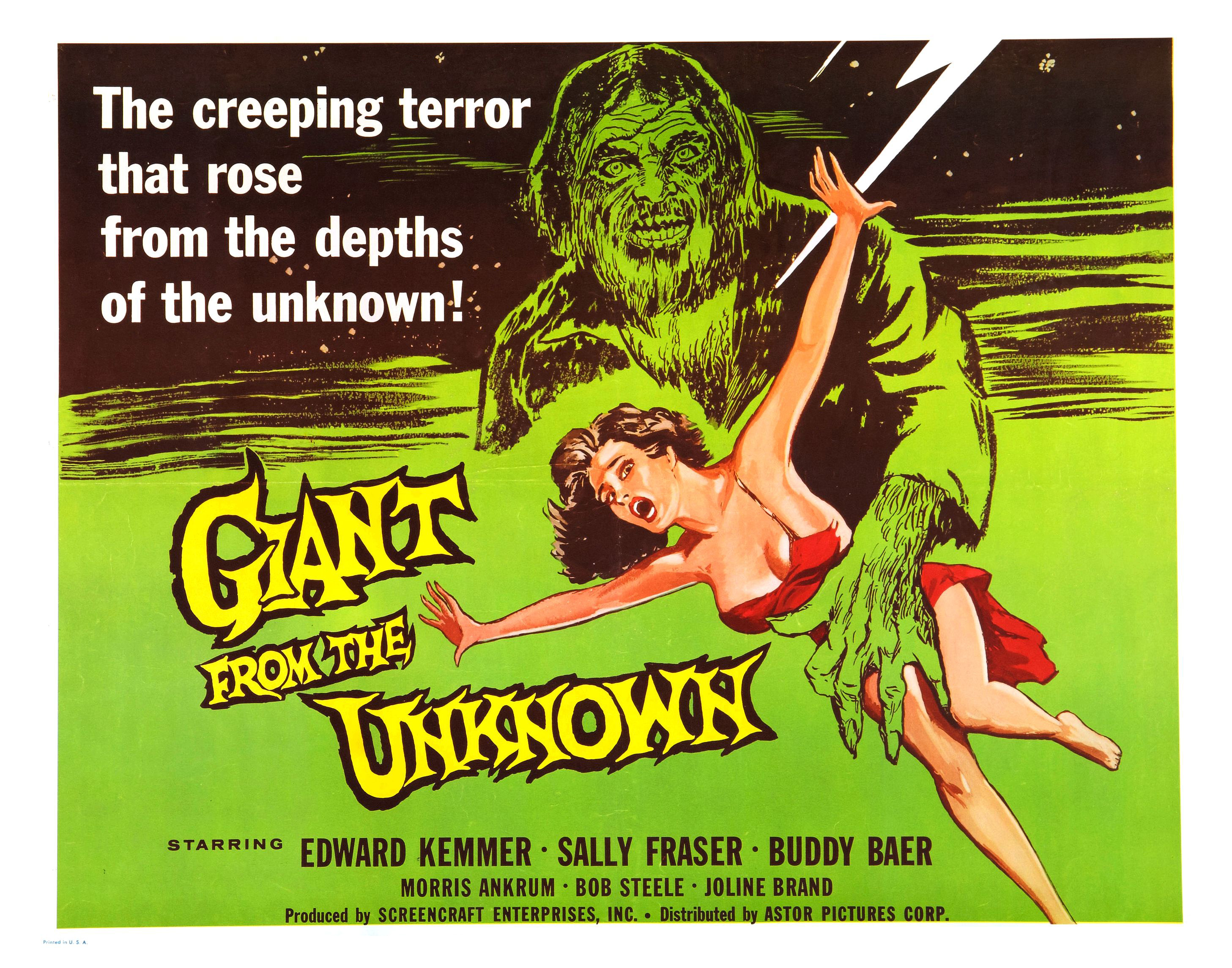
Giant from the Unknown (1958)
At first glance, the poster for Giant from the Unknown seems like a random collection of typographical styles, two primary colours and one secondary colour, a damsel in distress, and a lightning effect that appears to have been included for no particular reason at all. And that’s without the titular giant’s werewolf-like appearance (“My, what a lot of chest hair you have.” “All the better to frighten you, my dear… hopefully”). But it’s a poster that is deceptively effective – or effectively deceptive? – and which uses the apparently random nature of its elements to provide a strangely compelling overall image.
The movie itself is about – and I quote – “A very large, degenerate, Spanish conqueror [who] is freed from suspended animation by lightning and goes on a killing spree in a small town.” So that explains the lightning bolt. Then there’s the depiction of the Giant (who we now know is from Spain and not the Unknown – wherever that is). The artist has come up with an image that, ultimately, is misleading, but with its unruly hair and wild-eyed stare, and allied to a hairy, sharp-nailed hand, is much more of a beast than a giant. Fortunately he’s also proportionately bigger than the woman he’s menacing (though you do have to wonder what his little finger is doing). He’s a commanding figure when all’s said and done, and his stare seems to be directed right at you, which is unnerving considering he’s just an image on a poster.
The woman he’s towering over should be more eye-catching, what with her flimsy red dress, splash of hair, petrified gaze, and exposed flesh. The artist has seen fit to remove the strap from over the woman’s right shoulder, an excision that is at once exploitative and also a way to further highlight her vulnerability. The Giant doesn’t exactly look lascivious, but the inference is clear: that flimsy red dress won’t be there for long once he catches her. Of course, this is from 1958, and there was absolutely no chance of the poster image being replicated within the movie, but certain target audiences of the time would have hoped like crazy that it was.
The largely green background aids the two central images to stand out more, and gives the title a chance to “pop”, it’s sharp-edges and crowded conjoined lettering serving to accentuate the strangeness of the movie. (It’s also interesting to speculate that the woman is reaching desperately to grab the word “the” and maybe save herself.) Above the title is the movie’s tagline, a typical piece of hyperbole that even moviegoers of the time wouldn’t have been fooled by. The typeface used is unexpectedly dull, and doesn’t fit the random nature of the other elements – unless that’s the point of it, and a touch of random dullness was somehow a requirement.
The remaining type details the main cast members, and is in a more traditional black. But there’s an obvious – glaringly obvious – omission: the name of the director (in this case Richard E. Cunha, who was also the movie’s DoP). Either this was a tremendous oversight, or a deliberate decision by Screencraft Enterprises, Inc.; either way, not seeing a director’s name on a poster doesn’t exactly add confidence in the finished product’s likelihood of being good/entertaining/worth seeing, even if it is called Giant from the Mountain.
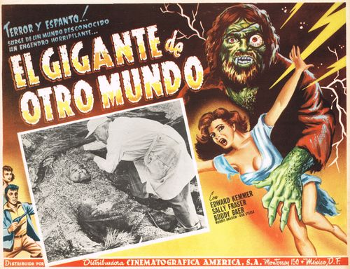
But all in all, this is a poster that, while largely generic for the time it was produced, exerts a strange fascination, and has an odd hypnotic nature to it. It’s a diamond in the rough, a poster that’s truly from the Unknown, and a better advert for the movie than it perhaps deserves. It’s certainly better than this Mexican lobby card that was used (note the difference between the artist’s impression and the actual Giant):
Agree? Disagree? Feel free to let me know.
02 Wednesday Nov 2016
Posted in Movies
Tags
American International Pictures, Horror, Michael Reeves, Poster of the week, The Conqueror Worm, Tigon, Vincent Price, Withchfinder General
When movies are released with an alternative title, often there’s a new poster created to go with the change of name. And sometimes the new poster proves to be better than the original (though more often there’s no difference either way). In 1968, the British production company Tigon released a movie based on a novel by Ronald Bassett called Witchfinder General. The movie was directed by wunderkind Michael Reeves, and starred Vincent Price in what would come to be regarded as one of his very best performances.

The above poster was used in the UK, and while it has a lot to say for itself in terms of the activity presented within its frame, it’s not the best example of a horror movie poster from the period. The title is shown in large block capitals, but more in the style of an historical epic rather than the low-budget horror movie it’s actually about. And the image of Vincent Price, with its backdrop of rising flames, isn’t the best representation of the actor you’re ever likely to see, what with his beady eyes and protruding lower lip. There are – unfortunately – lots of other areas where the poster design lacks imagination, and in the case of the woman on the left hand side with her arms raised who looks like she’s wearing a bikini, quality control. There’s a riot of activity going on across the image, and while some of it – the burnings, Price’s black-cloaked figure – are relevant to the movie, there’s far more that isn’t, and there’s a sense that a cast of thousands has been assembled to match the intensity of the material (completely unlikely, though, as a plan to shoot the Battle of Naseby was scrapped as it would involve hiring too many extras). And then there’s the typeface, underlined in red for no reason at the top, taking up the bottom fifth of the poster, and leading to the central images being squashed between the two. In short, it’s a messy, jumbled effort and does the movie it’s advertising no favours.
In the US it was a whole different ballgame (as it usually is). Co-producers on the movie, American International Pictures, wanted to play up the presence of Vincent Price and link it in to the various Edgar Allan Poe movies they’d produced earlier in the decade. Of course, Reeves’ tale of Matthew Hopkins, Witchfinder General takes place roughly two hundred years before Poe’s career made him famous, so there can’t be any kind of connection at all, but AIP were the kind of company that wouldn’t let a simple thing like an historical mismatch get in the way of selling a movie. And as for that title, well it’s not very witch-y, is it?

The title change does have a certain charm, and on its own it’s an ominous enough combination, but it doesn’t adequately reflect the content of the movie. The poster though, for all its adherence to the lie that this is an adaptation of an Edgar Allan Poe tale, gets much more right than its British predecessor. The admonition to stay home with your children if you’re too squeamish is straight out of low-budget horror movie marketing for the time, but for once, it’s not false advertising. Reeves’ approach to the material was to highlight the sadism and the cruelty of the period, and while the UK censors took umbrage at some of the scenes in the movie and they were removed, US viewers saw the movie in a version that was virtually intact. And instead of a pouting, disapproving-looking Price staring out at you, AIP went with a mangled skull with one eye still in place, its tousled, straw-like hair like roots growing out of the skull itself. It’s definitely an arresting image, and one that isn’t constrained by the more orderly typeface seen at the top left and along the bottom of the image. It’s also the kind of horrifying image you might see in an illustrated version of Poe’s stories, and not a tale of witch-hunting in 17th century England. But it works, almost completely, with the only caveat being that its depiction of the crosses Hopkins’ victims are tied to, don’t match up to those in the movie (and really, that’s just a minor gripe at best).
So, to be clear, AIP took a movie they’d co-financed, they changed the title, they made it look and sound like another of their Edgar Allan Poe adaptations, they added an image with no relevance to the content of the movie at all, and they did it with full awareness that they were misrepresenting their own movie. And yet – it works, and more powerfully than Tigon’s version. Maybe there’s a lesson in there, somewhere, but one thing’s for sure, sometimes artistic licence really is the way to go.
Agree? Disagree? Feel free to comment.
30 Friday Oct 2015
Posted in Movies
Today thedullwoodexperiment is two years old.

It still comes as a surprise to me that I get to do this (most) every day, and that I get the visits and feedback that I do, just by writing about what I love most: the movies. Even when a movie is a real stinker, it’s still an enjoyable feeling to be able to put my thoughts about such debacles out there, and alongside the movies that really work.
I’ve got several ideas and plans for Year Three, including the return of Poster of the Week (though in a slightly different format), the return of Zatoichi (my apologies for not having continued the series as originally planned), further installments of For One Week Only, and several other ideas that will remain under wraps for now. Reviews will continue to be the focus, but I aim to increase the amount of non-review posts as well.
As always I’m open to suggestions about which movies should be reviewed or included, and if anyone wants to see something specific under the For One Week Only banner, feel free to let me know. Any and all feedback will be gratefully received. Now, what can I watch next…?
05 Monday Oct 2015
Posted in Movies
Tags
Drive, Fan posters, Inception, Iron Man, Leon, Monsters Inc., Movie poster, Mulholland Dr., Poster of the week, Scott Pilgrim vs the World, Star Wars Episode IV: A New Hope, Wolfen, X-Men: First Class
Away from the world of studio marketing, where movie posters are increasingly showing signs of creative fatigue, and often are little more than images of the main characters in a scene from the movie, the movie poster as art is being left to pass away quietly in a dark corner somewhere, neglected and forgotten. With the studios seemingly unwilling to invest in getting an artist or illustrator to add a little extra lustre to a movie’s reputation, it’s left to the fans to really show them how it’s done. The following ten movie posters have been created by people who understand the concept or idea behind a movie, or just want to see something more original than what we see at our local cinemas. And usually, they’re a damn sight more clever as well!
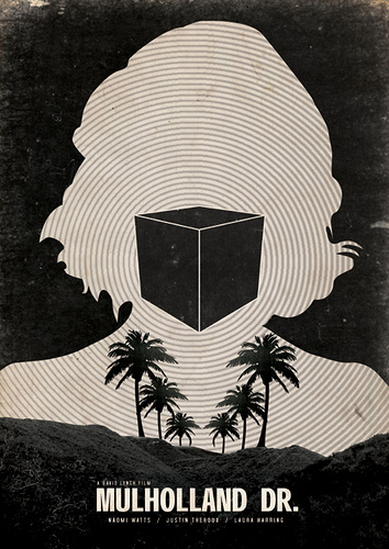
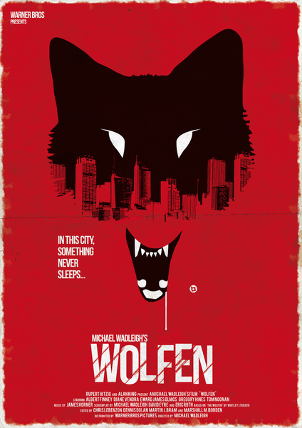
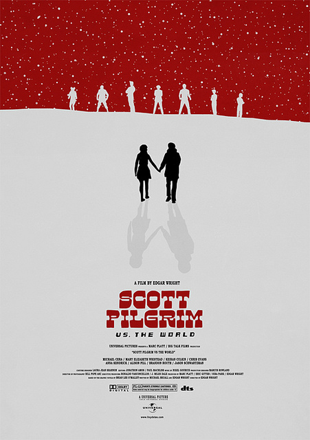
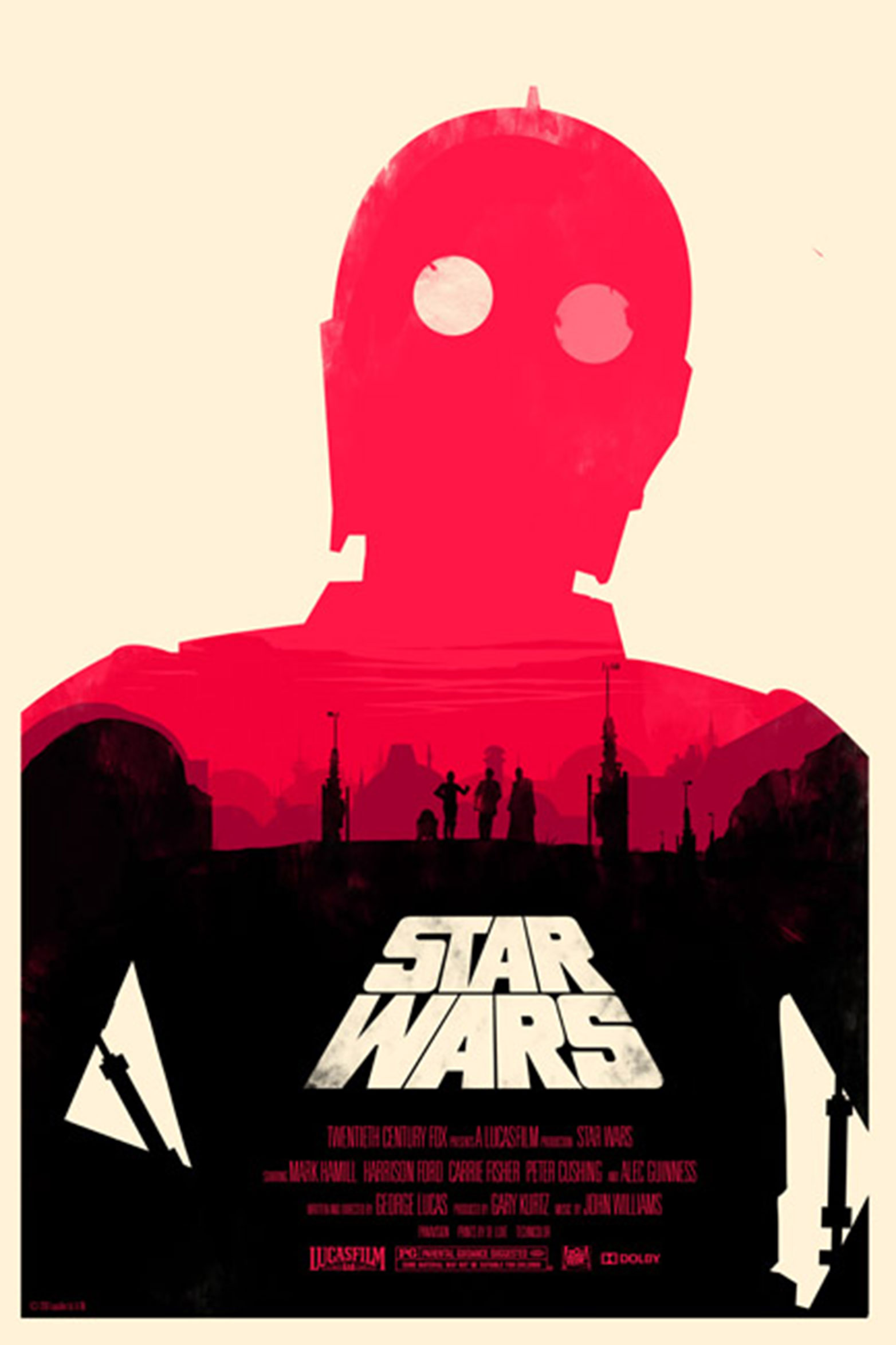

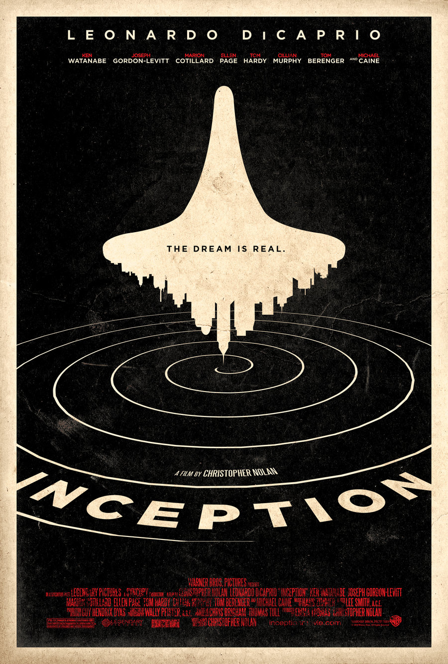

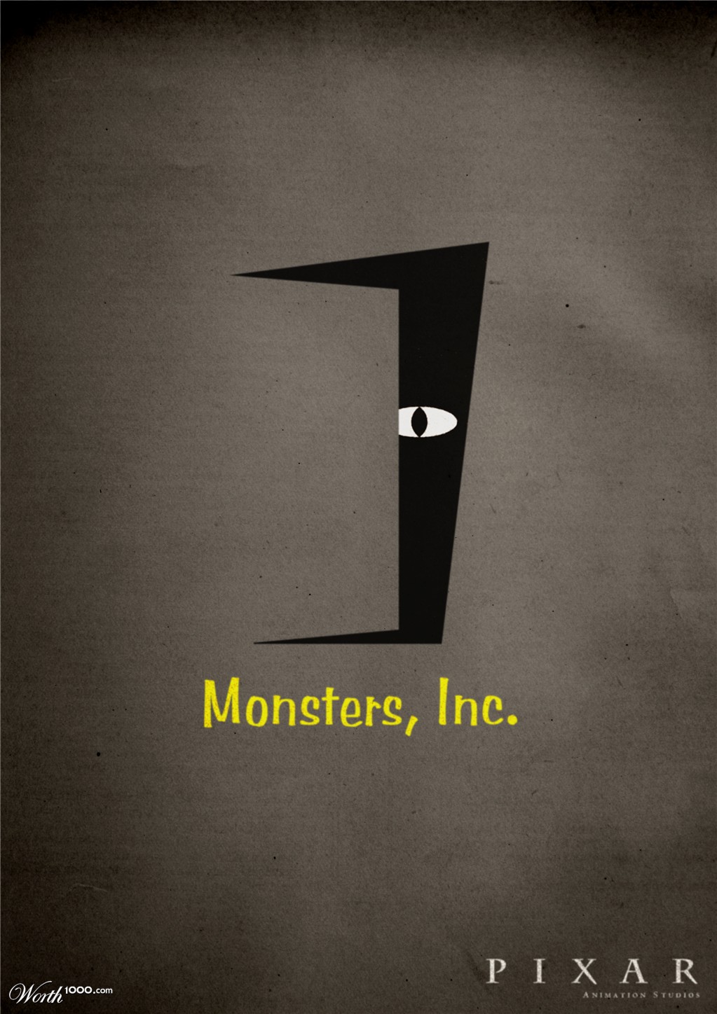
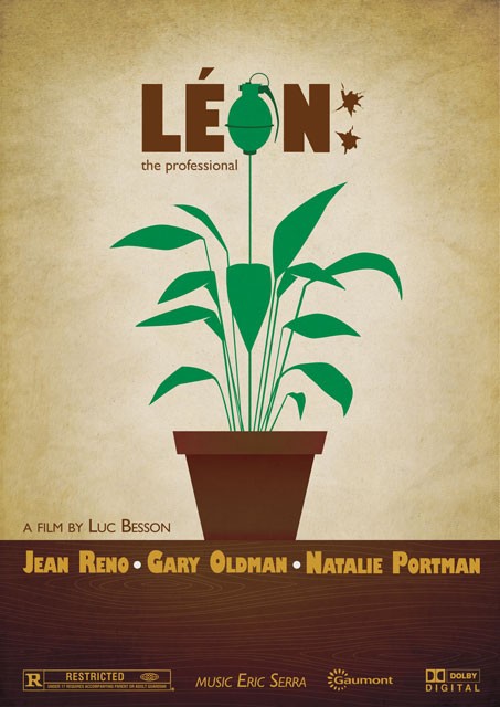
NOTE: If you’re looking at these and thinking, “That’s my poster, I did that!”, then please let me know so I can update this post with the appropriate credits.
08 Tuesday Sep 2015
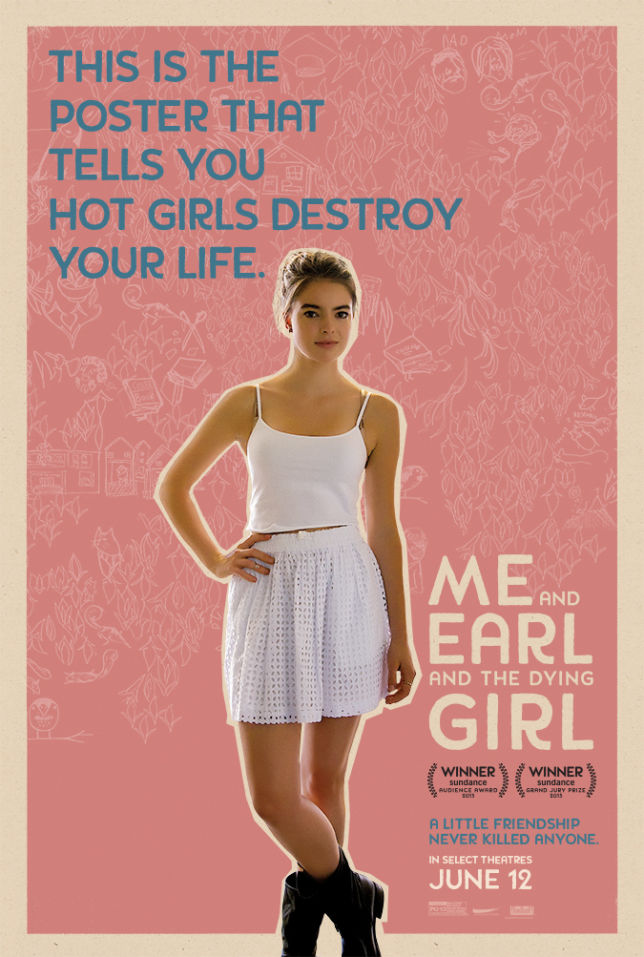
If you’ve seen Me and Earl and the Dying Girl, then you’ll have a better understanding of the posters that were designed as part of the movie’s online advertising. Each one has an individual focus, and they all reference something or someone that happens in the movie. They’re clever, follow a pre-determined and consistent format, and for me, form one of the best representations of a movie in quite a while. See what you think, and if you feel like it, let me know which one is your favourite.


29 Monday Dec 2014
Posted in Movies

The Rules of Attraction (2002)
You’re adapting a novel by Bret Easton Ellis, you’ve got a cast that includes some of the hottest young actors around, and you want to make sure that the movie is advertised as effectively as possible – what do you do? Well, the answer’s obvious: you fill your poster with images of stuffed toys engaging in various sexual activities and positions.
This kind of exploitative approach is usually reserved for exploitation movies but The Rules of Attraction was a low-budget ($4m) indie movie that featured well-known stars, a director who helped Quentin Tarantino come up with the story for Pulp Fiction (1994), and was an adaptation of a novel that had already garnered a fair degree of notoriety. With all that going for it, the decision to have fourteen pairs of rutting toys on the poster must have seemed like one of the best, most transgressive, and cool, ideas ever.
And it is. It’s arguably one of the most arresting posters ever created, so much so in fact that it was banned in the US and replaced by the poster below.
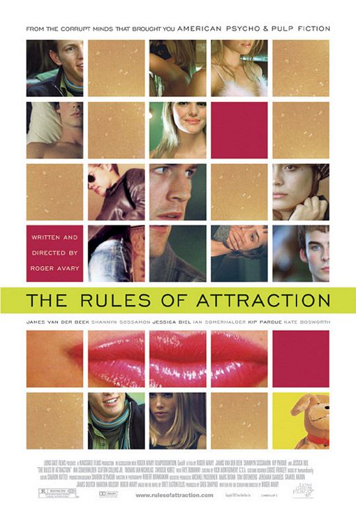
Much better, eh? So this was the poster that US audiences saw at theatres, while Canada and the UK were deemed able to deal with the audacious nature of – gasp! – toys giving each other a good seeing to. (It’s always a strange thing that the US has such a hard time dealing with sex but seems okay with all kinds of violence.) And in its own way, the poster being banned worked a treat, giving the movie an added boost at the box office.
Of itself, the poster is a humorous mix of fluffy indiscretions in a range of bright colours against a pale green background that at first seems off-putting but actually works when it shouldn’t. And its tag line is more subtle than expected, reflecting both the toys’ antics and some of the character motivations in the movie. (It’s a shame about the quotes, though – definitely not reflections of the finished movie.)
Agree? Disagree? Feel free to let me know.
NOTE: This is the last Poster of the Week for a while, as it makes way for a new format that will begin next week. To everyone who has taken an interest in the various posters I’ve looked at over the last six months, thank you very much, and I look forward to renewing this strand later in 2015.
22 Monday Dec 2014
Posted in Movies

The Girl from 10th Avenue (1935)
The poster for this romantic drama from Warner Bros. is surprising in many ways. As a vehicle for Bette Davis, it’s appropriate for her to be front and centre in the design, but the way in which she’s depicted is a little offbeat. The early to mid-Thirties was a period when Davis was still a long way from being the forceful actress we all know today. A lot of her early roles were in movies such as this one, but this was the first time she was pictured as the type of hard-boiled, predatory character more suited to, say, Jean Harlow.
The image is also at odds with the character she plays, a shopgirl who marries a man on the rebound from a failed relationship. The challenging stare, the casual draping of the arm over the back of the chair, the cigarette caught between two fingers, the red gloves and hat (hints towards her being a “scarlet woman”), and the shapely legs so prominently displayed – all these point to a character who knows what she wants and how to get it. It’s an almost defiant image, daring the viewer to have an opinion about the character before seeing the movie.
The background is surprising as well, its heavy combination of black and brown almost swallowing the chair and Davis within it, only the well-chosen colours of Davis’s outfit keeping her from disappearing altogether. But then there’s the choice of yellow for the title, a bright distraction from the rest of the image, and making for a strangely effective contrast with the grey used for Davis’s name. With the other credits in orange on the opposite side, the overwhelming dourness of the design is undercut a little further, but all eyes will still be on the image of Davis, staring out at you with all the intensity of a woman from 10th Avenue, and not the girl she’s meant to portray.
Agree? Disagree? Feel free to let me know.
16 Tuesday Dec 2014
Posted in Movies
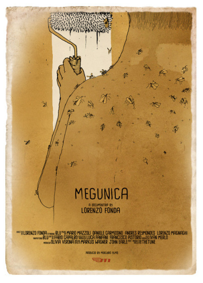
Megunica (2008)
A documentary that follows the Italian artist Blu on a tour of South America, Megunica – the title is an amalgam of the countries visited: Mexico, Guatemala, Nicaragua, Costa Rica and Argentina – is represented by a poster that is literally a work of art. Designed and drawn by Blu, the fun here is in interpreting the image and what it might mean.
I say “fun” because this is a movie I haven’t seen, but the poster is so intriguing it’s already had me trying to locate a copy of Megunica so I can discover if the image is relevant to a sequence in the movie, or if it’s a stand alone piece that the makers felt would be fitting just for the poster. (This is what a really good poster should do: not be just part of a marketing exercise, but grab the attention and be fascinating enough to make someone want to see the movie it’s promoting, even – and especially – if it’s a movie they might not plan to see normally.)
When looking at the poster, two things spring to mind immediately. The first is the idea that the man we see painting a wall and covered in flies is somehow attempting to wipe the slate clean. With South America’s history of exploitation and corruption in mind, Blu’s painter could be trying to make the point that it’s time for change, a time to start over. If so, it’s a powerful statement, at once provocative and profound. The second possibility is that it’s a self-portrait, a representation of Blu himself, an artist known for his murals and graffiti work the world over. What better way to “introduce” him than as the focus of the poster, and doing what he does best?
Both ideas, of course, may be erroneous, but again, that’s part of the fun. The flies may be representative of the conditions where the movie was made, or a metaphor for South American societies, or they could be “just” flies. But whichever notion is correct, or if they’re there for another reason entirely, the fact that this poster can prompt even this much debate is a triumph.
Agree? Disagree? Feel free to let me know (especially if you’ve seen the movie).
08 Monday Dec 2014
Posted in Movies
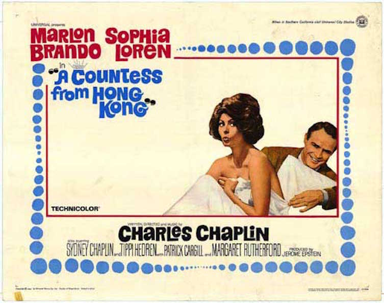
A Countess from Hong Kong (1967)
Chaplin’s final movie wasn’t the well-received swan song he may have hoped for, and it does try to tell a modern story in an old-fashioned way that doesn’t work for the most part, but this poster captures some of the light-hearted fun he was aiming for.
It’s a very Sixties poster, with lots of space left unused, and a slightly trippy feel to the border, the blue bubbles reducing and expanding for no particular reason but still suiting the design. The break at the top left for the stars’ names and the title disrupts the pattern, but it’s a break that doesn’t upset the overall style. Having the stars’ names in red makes for an obvious focus, and they pop out from the pale yellow background like an alert.
The images of Loren and Brando are appealing, especially Loren’s pout, though whether she’s doing so out of surprise or distaste is hard to tell at first thanks to the direction in which her eyes are looking, while Brando’s grin speaks of a man enjoying himself immensely (and if you’re sharing romantic scenes with Sophia Loren, why not?). They seem to be enjoying each other’s company, and it’s clear that they’re relaxed and comfortable with each other. It’s a lovely image, the kind it’s easy to imagine two lovers sharing. And then there’s the inclusion of Brando’s hand and arm, as he attempts to pull away the sheet from Loren’s upper half; it’s a neat touch, and explains the look on Loren’s face.
Below the image are the remaining credits, with Chaplin’s name highlighted in black, and then the supporting cast (also in black). With the bright, primary colours used elsewhere, it’s a bit of a surprise to see black employed so much, though it does make Chaplin’s name stand out (which may have been the intention). All in all, though, this is a fun poster to look at, and it brings together its few elements to surprisingly good effect.
Agree? Disagree? Feel free to let me know.
02 Tuesday Dec 2014
Posted in Movies
Tags
Kevin Costner, Lee Harvey Oswald, Movie poster, Oliver Stone, Poster of the week, President John F. Kennedy

JFK (1992)
Oliver Stone’s controversial examination of the assassination of US President John F. Kennedy is engrossing, challenging and provocative. This poster for the movie isn’t quite as powerful – though that’s not a bad thing – but it what does do really well is compile some very iconic imagery into an attractive, attention-grabbing whole.
There are three very potent images included here. The first is the shot of Jackie Kennedy reaching over the back of the car with the Security Service agent rushing toward her. Even if you were unaware of the context of that image, you’d still know there was something wrong there, that this woman was in trouble. Knowing the context adds sympathy, sorrow, grief and shock, and the image’s inclusion is a poignant and concise reminder of the events of 22 November 1963.
In contrast, the image of Lee Harvey Oswald clasping a rifle in one hand and copies of the Communist paper The Militant in the other, provokes a different reaction. Whether you regard him as an assassin or a patsy, there’s something about Oswald’s look to camera that makes the viewer a little uneasy. Whatever his involvement in the death of John F. Kennedy, Oswald is still someone who invites suspicion, and this image reinforces that feeling with quiet authority.
Lastly, and perhaps less obviously, there is the torn American flag, a symbol of the “loss of innocence” America as a nation felt in the wake of Kennedy’s death. This was an event that – if such a thing is truly possible – damaged the nation’s psyche. It’s inclusion is the poster’s most subtle aspect, and mixed with the other two images, creates a compelling reflection on the movie’s subject matter.
The further inclusion of an image of Kevin Costner as District Attorney Jim Garrison doesn’t really add anything to the overall design, and appears more of a marketing idea than anything else. But the tag line is certainly apt, and rounds off the poster’s effect quite nicely: “The Story That Won’t Go Away”. How true, indeed.
Agree? Disagree? Feel free to let me know.
24 Monday Nov 2014
Posted in Movies
Tags
Barbara Stanwyck, Breasts, Frank Capra, Hays Code, Inter-racial relationship, Movie poster, Nils Asther, Poster of the week
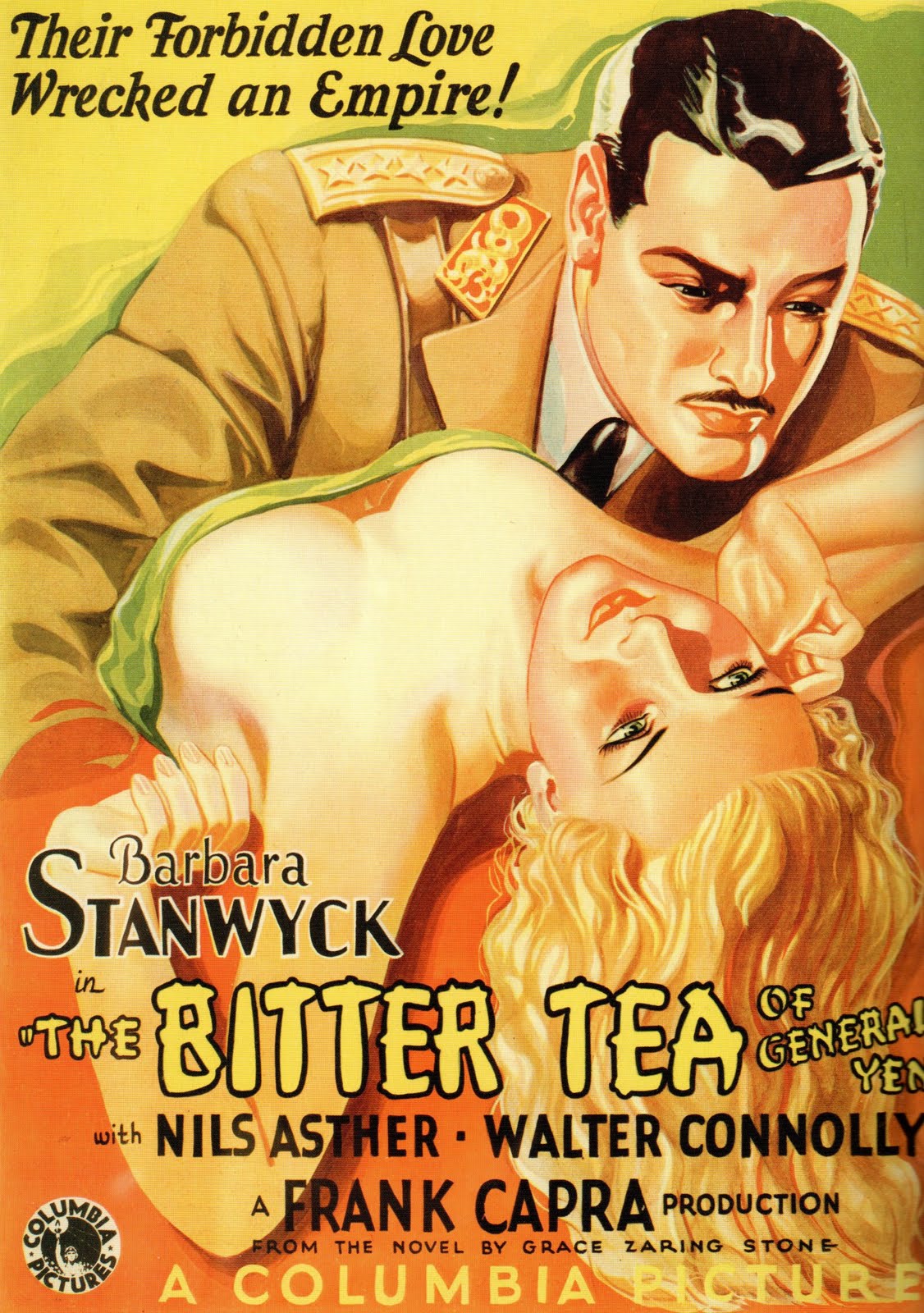
The Bitter Tea of General Yen (1933)
In 1930, Hollywood adopted the Motion Picture Production Code (aka the Hays Code), as a way of ensuring that movies wouldn’t “lower the moral standards of those who see [them]”. Although the Code was formally adopted at that time, it would be another four years before the Code was rigidly enforced, as producers between 1930 and 1934 ignored the Code in favour of strong box office returns on movies with racy material. And one such movie that flouted the Code was The Bitter Tea of General Yen.
Its tale of a Chinese warlord and the fianceé of a Christian missionary who fall in love, the movie transgressed against several particulars of the Code, not the least of which was in its depiction of sexual passion. And while most of the posters made to advertise the movie were entirely sedate and gave no indication of the torrid goings-on between Barbara Stanwyck and Nils Asther, this one spells it out as boldly as possible, and leaves the potential viewer in no doubt as to what he or she can expect (if they’re lucky).
General Yen’s ethnicity has been toned down quite a bit, making Asther look more Central European than Chinese, but the title is a giveaway, and there’s also the military-style jacket to reinforce matters. As he approaches the prone character of Megan Davis, there are two very obvious reasons for his interest: her barely covered breasts. Seen today, this rather blatant attempt at prurience doesn’t have as much effect as it would have done back in 1933, but it’s still a bit of a surprise to see such an exposure of flesh so prominently displayed. It certainly gives a good indication of how racy the movie is likely to be – even if that particular image isn’t replicated in the movie itself – and it’s also a further indication that the Code was being flouted as often, and in as many ways, as possible.
A racy, sexually provocative depiction of an inter-racial relationship – unusual for the time – and a great example of how the studios ignored the Code, this poster has a terrific collision of colours and only one worrying aspect to the whole thing: just what has happened to Asther’s right hand?
Agree? Disagree? Feel free to let me know.
18 Tuesday Nov 2014
Posted in Movies

Lust, Caution (2007)
Ang Lee’s exemplary drama of political and sexual intrigue is what many critics would describe as “awards worthy”. And so it has proven, particularly at the 2007 Venice Film Festival where it won Best Film (as you can see on the poster). And this is a great example of an “awards” poster, as well as being quite beautiful to look at.
The gold and red colouring immediately makes the poster alluring to look at, the warm flesh tones and splashes of vibrant red acting as flashpoints for the eyes, bold highlights that attract the eye and help settle it on the poster as a whole. The beauty of the image is appealing too, the wariness in the eyes of Wei Tang matching the cold stare of Tony Leung, and drawing attention to the tension in their relationship. With a swirl of blood adding an air of danger at the bottom, the drama inherent in the image becomes more potent (even if there’s no clear indication of what that drama encompasses).
But what’s most interesting – and nearly always is with this type of poster – is the choice of quotes. Each one is a lofty superlative drawn from respected reviewers and their publications, and each one leaves the reader with no doubts as to the movie’s quality. But while superlatives on a movie poster aren’t exactly unusual, here they’re just that little bit too effusive, making the movie sound like a masterpiece (which it doesn’t quite live up to).
And then, as if all the praise wasn’t enough, the designer decides to add the text that reminds everyone of Ang Lee’s prowess as a director, quoting his two most popular movies and giving the impression that Lust, Caution is as good (if not worse) than they are. It’s actually a subtle touch, more so than the review quotes, and more likely to draw in an audience. It all adds up to a movie poster that is deceptively effective at promoting the movie, and deceptively evocative at the same time.
Agree? Disagree? Feel free to let me know.
11 Tuesday Nov 2014
Posted in Movies
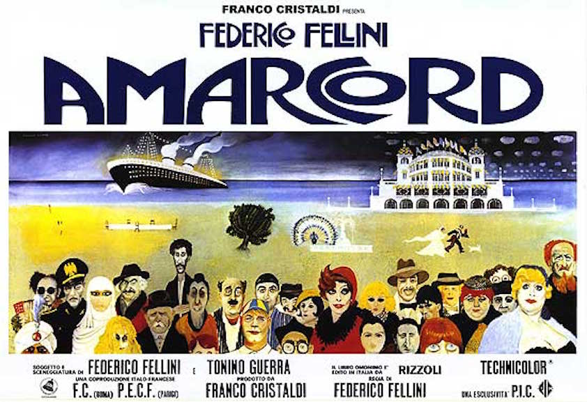
Amarcord (1973)
There are several great posters out there for Fellini’s movies, and while some of them have a caché that can’t be beat – I’m talking I vitelloni (1953) for one – this particular poster appeals to me in ways that have crept up on me over the years. (Some historical background: I saw the majority of Fellini’s movies over a period of four months back in 2002, and while learning more about them, saw the variety of designs allocated to the posters for his movies; most of them are really expressive and charming.)
Here it’s the breadth of the design, coupled with the number of references to characters, places and events in the movie that impresses the most, along with the clever way in which the eye is drawn to each component of the poster in a way that allows one to focus on one aspect without losing sight of the whole. The dark-hued sky with its portentous colouring is wonderfully dramatic, hinting at some of the conflict contained within the movie, and then there’s the space between the characters and the sea, sparingly dotted with images, a brighter stretch of colour that looks more optimistic.
It also serves as the backdrop for one of the most incredible assemblies of characters from a movie you’re ever likely to see. They’re all there: from Ciccio Ingrassia’s mad uncle, to Magali Noël’s beautiful Gradisca, to Maria Antonietta Beluzzi’s impossibly bosomed tobacconist – an intimate series of representations that border on good-natured caricature yet retain the essence of that character, allowing their personalities to be hinted at or confirmed (to find out which you have to see the movie). It’s like a rogues gallery except that these are all people you’d be intrigued to meet.
And then there’s the bold, swirling script used for the director’s name and the title, a magnificently cursive grouping of letters that maintains its own identity and oversees the image like a proud, protective parent. It all adds up to an audacious, striking movie poster that perfectly reflects the movie it represents.
Agree? Disagree? Feel free to let me know.
03 Monday Nov 2014
Posted in Movies
Dad and Dave Come to Town (1938)
For those of you wondering who Dad and Dave were, they were characters – father and son – who featured in four Australian movies made between 1932 and 1940. In many ways they were a precursor to the Beverly Hillbillies, though the humour in them relied heavily on slapstick. All four movies were successful Down Under, and even today are highly regarded.
Dad and Dave Come to Town was the third movie in the series, and this poster reflects both the storyline and the carefree approach to the material. Emphasis is given to the difference that city life has on Dad and Dave’s appearance in the movie, both of their gruff exteriors replaced by noticeably airbrushed “makeovers” (though Dave changes from slightly dangerous looking to appropriately dim looking). For enthusiasts, seeing Dad and Dave transformed into “city slickers” would have been an irresistible attraction.
The contrast between the rural community they come from and the big city is further highlighted by the warm farmyard scene juxtaposed with the dark outline of the city at the bottom – can it be a good influence on our heroes, or will they prove to be more than a match for city ways? And as if to reinforce the idea of the city’s wicked ways and its corrupting influence, there’s a couple of scantily clad women alongside the cityscape (as well as a very worrying looking mannequin), all carefully posed to promote the risqué nature of the humour in this particular outing.
What grabs the eye the most though is the colourful garishness of the poster itself, the bright yellows and reds bursting forth from the blue background like typographic explosions (and be honest, how often do you see the word ‘cripes’ given such prominence in a poster?). The depth and richness of these primary colours makes the whole poster that much more appealing and easy to look at. It’s the perfect way to enrich an already lusciously presented poster and its alluring images.
Agree? Disagree? Feel free to let me know.
27 Monday Oct 2014
Posted in Movies
Tags
Clint Eastwood, Lee Van Cleef, Movie poster, Poster of the week, Sequel, Sergio Leone, Tag line, Western
For a Few Dollars More (1965)
The sequel to Sergio Leone’s surprise hit, A Fistful of Dollars (1964), had several interesting posters designed for it at the time of its release, but this one is interesting for a couple of reasons.
The first thing to realise is that this is very much a poster that follows on from its predecessor, both in terms of design and reference. The image of Clint Eastwood is taken from the poster for A Fistful of Dollars (though just what’s going on with his left eye is a little strange), and the third tag line below the title is an updated version of a similar tag line from the first movie – that one read, “It’s the first motion picture of its kind! It won’t be the last!” It’s not often you see that kind of continuity in movie posters, but it’s a nice touch (even if it is bragging a little).
The principal tag line is urgent and attention grabbing, a bold statement of intent, and promising a showdown that will be exciting and dramatic. However, the description of Lee Van Cleef’s character – the man in black – is undermined by the poster’s image of him in very obviously brown coat and trousers and red waistcoat (though perhaps the artist was working from an early character or costume design). Van Cleef’s horse, clumsily included behind him, is there to show off the range of his arsenal, giving a clear indication (despite its positioning) of the danger facing the Man With No Name, and adding to the sense of threat in the main tag line.
There are other elements that don’t work as well – the gold coins dotted around, the slightly awkward second tag line – and at first glance it’s not as bold or inventive as some other posters for Westerns, but its warm tones and straightforward imagery work well enough to draw the eye more than once, and in its way, proves unexpectedly evocative.
Agree? Disagree? Feel free to let me know.
20 Monday Oct 2014
The Polar Express (2004)
Widely regarded as one of the quintessential Xmas movies, The Polar Express is a breath of digital capture fresh air, its sense of childlike wonder easily transporting its audience into a snow-filled fantasy land that should make even the coldest heart glow with wonderment. Even if this early example of the animation format still looks a little too artificial in places (and faces), its charm wins out every time.
This particular poster gives a great sense of the astonishing journey ahead of the small boy who stands in front of the titular locomotive, his awestruck gaze held on its snow-flecked lamp and the searching, probing, powerful beam of light that bursts out from it. It’s a light that points the way to an incredible journey, and heralds the trip of a lifetime. For the boy, standing there with (no doubt) wide-eyed fascination, it’s an amazing dream come inexplicably true, and his stance reflects his amazement at the sight of the enormous, magnificent train in front of him.
The size of the train is, perhaps, deliberately exaggerated to enhance the fantastical nature of things, a way of highlighting the magical experience that lies ahead. Its prominence is a powerful statement and oddly reassuring as well: whatever happens, and wherever it’s going, the Polar Express will get its passengers there no matter what.
But the train isn’t the whole of the image. There’s the snowman, one arm thrust out as if in presentation of the train, its countenance both knowing and mysterious. He’s saying, “Go on, step aboard, you won’t regret it”. There’s the backdrop of the houses, all dark and pensive, waiting for the dawn to bring them to life. And lastly there’s the tall tree on the left hand side, its branches reaching out to the falling snowflakes as if to catch them and thereby make itself beautiful.
With so many impressive, beautiful elements, it’s the tag line that caps everything off with perfect, heartfelt simplicity: “This holiday season… believe.” It’s no wonder then that over the last ten years, so many people around the globe have done exactly that.
Agree? Disagree? Feel free to let me know.
13 Monday Oct 2014
The Rocky Horror Picture Show (1975)
There were many posters created to promote Richard O’Brien’s affectionate tribute to 30’s horror and 50’s sci-fi, but this is one of the best. For its time, the movie was a slightly subversive treat, its air of permissive sexuality (in any form) allied to some great song and dance numbers. Now, almost forty years on, it’s less shocking, but it’s become perhaps the cult movie around the world.
Looking at the poster now it doesn’t have the same effect it would have done back in 1975. The sight of Tim Curry in make up, shiny basque, stockings and high heels no longer has that risqué quality that intrigued audiences who hadn’t seen the stage show, but it’s still an arresting image, a bold statement of intent that hasn’t lost its impact entirely. His haughty, scornful look is another great touch, challenging the potential viewer as if to say, “Do you have what it takes to watch this movie?”
And then there are the lips – courtesy of Patricia Quinn, Magenta in the movie – a now iconic image that is recognised everywhere. On their own they’re like a fetish object, full and curvy and inviting and infused with an indefinable promise of things to cum. With Tim Curry as Frank-N-Furter draped across them, they become even more erotically charged, the combination of willing lips and waiting body making the movie’s invitation to “Don’t dream it, be it” all the more alluring. It’s a powerful merger of two already compelling images, and is extremely effective.
Lastly, there’s the title itself, a dripping, blood-red example of the kind of title graphic used in the 40’s, a fond recreation of a style that represented shock and horror and terror “unlike anything seen before”. And with a black background that allows everything else to stand out in sharp relief, this is a poster that draws the eye and makes it hard to look away.
Agree? Disagree? Feel free to let me know.
06 Monday Oct 2014
Posted in Movies
Tags
George Sanders, Ingrid Bergman, Movie poster, Poster of the week, Roberto Rossellini, Viaggio in Italia
Journey to Italy (1954)
One of a multitude of poster designs created for the movie, this particular example is striking for a number of reasons, not least it’s decision to represent its leading lady with a less than flattering illustration. Bergman was still a big star in ’54, even if she had left her family for Rossellini, the movie’s director. This was the third film they made together, and its tale of a ruined marriage was reflected in the compositional choices made for this poster.
On the left is that curious representation of Bergman, her gaze drawn by something we can’t see, her pensive expression making it hard to work out what she’s thinking. Below her we see a young couple embracing – is she remembering this, is it part of her past with her husband, or is it something she sought but never found? (The answer can be found in the movie.) And above her, merging with her hair, a gondola that’s broken in two. An obvious metaphor perhaps, but not so obvious at first glance.
And then there’s that central image, a still taken from the movie itself, with Sanders in full on predatory mode, his gaze fixed on the young woman in such a way that his intentions couldn’t be any clearer. He’s sizing her up, thinking ahead maybe to when he can be alone with her. But look closely at the young woman and she’s looking at him right back, aware of the significance of his attention but unafraid, challenging him perhaps, or ready to acquiesce. Either way, she’s on an equal footing with him.
The movie’s original Italian title, at once a literal statement of its subject matter and a cogent summing up of what happens to Bergman and Sanders as their trip threatens to unravel them as individuals and as a couple, is mostly in vibrant red, highlighting the passion that lurks below the surface of both characters.
With so much information packed into one apparently pedestrian looking poster, it’s a testament to its designer – whoever they were – that it belies its commonplace appearance and is far more subtle and effective than it looks a first.
Agree? Disagree? Feel free to let me know.
29 Monday Sep 2014
Posted in Movies
Vera Drake (2004)
At first glance, this poster for Mike Leigh’s 50’s set drama looks drab and unappealing, its bland colour scheme and triple image of Vera herself (as played by Imelda Staunton) lacking any appreciable vibrancy or vitality. It’s a poster for a Mike Leigh movie, a dark, often uncompromising look at the life of a woman whose personal sense of morality was at odds with both society and the criminal justice system of the time. It’s a hard sell, even with Leigh in the driving seat, but whatever your views on the movie itself, the poster is unassuming, yet brilliantly devised.
The main focus is obviously the triptych. An image of Vera repeated against differing backgrounds that in some way reflect the description given of her in each panel. In the first, she’s a Wife, and the wallpaper depicts a wild growth of branch and flower, a more sensual, earthy tone that emphasises the carnal nature of marriage. It’s telling us that Vera is first and foremost a woman (which isn’t so obvious when watching the movie). In the second panel, she’s a Mother, and the wallpaper is less attractive, more formal, its ordered pattern highlighting the conformity that Vera has taken on by having a child. Her life is no longer as carefree as it was.
And then there is the final panel, a stark portrayal of Vera as a Criminal, the background a bare brick wall, the kind you might encounter in a prison cell. It’s a powerful conclusion, reflecting the distance Vera has travelled from that first, happier, image. Here is one woman’s journey in Life portrayed succinctly and with effortless flair. This is a tremendously evocative poster – for a tremendously evocative and moving movie – and while the press quote may seem a little grandiose, there’s no denying that, as far as the poster goes, it really is “magnificent”.
Agree? Disagree? Feel free to let me know.
16 Tuesday Sep 2014
Posted in Movies
Tags
CinemaScope, Landscape format, Movie poster, Poster of the week, Sequel, Susan Hayward, The Robe, Victor Mature
Demetrius and the Gladiators (1954)
With the advent of CinemaScope in 1953, the movies became bigger, grander, and more expansive, as befitted the new anamorphic format. And as if to emphasise the new screen size, movie posters became bigger, grander, and more expansive as well, with landscape designs becoming more and more prevalent. The first CinemaScope movie was The Robe (1953), a biblical drama starring Richard Burton. As can be seen from the poster above, it spawned a sequel that featured a character from that first movie, the slave Demetrius played by Victor Mature.
What’s interesting about this particular poster is its devotion to cramming in as much incident from the movie as possible, much like the screen image audiences would see, a wide, panoramic view of the action. There’s the carousing and revelries of the citizens of Rome (that might not be consensual given the look on the woman’s face in the bottom left hand corner). There’s the sight of three tigers all leaping at Demetrius in the arena (with the Coliseum and another gladiator highlighted behind them), and in the bottom right hand corner the figure of Peter (played by Michael Rennie) clasping the robe that will be passed to Demetrius. And almost taking centre stage, Demetrius and Messalina (played by Susan Hayward) locked in an embrace that unfortunately makes the titular hero look like a vampire feeding off his latest victim.
With the movie’s villain, Caligula, relegated to the far background of the Romans and their debauchery, the poster encapsulates several of the movie’s main highlights but saves room for its most important attributes. These are the technical advancement (and miracle) of CinemaScope, along with the innovation that is “high-fidelity directional-stereophonic sound” (not forgetting the movie’s having been filmed in Technicolor as well). Leaving no room for its cast or director (at the very least), the poster makes no effort to include anything further than the title and it’s relation to The Robe; it’s as if it expects moviegoers to be aware of who’s in it etc. already.
Making a virtue of promoting the movie’s spectacle, this poster for Demetrius and the Gladiators is a visual treat, drawing the eye here and there, and stripping back the usual cast and crew information in favour of those arresting images. It’s a bold move, but one that pays off handsomely.
Agree? Disagree? Feel free to let me know.
08 Monday Sep 2014
Posted in Movies
Psycho (1960)
Made for a very specific purpose – as you can see – this has a very interesting design, a spare, unapologetic approach that gets straight to the point, and isn’t interested in frills or embellishments to make it look more attractive. It is arresting, however, and is possibly one of the most effective pieces of movie advertising ever created.
It also features the only time Alfred Hitchcock appeared in a poster for one of his movies. This particular version (there were others with the title in green and with slightly different wording) was created for the UK market, and was used to impress upon audiences the notion that Psycho was not to be missed at all, not any part of it. It’s a brilliant conceit, to admonish prospective audiences before they’ve even seen the movie, but Hitchcock was as shrewd at marketing his movies as he was making them. With viewers almost corralled into seeing the movie, Psycho had a distinct advantage over other movies on release at the time: viewers wouldn’t want to feel left out of seeing it.
The visual effect of the poster can’t be underestimated either. The appearance of the director, his image outlined in red (almost like a grisly version of a chalk outline) draws the eye first, then the very pointed indicating of his watch, his features almost saying, “You’re going to be late, aren’t you?” The potential viewer suitably chided, their gaze is drawn to the right and the reason for Hitchcock’s appearance, the warning that is unequivocal and to the point. And with no exceptions.
The rest is standard stuff, contractually obliged inclusions of the stars’ names, with special mention going to Janet Leigh whose character name is mentioned, giving the impression that she is the star of the movie and that Marion Crane will be the focus of the action (though, as we all know now, not for long). (Too subtle perhaps, but never underestimate Hitchcock’s ability to manipulate his audiences, both on and off screen.)
A superb example, then, of the way in which an already hotly anticipated movie can be made to appear as an absolute must-see movie. Simply brilliant.
Agree? Disagree? Feel free to let me know.
01 Monday Sep 2014
Tags
Baskerville, Christopher Lee, Hammer Films, Hound, Movie poster, Peter Cushing, Poster of the week, Sherlock Holmes

The Hound of the Baskervilles (1959)
Another Hammer movie poster – see also Dracula (1958) – this unusually simple piece of advertising (for its time), has an impact that can’t be denied. With its human cast relegated to the sidelines (literally), the hound is allowed to take centre stage and dominate the poster. It’s less of a hound and more of a wolf, of course, but its sharp, pointed teeth, tipped with blood, and yellow-eyed stare, is more than enough to put anyone off from wanting to encounter the beast on a lonely, deserted moor.
Its grey and white fur, offset by deep, shadowy blacks, frames the hound’s features to considerable effect, with its canines to the fore, almost as if it’s about to take a chunk out of the title. The eyes have a demonic gleam to them, and there’s a hypnotic quality to them as well, as if by staring at them for too long there’s a chance the hound will jump out of the poster and rip you to pieces – far-fetched, perhaps, but there is a certain, unnerving element to the image, one that is far more effective on closer inspection. And then there’s the moon, a grey smudge near the top right corner, hinting at lycanthropy and occupying a place that would otherwise have been completely blank (though no less effective for being so).
The bold red of the title, in its way splashed across the poster, demands attention from the eye, and the colour hints at the bloodshed that is likely to occur in the movie (even if it’s not quite as brutal as we’d like to imagine). The tag line at the top of the poster tries too hard to grab the attention away from the hound, while the main cast members are sequestered over on the left hand side, almost as an afterthought; even the acknowledgment to Sir Arthur Conan Doyle turns out to be in a smaller typeface than that advising of the movie’s having been made in Technicolor (as for the director et al., mentioned in the bottom left hand corner, unless you’ve got 20/20 vision, you won’t have a clue who they are).
It’s a simple, effective poster and deserves a wider audience, free from artifice and pseudo-intellectual interpretations: in short, a poster that’s way more compelling than you’d initially give it credit for.
Agree? Disagree? Please feel free to let me know.
26 Tuesday Aug 2014
Posted in Movies
Werewolf of London (1935)
As Universal’s first werewolf movie – though now overshadowed by The Wolf Man (1941) – Werewolf of London is an interesting forerunner for the later series of movies, and it has its own undeniable charm. The poster – one of several used at the time – has all the usual characteristics of a movie poster from the period: the montage of images from the movie, the garish title, principal cast names in larger print than the supporting cast, but it’s the addition of the printed warning that separates this from its peers.
Viewed nowadays, the reference to “hysterical women” would be viewed with distaste and probably, a certain amount of vehemence. But back in 1935, these types of warnings, while not commonplace, were certainly not unknown, and this is a perfect example of the dramatic hyperbole employed. Advising its potential audience of “the most terrifying scene ever filmed” sets the tone immediately, and while modern audiences might laugh at such a claim, contemporary viewers would have been less credulous. Urging female viewers to close their eyes at a certain point in the movie is a master-stroke too, as it’s more than likely that curiosity will overcome any fear and they’ll watch anyway (there’s nothing like a bit of reverse psychology to bring in the audience).
The reference to “fainting spells or shocks of any kind” is almost like a challenge: we dare you to watch this scene. It’s funny to read from the perspective of 2014, but we live in different times, and we have to remember that in 1935 the sight of Henry Hull with excessive facial hair and a jutting underbite would have been frightening to a lot of people.
As for the rest of the poster, the actors have been given an effective colour makeover, and the green tinge given to the werewolf is weirdly compelling, while the inclusion of a bat flying close to Big Ben seems to hint at another famous monster being involved, even though it’s not the case. But it’s that warning to women that always draws the eye (and boggles the mind).
Agree? Disagree? Feel free to let me know.
19 Tuesday Aug 2014
Posted in Movies

The Wild Bunch (1969)
One of many used for the movie’s original release, this poster for Sam Peckinpah’s seminal Western, is both powerful and sobering at the same time, its elements combining to provide an elegiac, mournful reflection of the movie itself.
A lot of it has to do with the use of space within the frame, as well as the way light and dark blend into each other: it’s quite a simple effect but it has such a resonance that you’re drawn to those nine men without even realising it. With their facing a bright light, and seemingly heading towards it, the symbolism is obvious, but the way in which their shadows play out behind them, merging into darkness, it adds a further, fatalistic aspect to the image (there’s also the uncertainty of which “destination” they’ll end up in).
Above them is the tag line, a further intimation of the movie’s probable outcome, its regretful tone at once sad and forlorn, a doleful proclamation that endorses the foreboding image below it. It’s a great combination of words and pictures, a forceful statement that things can’t – and won’t – end well for these men, even with all their firepower.
And then, as if to reinforce that view, we have a collection of stills from the movie, action beats that show some of the violent imagery the movie contains, and featuring the Wild Bunch themselves, though not as typical gunslinging heroes, but with their pain and confusion and terror made evident from the faces of Warren Oates and Ernest Borgnine. The more you look at them, the more you realise how effective they are at highlighting the movie’s often brutal content. The yellow tint used is important too, representing the fading of time and the passing of an era.
All in all, this is a great, and perhaps, initially deceptive movie poster that gives a clear representation of the movie’s nature, and makes a powerful statement of intent, much like the movie itself.
Agree? Disagree? Feel free to let me know.
11 Monday Aug 2014
Posted in Movies

The Best Years of Our Lives (1946)
One of the best – if not the best – post-World War II dramas was a triumph for all concerned, a seven-time Oscar winner that showed the difficulties of servicemen returning home and facing a range of difficulties in readjusting to “normal” life. It’s a powerful movie, and thanks to an unusually subtle screenplay (for the time) by Robert Sherwood, matched by astute direction from William Wyler, has remained as impressive a movie experience today as it was then. Not that you’d guess from the poster…
First off, it’s not the greatest of posters. It’s fairly typical of the time the movie was made, and in some respects – the embracing couple, the bold assertion at the top – it’s content and approach aren’t dissimilar from many other posters. Even the image of the “good-time girl” (representing Virginia Mayo’s character) isn’t unusual. And then there’s the two quotes, from two of the most respected journalists and critics of the time, and which prove to be the only clues – albeit as vague as possible – as to the movie’s content (unless you’ve read MacKinlay Kantor’s novel). But then there’s that tag line, that bold description of the movie’s merits, and if you’ve seen the movie you’ll know: “The screen’s greatest love story” is pushing it a bit too far.
In truth there are several love stories in The Best Years of Our Lives, and they are all “heart-warming” to one degree or another, but they’re not the movie’s focus, and nor are they the “engines” that drive the various storylines. There’s much more going on than just a love story, and the movie’s various themes were more dramatic than audiences were used to – just the word ‘divorce’ caused a furore at the time – but again you wouldn’t guess that from the poster, which instead advertises what seems like a grand romantic experience. It’s a lie, a deliberate falsehood designed to bring people in to see a movie that often reflected uncomfortably their own lives and their own problems in putting the war behind them.
Here then is an example of a movie poster that has a different agenda to the one the movie it’s promoting. Here is a poster that undermines it’s own movie’s message: that even the worst difficulties in Life can be overcome, and that life itself is something to be treasured above all. It’s a shame then that RKO, the releasing studio, couldn’t see that, and create a poster that supported that ideal. But if you think a movie might be a tough sell…
(For an intelligent, well thought out appraisal of The Best Years of Our Lives, by my fellow blogger Rachel T, please click here.)
Agree? Disagree? Feel free to let me know.
05 Tuesday Aug 2014
Posted in Movies
Schindler’s List (1993)
Sometimes the most effective posters are the simplest, the ones that offer the least amount of graphics, the least amount of text, and the least amount of information. Often it’s a single image that will feature, something that is integral to the mood of the movie, or gives an impression of the subject matter. At other times, it’s just the movie’s title, bold against a plain background, that is all that’s needed. In many ways it’s this simplicity that is more effective than a poster that has lots of things “going on” in it, where the publicity department has decided sensory overload is the way to go.
But this poster for Steven Spielberg’s masterpiece is a perfect match for the movie’s solemn, haunting intensity. With its uncompromising black background and sombre appearance the potential viewer is immediately alerted to the serious nature of the movie itself. It’s a striking effect, that background, harsh and forbidding and so unlike the usual colourful or artistically driven posters that we’re more used to.
The background, while effective on its own, also serves to highlight the three components that make up the only respite from all that darkness. There’s the legend “A Film by Steven Spielberg” tightly assembled above the movie’s title, the first of three complementary fonts used, but not overshadowing the title, its larger, more decorative appearance drawing the eye first and foremost. And then the eye is drawn downward to the quote from the Talmud, the words slightly transparent towards the top of each letter, as if the very saying itself is in danger of disappearing, a subtle underlining of its importance to the story itself.
And then there’s the single image, a dying candle in its holder, a red flame representing fading hope but also endurance, its splash of colour both relevant to the image and reflective of the visual motif that appears in the movie itself. It’s a quiet masterstroke, a beautiful touch that speaks volumes, affecting and dramatic and powerful all at the same time.
Agree? Disagree? Feel free to let me know.
28 Monday Jul 2014
Posted in Movies
Westworld (1973)
When I first saw Westworld it was on a double bill with its sequel Futureworld when that movie was released in 1976. At the cinema where I saw them both, there was only the poster for Futureworld on display, so I didn’t see this particular gem until quite some time after. Given the disparity between the two movies – and an audience that consisted of myself and three others – maybe my hometown’s long-defunct ABC cinema should have gone with this poster instead.
There’s a lot going on here, from the faceless man at the control panel with all its futuristic dials and buttons, to the monitor screens that show images of Richard Benjamin and James Brolin, a saloon, and what looks like the Gunslinger (Brynner), this glimpse of what happens behind the scenes at Westworld is intriguing for its combination of humans and technology, and gives rise to the question, which one is in control? For standing over the control panel is the Gunslinger, a figure that bears ominous signs of damage and proves itself to be a robot, Brynner’s face slid aside to reveal the circuitry beneath the façade. It’s an arresting visual conceit, and one that is reinforced by the bullet wound in the robot’s torso, the combination of blood and wiring adding to what is already amiss about the character.
The extended tag line is well constructed too, with its underlining of the word anything, the implication all too clear, and the clever misspelling and debasement of the last word, an expressive augury of what will happen in the movie, and how anything can and will become too terrible to imagine. It supports the central image of the implacable Gunslinger, and adds a further layer of threat – not that’s it really needed. And then there’s the title, bold and expressive in red, cutting across the image with authority, actually drawing attention away from the imagery and the text, the strongest component of a poster that draws the eye to it with calculated ease.
Agree? Disagree? Feel free to let me know.
22 Tuesday Jul 2014

Dracula (1958)
Hammer Films not only made lurid melodramas and (for their time) sex-driven horror movies, they also produced lurid, sex-driven movie posters. This poster, for the first in what would be seven movies featuring Christopher Lee as the titular bloodsucker, isn’t as daring as some that would follow, but in its own way it has a disturbing quality that perfectly matches, and complements, the mood of the movie it’s advertising.
First, there’s the woman, lying prone and unconscious, her neck and shoulders exposed, the intended victim who is unaware of the terrible thing that is about to be done to her. She looks innocent, a perfect contrast to the beast in human form that has her in its clutches, the threat of its vampire fangs clearly visible, his intention equally clear: he is about to defile her innocence. It’s a horrifying prospect: the woman is unable to defend herself and her fate is assured; she too will become a vampire.
The image has some clever touches. There’s the bronzed, healthy skin tones of the woman which are in stark contrast to the unhealthy pallor of the vampire’s, his pale(r) flesh revealing another loss the woman will endure once she’s bitten. And then there’s the proximity of Dracula’s hand at her neck: could it be there to caress her rather than keep her hair away from where he plans to bite her? If so, this neatly ties in with the movie’s audacious tag line, its bold assertion giving rise to the idea that maybe Dracula wants more than just blood from his victim, that there’s another thrill involved here (they are both lying down); maybe the woman is a willing participant instead?
The warning in the bottom right hand corner is another clever piece of marketing, urging couples to see the movie, to experience the thrills and chills together (and thereby boost the box office). The principal cast are given prominent billing, the director et al. appearing slightly less important as usual, and lastly there’s the added touch of the reminder that an X certificate movie is for adults only – perhaps as a further hint of the “terrifying love” that they’ll witness within the movie?
Agree? Disagree? Feel free to let me know.
14 Monday Jul 2014
Tags
Donald Pleasance, Françoise Dorléac, Jan Lenica, Lionel Stander, Movie poster, Polish film poster, Poster of the week, Red heart, Roman Polanski, Title
Cul-de-sac (1966)
This is the Polish poster for the movie, created by Jan Lenica, and is a fantastic example of how Polish graphic designers and artists approached the idea of devising movie posters. The usual conventions of the movie poster were able to be ignored, or subverted, the projects being sanctioned by the state and the Polish film industry as a whole. This gave rise to an incredible period of creativity, where the poster became elevated from traditional merchandising tool to (often) complex work of art.
Here, the potent “triangle” of Roman Polanski’s psychological drama is represented by three equally potent depictions of the characters played by (from left) Lionel Stander, Donald Pleasance and Françoise Dorléac. Stander is the brute, with both fists clenched and a gun pointed at Pleasance, his open mouth signifying anger and savagery. Pleasance is the mild-mannered, almost blank-faced intellectual, his spectacles and slight frame at odds with Stander’s solid, brutish stance. And then there’s Dorléac, her figure distorted and emphasised at the same time, facing the two men, her interest in both of them quite evident. It’s an odd variation on the police line up, and yet tells us everything we need to know about the dynamic surrounding the trio. There’s also the heart, eye-catching and red in the middle of Pleasance’s chest, a symbol of the love Pleasance and Dorléac have for each other (and this despite the abusive games they play).
The title is given due prominence, the letters seemingly cut out from a magazine or newspaper, and looking like badly cut jigsaw pieces; such an approach reinforces the fractured nature of the relationships, as well as the movie’s frequent shifts in tone. And the principal cast have their names seemingly dropped into place rather than carefully arranged, this haphazard orientation again underlining the off-kilter essence of the movie. It all adds up to a wonderful “companion piece” to the movie itself, a startling, original, captivating poster that draws the attention and doesn’t let go.
08 Tuesday Jul 2014
Posted in Movies
Tags
Comedy, Ealing, Edward Bawden, Movie poster, Poster of the week, The Titfield Thunderbolt, Train
The Titfield Thunderbolt (1953)
There have been many memorable Ealing film posters over the years, and to pick just one of them for appraisal might seem foolish or a little mad, but the poster for The Titfield Thunderbolt has a distinction that marks it out from the rest: this poster was the work of English artist Edward Bawden (1903-1989) (you can see his name near the bottom right hand corner). It’s a wonderfully colourful, vibrant work, full of marvelous detail that’s been done in an almost offhand, cavalier way, its broad brush strokes complimenting the more finely worked details. The mix of the main colours – blue, red, orange, yellow – creates a warm, inviting glow that seems able to spread beyond the confines of the poster itself, giving the illusion that the train could actually move out from the station.
The graphics are eye-catching as well, issuing from the smoke like messages, giving pride of place to the title, then surrounding it with the names of the principal cast (and if you were a moviegoer in the early Fifties, wouldn’t you want to go and see a movie with that cast in it?). It’s funny too, to observe the creative minds behind the movie being practically squeezed in at the end of the smoke trail, director Charles Crichton, producer Michael Truman, and screenwriter T.E.B. Clarke added in but with their names reduced in size compared to the (much more important) stars.
But it’s still the imagery that draws the attention, from the clever little details – the dog collars on the train driver and stoker, the towing chain at the front of the train, the Xmas cracker style of the smokestack – to the rudimentary background elements (dog, church etc.), to the happy, waving people on the platform, their sense of pride in the train clearly evident. And the train itself is a terrific representation, a product of a bygone age given a new lease of life in the movie, and in the poster, shown as the principal character, a vital, much-loved piece of living machinery that will transport the viewer to wherever they want to go.
30 Monday Jun 2014
Stoker (2013)
If you’ve seen Stoker, then you’ll know that it has an often surreal, slightly macabre air to it, and this poster beautifully captures the mood and spirit of the movie. The various items that make up the cornucopia on display are all relevant to the story in one way or another, but their individual placements give no hint as to their importance or even if they’ll feature prominently or not. Some, like the sneakers, seem to have no importance at all, and yet, the level of mystery the poster affords belies their prominence or pertinence. Others, such as the skull, seem too apposite, as if their inclusion were entirely to be expected given the movie’s subject matter. And then there is the coffin, the focal point of everything, its occupant’s demise the reason for everything that takes place.
With such an effective illustration dominating the poster, it’s easy to overlook the effect of having still pictures of Nicole Kidman and Mia Wasikowska almost growing out of the image. Kidman’s veil and downcast visage indicates a grieving widow, while Wasikowska’s accusatory look in Kidman’s direction seems to say that not everything about Kidman’s demeanour can be trusted. These portraits imply an animosity between the two characters that is both intriguing and compelling: just what can be so wrong for Wasikowska’s character to look that way?
Having so many provocative elements, the poster needs only to add its principal cast members and its title to round things off, but even then there’s a further, arresting aspect: the distressed green and white of the title’s letters. It’s a slightly unnerving combination of colours, bold and eye-catching, and reinforces the sense of disquiet the rest of the poster generates. All in all, the poster more than adequately reflects the movie’s rising turmoil and does so with a quiet effectiveness that creeps up stealthily and silently.
Agree? Disagree? Let me know.
24 Tuesday Jun 2014
Posted in Movies
Tags
Casablanca, Humphrey Bogart, Ingrid Bergman, Movie poster, Movie stars, Poster of the week, Romantic drama, Tag line
Casablanca (1942)
What I like most about this poster is its simplicity. It tells you as little as possible. There’s the three main stars, the name of the film company, the title, the supporting players, the director, and the producer. From this, the potential viewer doesn’t have a clue as to what the movie’s about, or where it’s set, or if it’s a period piece, or more contemporary, or if it’s a drama – though with that cast it’s unlikely to be a comedy – or if it’s even the latest “screen sensation!”
Even the main image, of Bogart and Bergman huddled together, doesn’t give anyone a clue. He looks pensive and sad, but as to why, well, it could be anything. And she is looking off into the distance, apprehensive, worried perhaps, at what she sees. Together they’re a couple who could be facing any number of problems, but until you see the movie you’ll never know what they are, or how much those problems will affect them.
In many ways, the poster is a bit of a gamble, using the stars’ brand-name recognition to entice an audience into seeing a movie that they don’t know anything about. And the title could mean anything: the place where the movie is set, a character’s name perhaps, or even a code name (that’s a bit of stretch, admittedly, but from the perspective of ignorance, it could even be the name of a company or a product). And back in the days when there was generally one poster created per movie, the deceptive brilliance of this particular poster has got to be admired. It’s lack of artifice seems to be saying, “Bogart, Bergman, Henreid, Casablanca – what else do you need to know?” (Well, nothing – obviously.) And to cap it all off, it’s clear that, in this instance, the movie’s title is also it’s tag line. Just genius, sheer genius.
Agree? Disagree? Let me know.
17 Tuesday Jun 2014
Posted in Movies
Tags
50's sci-fi movie, Comic strip, Giant spider, Movie poster, Poster of the week, Tag line, The Incredible Shrinking Man
The first in a (hopefully) regular series, Poster of the Week is an idea borne out of my searching for movie posters to add to each of my reviews. I often try and root out some of the more unusual versions that are out there, and often I see other posters that look great but which I’ve never seen before. So… I thought I’d share some of those posters with everyone. Feel free to make requests, and I’ll endeavour to include them as often as I can.

The Incredible Shrinking Man (1957)
I like this poster for many reasons. First there’s the comic strip approach that, while giving away most of the story, also piques the interest quite a bit: if all this is in the movie just how well is it going to be done? (And who wouldn’t want to see a little man fight a giant spider?) And then there’s the couple in the bottom left hand corner who seem to be looking up at the comic strip in amazement – one of them has to be saying, “Honey, we’ve gotta go see this movie!” The type face in the top left corner is great too, with the words getting smaller and smaller at first and then getting bigger to show how exciting it’s going to be. In these days of simple tag lines that often need to be clever at the same time – e.g. There Is No Plan B, The A-Team (2010) – it’s good to see a poster that’s really trying to sell the movie rather than just make you smile. And then there’s the colour scheme, a selection of muted pastel colours that shouldn’t work, especially the blue, but somehow does, and it doesn’t “hurt” the eye to look at it.
Most movie posters these days have a single image with the ubiquitous tag line added, so it’s nice to see a poster that tries to cram as much in as possible. I like these old posters, they always try to make the movie sound like a major event, even if it’s a studio ‘B’ movie. They’re a bit of a lost art now, though, which I think is sad. True, times have moved on, and we may like to think that movie posters are more sophisticated now, but for me there’s a special attraction in a poster that gives you so much to look at and take in.
Agree? Disagree? Let me know.
A Movie Blog
The official blog of everything in film
Movie Reviews and Original Articles
Dave Examines Movies
Film and Theatre Lover!
Daily Movie Reviews
All my aimless thoughts, ideas, and ramblings, all packed into one site!
Telling the story of film
Movie Reviews & Ramblings from an Australian Based Film Fan
