
Psycho (1960)
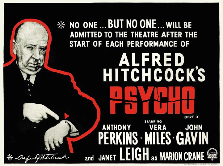
Made for a very specific purpose – as you can see – this has a very interesting design, a spare, unapologetic approach that gets straight to the point, and isn’t interested in frills or embellishments to make it look more attractive. It is arresting, however, and is possibly one of the most effective pieces of movie advertising ever created.
It also features the only time Alfred Hitchcock appeared in a poster for one of his movies. This particular version (there were others with the title in green and with slightly different wording) was created for the UK market, and was used to impress upon audiences the notion that Psycho was not to be missed at all, not any part of it. It’s a brilliant conceit, to admonish prospective audiences before they’ve even seen the movie, but Hitchcock was as shrewd at marketing his movies as he was making them. With viewers almost corralled into seeing the movie, Psycho had a distinct advantage over other movies on release at the time: viewers wouldn’t want to feel left out of seeing it.
The visual effect of the poster can’t be underestimated either. The appearance of the director, his image outlined in red (almost like a grisly version of a chalk outline) draws the eye first, then the very pointed indicating of his watch, his features almost saying, “You’re going to be late, aren’t you?” The potential viewer suitably chided, their gaze is drawn to the right and the reason for Hitchcock’s appearance, the warning that is unequivocal and to the point. And with no exceptions.
The rest is standard stuff, contractually obliged inclusions of the stars’ names, with special mention going to Janet Leigh whose character name is mentioned, giving the impression that she is the star of the movie and that Marion Crane will be the focus of the action (though, as we all know now, not for long). (Too subtle perhaps, but never underestimate Hitchcock’s ability to manipulate his audiences, both on and off screen.)
A superb example, then, of the way in which an already hotly anticipated movie can be made to appear as an absolute must-see movie. Simply brilliant.
Agree? Disagree? Feel free to let me know.

I think for true horror fans the poster is lame, lacking any element of terror (except the logo, that’s good), a graphic image from the shower scene as used on other versions of the poster is far more effective!
LikeLike
This was a marketing exercise more than anything else, and the “graphic image” you mention was used when the movie was re-released in later years. Most of the original posters that depicted scenes from the movie showed Janet Leigh in her underwear and/or John Gavin with his shirt off. It was a deliberate attempt to lure audiences in without giving away anything about Norman Bates or the “shocks” that Hitchcock had up his sleeve. It’s still a very clever, well-designed poster.
LikeLike