• 10 Reasons to Remember…
  • A Brief Word About…
  • About
  • For One Week Only
  • Happy Birthday
  • Monthly Roundup
  • Old-Time Crime
  • Other Posts
  • Poster of the Week
  • Question of the Week
  • Reviews
  • Trailers

thedullwoodexperiment

~ Viewing movies in a different light

thedullwoodexperiment

Tag Archives: Movie poster

Poster of the Week – Helena (1924)

13 Tuesday Dec 2016

Posted by dullwood68 in Movies

≈ Leave a comment

Tags

Avant garde, Edy Darclea, Helen of Troy, Historical epic, Movie poster, Paris, Poster of the week, Russia, Vladimir Gajdarov

rare-original-vintage-russian-avant-garde-movie-poster-for-helen-of-troy-1925

The oldest item yet to feature on Poster of the Week, this Russian-made poster for the German silent epic, Helena (1924, aka Helen of Troy), is a great example of avant garde design, and features the bold use of a limited range of colours. It’s striking, grabs the attention, and offers lots of detail that draws the viewer’s attention (and a little unwillingly at that).

The image is the key factor in the poster’s design, with Vladimir Gajdarov’s Paris posing regally as if bathed in the rays of the setting sun, his handsome, aquiline features made all the more dramatic by his closed eyes and proud bearing. He’s like a god, his striking countenance offering no doubt that here is the movie’s hero in all his costumed splendour. His tanned, sun-blessed skin tones and wavy brown hair complement each other perfectly, and they blend seamlessly into the burnt orange flare of his tunic, and then on down into his right arm. Only the silver-grey of his breastplate breaks up the effect, but its presence there works, the juxtaposition of the deep reds and the shiny silver-grey proving arresting.

As we pan across the bottom half of the poster, there’s Paris’s helmet, an almost isolated pocket of silver-grey that features strange whorls and curlicues. It’s as if there should be a pattern there, something to occupy the eye as it lingers on the helmet, but the effect isn’t that considered or organised. Each swirl is independent of the others, and each has its own flow and purpose (even if, ultimately, we don’t know what that purpose is). Paris holds his helmet in place with rigid formality, an extension of his pose to the left.

But what’s this? There’s something odd going on in the poster’s centre. There’s something keeping Paris and Helen of Troy apart. At one end, by Paris’s left hand, it looks like it could be a fur, but it’s clearly attached to some kind of material that at its other end is too sharply defined to be from an animal (it also looks as if Paris would impale himself on it if he leans forward too far). This part of the image doesn’t make any sense, even if you accept that it’s the cockade to Paris’s helmet, and especially with the way that Edy Darclea’s Helen is leaning over it in her efforts to be closer to Paris. She looks both uncomfortable and awkward in her positioning. Her gaze, such as it is with her eyes being closed, isn’t even in line with that of Paris’ gaze, and her smile seems both unlikely and inappropriate.

Helen is further let down by the artist’s choice of hat wear. With its truncated top and red circles it’s the Ancient Greek equivalent of a bobble hat, but without the telltale bobble to give it all away. Her skin tone is problematical as well, with its light orange appearance looking too pale against the reds and greys near to her. And what we can see of her tunic reveals a distinct “peasant blouse” effect, an unlikely choice given the period. All this – and let’s forget about the lone ringlet allowed to drape itself over her shoulder – serves to make Helen a less effective component of the overall image than her lover, Paris. Deliberate? We’ll never know, but it’s strange that one side grabs the attention for all the right reasons, and the other side does the same but for all the wrong reasons.

Of course, this being a Russian poster, the text is in Cyrillic, with the main title given prominence near to the top right hand corner. Down in the right hand corner we have the movie’s two sub-titles: Part 1 – The Elopement of Helen, and Part 2 – The Fall of Troy, while crammed into the space below Paris’s right hand is what appears to be details of a limited engagement at one of Moscow’s cinemas. But if you have to spare a thought for anyone connected with this production, then it’s the principal cast of Darclea, Gajdarov, and Albert Steinrück that come off worst: they’re the names squashed between the back of Paris’s head and the edge of the poster. However, the text does make for a nice counterpoint to the main image, and even if it’s been added wherever there’s a space, it’s still effective in terms of the overall image.

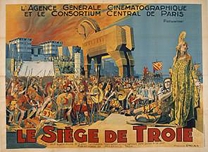
This type of avant garde poster was a common sight in Russia during the 1920’s and while there are issues with the depiction of Helen, this is still a poster that draws you in and rewards on several levels. The colours are a pleasing mix of saturated and restrained, and despite Paris’s rigid bearing, contains enough “fun” elements to make it an enjoyable poster to look at, and much, much better than this French version (apologies for the grainy resolution):

siege_troie

Share this:

  • Twitter
  • Facebook
  • More
  • Print
  • Email

Like this:

Like Loading...

Poster of the Week – Giant from the Unknown (1958)

06 Tuesday Dec 2016

Posted by dullwood68 in Movies

≈ Leave a comment

Tags

Horror, Movie poster, Poster of the week, Richard E. Cunha, Screencraft Enterprises Inc

giant_from_unknown_poster_02

Giant from the Unknown (1958)

At first glance, the poster for Giant from the Unknown seems like a random collection of typographical styles, two primary colours and one secondary colour, a damsel in distress, and a lightning effect that appears to have been included for no particular reason at all. And that’s without the titular giant’s werewolf-like appearance (“My, what a lot of chest hair you have.” “All the better to frighten you, my dear… hopefully”). But it’s a poster that is deceptively effective – or effectively deceptive? – and which uses the apparently random nature of its elements to provide a strangely compelling overall image.

The movie itself is about – and I quote – “A very large, degenerate, Spanish conqueror [who] is freed from suspended animation by lightning and goes on a killing spree in a small town.” So that explains the lightning bolt. Then there’s the depiction of the Giant (who we now know is from Spain and not the Unknown – wherever that is). The artist has come up with an image that, ultimately, is misleading, but with its unruly hair and wild-eyed stare, and allied to a hairy, sharp-nailed hand, is much more of a beast than a giant. Fortunately he’s also proportionately bigger than the woman he’s menacing (though you do have to wonder what his little finger is doing). He’s a commanding figure when all’s said and done, and his stare seems to be directed right at you, which is unnerving considering he’s just an image on a poster.

The woman he’s towering over should be more eye-catching, what with her flimsy red dress, splash of hair, petrified gaze, and exposed flesh. The artist has seen fit to remove the strap from over the woman’s right shoulder, an excision that is at once exploitative and also a way to further highlight her vulnerability. The Giant doesn’t exactly look lascivious, but the inference is clear: that flimsy red dress won’t be there for long once he catches her. Of course, this is from 1958, and there was absolutely no chance of the poster image being replicated within the movie, but certain target audiences of the time would have hoped like crazy that it was.

The largely green background aids the two central images to stand out more, and gives the title a chance to “pop”, it’s sharp-edges and crowded conjoined lettering serving to accentuate the strangeness of the movie. (It’s also interesting to speculate that the woman is reaching desperately to grab the word “the” and maybe save herself.) Above the title is the movie’s tagline, a typical piece of hyperbole that even moviegoers of the time wouldn’t have been fooled by. The typeface used is unexpectedly dull, and doesn’t fit the random nature of the other elements – unless that’s the point of it, and a touch of random dullness was somehow a requirement.

The remaining type details the main cast members, and is in a more traditional black. But there’s an obvious – glaringly obvious – omission: the name of the director (in this case Richard E. Cunha, who was also the movie’s DoP). Either this was a tremendous oversight, or a deliberate decision by Screencraft Enterprises, Inc.; either way, not seeing a director’s name on a poster doesn’t exactly add confidence in the finished product’s likelihood of being good/entertaining/worth seeing, even if it is called Giant from the Mountain.

But all in all, this is a poster that, while largely generic for the time it was produced, exerts a strange fascination, and has an odd hypnotic nature to it. It’s a diamond in the rough, a poster that’s truly from the Unknown, and a better advert for the movie than it perhaps deserves. It’s certainly better than this Mexican lobby card that was used (note the difference between the artist’s impression and the actual Giant):

6a00d83451d04569e2019aff41468e970b-500wi

Agree? Disagree? Feel free to let me know.

Share this:

  • Twitter
  • Facebook
  • More
  • Print
  • Email

Like this:

Like Loading...

Poster(s) of the Week – Fan Movie Posters: A Selection

05 Monday Oct 2015

Posted by dullwood68 in Movies

≈ Leave a comment

Tags

Drive, Fan posters, Inception, Iron Man, Leon, Monsters Inc., Movie poster, Mulholland Dr., Poster of the week, Scott Pilgrim vs the World, Star Wars Episode IV: A New Hope, Wolfen, X-Men: First Class

Away from the world of studio marketing, where movie posters are increasingly showing signs of creative fatigue, and often are little more than images of the main characters in a scene from the movie, the movie poster as art is being left to pass away quietly in a dark corner somewhere, neglected and forgotten. With the studios seemingly unwilling to invest in getting an artist or illustrator to add a little extra lustre to a movie’s reputation, it’s left to the fans to really show them how it’s done. The following ten movie posters have been created by people who understand the concept or idea behind a movie, or just want to see something more original than what we see at our local cinemas. And usually, they’re a damn sight more clever as well!

DN_IRONMAN_A2   Mulholland Dr

Wolfen   Scott Pilgrim vs the World

Star Wars Episode IV   X-Men First Class

Inception   Drive

Monsters, Inc   Leon

NOTE: If you’re looking at these and thinking, “That’s my poster, I did that!”, then please let me know so I can update this post with the appropriate credits.

Share this:

  • Twitter
  • Facebook
  • More
  • Print
  • Email

Like this:

Like Loading...

Poster of the Week – The Rules of Attraction (2002)

29 Monday Dec 2014

Posted by dullwood68 in Movies

≈ Leave a comment

Tags

Bret Easton Ellis, Literary adaptation, Movie poster, Poster of the week, Roger Avary

Rules of Attraction, The

The Rules of Attraction (2002)

You’re adapting a novel by Bret Easton Ellis, you’ve got a cast that includes some of the hottest young actors around, and you want to make sure that the movie is advertised as effectively as possible – what do you do? Well, the answer’s obvious: you fill your poster with images of stuffed toys engaging in various sexual activities and positions.

This kind of exploitative approach is usually reserved for exploitation movies but The Rules of Attraction was a low-budget ($4m) indie movie that featured well-known stars, a director who helped Quentin Tarantino come up with the story for Pulp Fiction (1994), and was an adaptation of a novel that had already garnered a fair degree of notoriety. With all that going for it, the decision to have fourteen pairs of rutting toys on the poster must have seemed like one of the best, most transgressive, and cool, ideas ever.

And it is. It’s arguably one of the most arresting posters ever created, so much so in fact that it was banned in the US and replaced by the poster below.

Rules of Attraction, The2

Much better, eh? So this was the poster that US audiences saw at theatres, while Canada and the UK were deemed able to deal with the audacious nature of – gasp! – toys giving each other a good seeing to. (It’s always a strange thing that the US has such a hard time dealing with sex but seems okay with all kinds of violence.) And in its own way, the poster being banned worked a treat, giving the movie an added boost at the box office.

Of itself, the poster is a humorous mix of fluffy indiscretions in a range of bright colours against a pale green background that at first seems off-putting but actually works when it shouldn’t. And its tag line is more subtle than expected, reflecting both the toys’ antics and some of the character motivations in the movie. (It’s a shame about the quotes, though – definitely not reflections of the finished movie.)

Agree? Disagree? Feel free to let me know.

NOTE: This is the last Poster of the Week for a while, as it makes way for a new format that will begin next week. To everyone who has taken an interest in the various posters I’ve looked at over the last six months, thank you very much, and I look forward to renewing this strand later in 2015.

Share this:

  • Twitter
  • Facebook
  • More
  • Print
  • Email

Like this:

Like Loading...

Poster of the Week – The Girl from 10th Avenue (1935)

22 Monday Dec 2014

Posted by dullwood68 in Movies

≈ Leave a comment

Tags

Bette Davis, Movie poster, Poster of the week, Warner Bros.

Girl from 10th Avenue, The

The Girl from 10th Avenue (1935)

The poster for this romantic drama from Warner Bros. is surprising in many ways. As a vehicle for Bette Davis, it’s appropriate for her to be front and centre in the design, but the way in which she’s depicted is a little offbeat. The early to mid-Thirties was a period when Davis was still a long way from being the forceful actress we all know today. A lot of her early roles were in movies such as this one, but this was the first time she was pictured as the type of hard-boiled, predatory character more suited to, say, Jean Harlow.

The image is also at odds with the character she plays, a shopgirl who marries a man on the rebound from a failed relationship. The challenging stare, the casual draping of the arm over the back of the chair, the cigarette caught between two fingers, the red gloves and hat (hints towards her being a “scarlet woman”), and the shapely legs so prominently displayed – all these point to a character who knows what she wants and how to get it. It’s an almost defiant image, daring the viewer to have an opinion about the character before seeing the movie.

The background is surprising as well, its heavy combination of black and brown almost swallowing the chair and Davis within it, only the well-chosen colours of Davis’s outfit keeping her from disappearing altogether. But then there’s the choice of yellow for the title, a bright distraction from the rest of the image, and making for a strangely effective contrast with the grey used for Davis’s name. With the other credits in orange on the opposite side, the overwhelming dourness of the design is undercut a little further, but all eyes will still be on the image of Davis, staring out at you with all the intensity of a woman from 10th Avenue, and not the girl she’s meant to portray.

Agree? Disagree? Feel free to let me know.

Share this:

  • Twitter
  • Facebook
  • More
  • Print
  • Email

Like this:

Like Loading...

Poster of the Week – Megunica (2008)

16 Tuesday Dec 2014

Posted by dullwood68 in Movies

≈ Leave a comment

Tags

Blu, Movie poster, Poster of the week, South America

Megunica

Megunica (2008)

A documentary that follows the Italian artist Blu on a tour of South America, Megunica – the title is an amalgam of the countries visited: Mexico, Guatemala, Nicaragua, Costa Rica and Argentina – is represented by a poster that is literally a work of art. Designed and drawn by Blu, the fun here is in interpreting the image and what it might mean.

I say “fun” because this is a movie I haven’t seen, but the poster is so intriguing it’s already had me trying to locate a copy of Megunica so I can discover if the image is relevant to a sequence in the movie, or if it’s a stand alone piece that the makers felt would be fitting just for the poster. (This is what a really good poster should do: not be just part of a marketing exercise, but grab the attention and be fascinating enough to make someone want to see the movie it’s promoting, even – and especially – if it’s a movie they might not plan to see normally.)

When looking at the poster, two things spring to mind immediately. The first is the idea that the man we see painting a wall and covered in flies is somehow attempting to wipe the slate clean. With South America’s history of exploitation and corruption in mind, Blu’s painter could be trying to make the point that it’s time for change, a time to start over. If so, it’s a powerful statement, at once provocative and profound. The second possibility is that it’s a self-portrait, a representation of Blu himself, an artist known for his murals and graffiti work the world over. What better way to “introduce” him than as the focus of the poster, and doing what he does best?

Both ideas, of course, may be erroneous, but again, that’s part of the fun. The flies may be representative of the conditions where the movie was made, or a metaphor for  South American societies, or they could be “just” flies. But whichever notion is correct, or if they’re there for another reason entirely, the fact that this poster can prompt even this much debate is a triumph.

Agree? Disagree? Feel free to let me know (especially if you’ve seen the movie).

Share this:

  • Twitter
  • Facebook
  • More
  • Print
  • Email

Like this:

Like Loading...

Poster of the Week – A Countess from Hong Kong (1967)

08 Monday Dec 2014

Posted by dullwood68 in Movies

≈ Leave a comment

Tags

Charles Chaplin, Marlon Brando, Movie poster, Poster of the week, Sophia Loren

Countess from Hong Kong, A

A Countess from Hong Kong (1967)

Chaplin’s final movie wasn’t the well-received swan song he may have hoped for, and it does try to tell a modern story in an old-fashioned way that doesn’t work for the most part, but this poster captures some of the light-hearted fun he was aiming for.

It’s a very Sixties poster, with lots of space left unused, and a slightly trippy feel to the border, the blue bubbles reducing and expanding for no particular reason but still suiting the design. The break at the top left for the stars’ names and the title disrupts the pattern, but it’s a break that doesn’t upset the overall style. Having the stars’ names in red makes for an obvious focus, and they pop out from the pale yellow background like an alert.

The images of Loren and Brando are appealing, especially Loren’s pout, though whether she’s doing so out of surprise or distaste is hard to tell at first thanks to the direction in which her eyes are looking, while Brando’s grin speaks of a man enjoying himself immensely (and if you’re sharing romantic scenes with Sophia Loren, why not?). They seem to be enjoying each other’s company, and it’s clear that they’re relaxed and comfortable with each other. It’s a lovely image, the kind it’s easy to imagine two lovers sharing. And then there’s the inclusion of Brando’s hand and arm, as he attempts to pull away the sheet from Loren’s upper half; it’s a neat touch, and explains the look on Loren’s face.

Below the image are the remaining credits, with Chaplin’s name highlighted in black, and then the supporting cast (also in black). With the bright, primary colours used elsewhere, it’s a bit of a surprise to see black employed so much, though it does make Chaplin’s name stand out (which may have been the intention). All in all, though, this is a fun poster to look at, and it brings together its few elements to surprisingly good effect.

Agree? Disagree? Feel free to let me know.

Share this:

  • Twitter
  • Facebook
  • More
  • Print
  • Email

Like this:

Like Loading...

Poster of the Week – JFK (1992)

02 Tuesday Dec 2014

Posted by dullwood68 in Movies

≈ Leave a comment

Tags

Kevin Costner, Lee Harvey Oswald, Movie poster, Oliver Stone, Poster of the week, President John F. Kennedy

JFK

JFK (1992)

Oliver Stone’s controversial examination of the assassination of US President John F. Kennedy is engrossing, challenging and provocative. This poster for the movie isn’t quite as powerful – though that’s not a bad thing – but it what does do really well is compile some very iconic imagery into an attractive, attention-grabbing whole.

There are three very potent images included here. The first is the shot of Jackie Kennedy reaching over the back of the car with the Security Service agent rushing toward her. Even if you were unaware of the context of that image, you’d still know there was something wrong there, that this woman was in trouble. Knowing the context adds sympathy, sorrow, grief and shock, and the image’s inclusion is a poignant and concise reminder of the events of 22 November 1963.

In contrast, the image of Lee Harvey Oswald clasping a rifle in one hand and copies of the Communist paper The Militant in the other, provokes a different reaction. Whether you regard him as an assassin or a patsy, there’s something about Oswald’s look to camera that makes the viewer a little uneasy. Whatever his involvement in the death of John F. Kennedy, Oswald is still someone who invites suspicion, and this image reinforces that feeling with quiet authority.

Lastly, and perhaps less obviously, there is the torn American flag, a symbol of the “loss of innocence” America as a nation felt in the wake of Kennedy’s death. This was an event that – if such a thing is truly possible – damaged the nation’s psyche. It’s inclusion is the poster’s most subtle aspect, and mixed with the other two images, creates a compelling reflection on the movie’s subject matter.

The further inclusion of an image of Kevin Costner as District Attorney Jim Garrison doesn’t really add anything to the overall design, and appears more of a marketing idea than anything else. But the tag line is certainly apt, and rounds off the poster’s effect quite nicely: “The Story That Won’t Go Away”. How true, indeed.

Agree? Disagree? Feel free to let me know.

Share this:

  • Twitter
  • Facebook
  • More
  • Print
  • Email

Like this:

Like Loading...

Poster of the Week – The Bitter Tea of General Yen (1933)

24 Monday Nov 2014

Posted by dullwood68 in Movies

≈ Leave a comment

Tags

Barbara Stanwyck, Breasts, Frank Capra, Hays Code, Inter-racial relationship, Movie poster, Nils Asther, Poster of the week

Bitter Tea of General Yen, The

The Bitter Tea of General Yen (1933)

In 1930, Hollywood adopted the Motion Picture Production Code (aka the Hays Code), as a way of ensuring that movies wouldn’t “lower the moral standards of those who see [them]”. Although the Code was formally adopted at that time, it would be another four years before the Code was rigidly enforced, as producers between 1930 and 1934 ignored the Code in favour of strong box office returns on movies with racy material. And one such movie that flouted the Code was The Bitter Tea of General Yen.

Its tale of a Chinese warlord and the fianceé of a Christian missionary who fall in love, the movie transgressed against several particulars of the Code, not the least of which was in its depiction of sexual passion. And while most of the posters made to advertise the movie were entirely sedate and gave no indication of the torrid goings-on between Barbara Stanwyck and Nils Asther, this one spells it out as boldly as possible, and leaves the potential viewer in no doubt as to what he or she can expect (if they’re lucky).

General Yen’s ethnicity has been toned down quite a bit, making Asther look more Central European than Chinese, but the title is a giveaway, and there’s also the military-style jacket to reinforce matters. As he approaches the prone character of Megan Davis, there are two very obvious reasons for his interest: her barely covered breasts. Seen today, this rather blatant attempt at prurience doesn’t have as much effect as it would have done back in 1933, but it’s still a bit of a surprise to see such an exposure of flesh so prominently displayed. It certainly gives a good indication of how racy the movie is likely to be – even if that particular image isn’t replicated in the movie itself – and it’s also a further indication that the Code was being flouted as often, and in as many ways, as possible.

A racy, sexually provocative depiction of an inter-racial relationship – unusual for the time – and a great example of how the studios ignored the Code, this poster has a terrific collision of colours and only one worrying aspect to the whole thing: just what has happened to Asther’s right hand?

Agree? Disagree? Feel free to let me know.

Share this:

  • Twitter
  • Facebook
  • More
  • Print
  • Email

Like this:

Like Loading...

Poster of the Week – Lust, Caution (2007)

18 Tuesday Nov 2014

Posted by dullwood68 in Movies

≈ Leave a comment

Tags

Ang Lee, Erotic thriller, Movie poster, Poster of the week

Lust, Caution

Lust, Caution (2007)

Ang Lee’s exemplary drama of political and sexual intrigue is what many critics would describe as “awards worthy”. And so it has proven, particularly at the 2007 Venice Film Festival where it won Best Film (as you can see on the poster). And this is a great example of an “awards” poster, as well as being quite beautiful to look at.

The gold and red colouring immediately makes the poster alluring to look at, the warm flesh tones and splashes of vibrant red acting as flashpoints for the eyes, bold highlights that attract the eye and help settle it on the poster as a whole. The beauty of the image is appealing too, the wariness in the eyes of Wei Tang matching the cold stare of Tony Leung, and drawing attention to the tension in their relationship. With a swirl of blood adding an air of danger at the bottom, the drama inherent in the image becomes more potent (even if there’s no clear indication of what that drama encompasses).

But what’s most interesting – and nearly always is with this type of poster – is the choice of quotes. Each one is a lofty superlative drawn from respected reviewers and their publications, and each one leaves the reader with no doubts as to the movie’s quality. But while superlatives on a movie poster aren’t exactly unusual, here they’re just that little bit too effusive, making the movie sound like a masterpiece (which it doesn’t quite live up to).

And then, as if all the praise wasn’t enough, the designer decides to add the text that reminds everyone of Ang Lee’s prowess as a director, quoting his two most popular movies and giving the impression that Lust, Caution is as good (if not worse) than they are. It’s actually a subtle touch, more so than the review quotes, and more likely to draw in an audience. It all adds up to a movie poster that is deceptively effective at promoting the movie, and deceptively evocative at the same time.

Agree? Disagree? Feel free to let me know.

Share this:

  • Twitter
  • Facebook
  • More
  • Print
  • Email

Like this:

Like Loading...

Poster of the Week – Amarcord (1973)

11 Tuesday Nov 2014

Posted by dullwood68 in Movies

≈ Leave a comment

Tags

Federico Fellini, Italian film, Movie poster, Poster of the week

Amarcord

Amarcord (1973)

There are several great posters out there for Fellini’s movies, and while some of them have a caché that can’t be beat – I’m talking I vitelloni (1953) for one – this particular poster appeals to me in ways that have crept up on me over the years. (Some historical background: I saw the majority of Fellini’s movies over a period of four months back in 2002, and while learning more about them, saw the variety of designs allocated to the posters for his movies; most of them are really expressive and charming.)

Here it’s the breadth of the design, coupled with the number of references to characters, places and events in the movie that impresses the most, along with the clever way in which the eye is drawn to each component of the poster in a way that allows one to focus on one aspect without losing sight of the whole. The dark-hued sky with its portentous colouring is wonderfully dramatic, hinting at some of the conflict contained within the movie, and then there’s the space between the characters and the sea, sparingly dotted with images, a brighter stretch of colour that looks more optimistic.

It also serves as the backdrop for one of the most incredible assemblies of characters from a movie you’re ever likely to see. They’re all there: from Ciccio Ingrassia’s mad uncle, to Magali Noël’s beautiful Gradisca, to Maria Antonietta Beluzzi’s impossibly bosomed tobacconist – an intimate series of representations that border on good-natured caricature yet retain the essence of that character, allowing their personalities to be hinted at or confirmed (to find out which you have to see the movie). It’s like a rogues gallery except that these are all people you’d be intrigued to meet.

And then there’s the bold, swirling script used for the director’s name and the title, a magnificently cursive grouping of letters that maintains its own identity and oversees the image like a proud, protective parent. It all adds up to an audacious, striking movie poster that perfectly reflects the movie it represents.

Agree? Disagree? Feel free to let me know.

Share this:

  • Twitter
  • Facebook
  • More
  • Print
  • Email

Like this:

Like Loading...

Poster of the Week – Dad and Dave Come to Town (1938)

03 Monday Nov 2014

Posted by dullwood68 in Movies

≈ Leave a comment

Tags

Australian movie, Bert Bailey, Dad and Dave, Movie poster, Poster of the week

Dad and Dave Come to Town

Dad and Dave Come to Town (1938)

For those of you wondering who Dad and Dave were, they were characters – father and son – who featured in four Australian movies made between 1932 and 1940.  In many ways they were a precursor to the Beverly Hillbillies, though the humour in them relied heavily on slapstick.  All four movies were successful Down Under, and even today are highly regarded.

Dad and Dave Come to Town was the third movie in the series, and this poster reflects both the storyline and the carefree approach to the material.  Emphasis is given to the difference that city life has on Dad and Dave’s appearance in the movie, both of their gruff exteriors replaced by noticeably airbrushed “makeovers” (though Dave changes from slightly dangerous looking to appropriately dim looking).  For enthusiasts, seeing Dad and Dave transformed into “city slickers” would have been an irresistible attraction.

The contrast between the rural community they come from and the big city is further highlighted by the warm farmyard scene juxtaposed with the dark outline of the city at the bottom – can it be a good influence on our heroes, or will they prove to be more than a match for city ways?  And as if to reinforce the idea of the city’s wicked ways and its corrupting influence, there’s a couple of scantily clad women alongside the cityscape (as well as a very worrying looking mannequin), all carefully posed to promote the risqué nature of the humour in this particular outing.

What grabs the eye the most though is the colourful garishness of the poster itself, the bright yellows and reds bursting forth from the blue background like typographic explosions (and be honest, how often do you see the word ‘cripes’ given such prominence in a poster?).  The depth and richness of these primary colours makes the whole poster that much more appealing and easy to look at.  It’s the perfect way to enrich an already lusciously presented poster and its alluring images.

Agree?  Disagree?  Feel free to let me know.

Share this:

  • Twitter
  • Facebook
  • More
  • Print
  • Email

Like this:

Like Loading...

Poster of the Week – For a Few Dollars More (1965)

27 Monday Oct 2014

Posted by dullwood68 in Movies

≈ Leave a comment

Tags

Clint Eastwood, Lee Van Cleef, Movie poster, Poster of the week, Sequel, Sergio Leone, Tag line, Western

For a Few Dollars More

For a Few Dollars More (1965)

The sequel to Sergio Leone’s surprise hit, A Fistful of Dollars (1964), had several interesting posters designed for it at the time of its release, but this one is interesting for a couple of reasons.

The first thing to realise is that this is very much a poster that follows on from its predecessor, both in terms of design and reference.  The image of Clint Eastwood is taken from the poster for A Fistful of Dollars (though just what’s going on with his left eye is a little strange), and the third tag line below the title is an updated version of a similar tag line from the first movie – that one read, “It’s the first motion picture of its kind! It won’t be the last!”  It’s not often you see that kind of continuity in movie posters, but it’s a nice touch (even if it is bragging a little).

The principal tag line is urgent and attention grabbing, a bold statement of intent, and promising a showdown that will be exciting and dramatic.  However, the description of Lee Van Cleef’s character – the man in black – is undermined by the poster’s image of him in very obviously brown coat and trousers and red waistcoat (though perhaps the artist was working from an early character or costume design).  Van Cleef’s horse, clumsily included behind him, is there to show off the range of his arsenal, giving a clear indication (despite its positioning) of the danger facing the Man With No Name, and adding to the sense of threat in the main tag line.

There are other elements that don’t work as well – the gold coins dotted around, the slightly awkward second tag line – and at first glance it’s not as bold or inventive as some other posters for Westerns, but its warm tones and straightforward imagery work well enough to draw the eye more than once, and in its way, proves unexpectedly evocative.

Agree?  Disagree?  Feel free to let me know.

Share this:

  • Twitter
  • Facebook
  • More
  • Print
  • Email

Like this:

Like Loading...

Poster of the Week – The Polar Express (2004)

20 Monday Oct 2014

Posted by dullwood68 in Movies

≈ 1 Comment

Tags

Animation, Movie poster, Poster of the week, Tag line

Polar Express, The

The Polar Express (2004)

Widely regarded as one of the quintessential Xmas movies, The Polar Express is a breath of digital capture fresh air, its sense of childlike wonder easily transporting its audience into a snow-filled fantasy land that should make even the coldest heart glow with wonderment.  Even if this early example of the animation format still looks a little too artificial in places (and faces), its charm wins out every time.

This particular poster gives a great sense of the astonishing journey ahead of the small boy who stands in front of the titular locomotive, his awestruck gaze held on its snow-flecked lamp and the searching, probing, powerful beam of light that bursts out from it.  It’s a light that points the way to an incredible journey, and heralds the trip of a lifetime.  For the boy, standing there with (no doubt) wide-eyed fascination, it’s an amazing dream come inexplicably true, and his stance reflects his amazement at the sight of the enormous, magnificent train in front of him.

The size of the train is, perhaps, deliberately exaggerated to enhance the fantastical nature of things, a way of highlighting the magical experience that lies ahead.  Its prominence is a powerful statement and oddly reassuring as well: whatever happens, and wherever it’s going, the Polar Express will get its passengers there no matter what.

But the train isn’t the whole of the image.  There’s the snowman, one arm thrust out as if in presentation of the train, its countenance both knowing and mysterious.  He’s saying, “Go on, step aboard, you won’t regret it”.  There’s the backdrop of the houses, all dark and pensive, waiting for the dawn to bring them to life.  And lastly there’s the tall tree on the left hand side, its branches reaching out to the falling snowflakes as if to catch them and thereby make itself beautiful.

With so many impressive, beautiful elements, it’s the tag line that caps everything off with perfect, heartfelt simplicity: “This holiday season… believe.”  It’s no wonder then that over the last ten years, so many people around the globe have done exactly that.

Agree?  Disagree?  Feel free to let me know.

Share this:

  • Twitter
  • Facebook
  • More
  • Print
  • Email

Like this:

Like Loading...

Poster of the Week – The Rocky Horror Picture Show (1975)

13 Monday Oct 2014

Posted by dullwood68 in Movies

≈ 1 Comment

Tags

Lips, Movie poster, Poster of the week, The Rocky Horror Picture Show, Tim Curry

Rocky Horror Picture Show, The

The Rocky Horror Picture Show (1975)

There were many posters created to promote Richard O’Brien’s affectionate tribute to 30’s horror and 50’s sci-fi, but this is one of the best.  For its time, the movie was a slightly subversive treat, its air of permissive sexuality (in any form) allied to some great song and dance numbers.  Now, almost forty years on, it’s less shocking, but it’s become perhaps the cult movie around the world.

Looking at the poster now it doesn’t have the same effect it would have done back in 1975.  The sight of Tim Curry in make up,  shiny basque, stockings and high heels no longer has that risqué quality that intrigued audiences who hadn’t seen the stage show, but it’s still an arresting image, a bold statement of intent that hasn’t lost its impact entirely.  His haughty, scornful look is another great touch, challenging the potential viewer as if to say, “Do you have what it takes to watch this movie?”

And then there are the lips – courtesy of Patricia Quinn, Magenta in the movie – a now iconic image that is recognised everywhere.  On their own they’re like a fetish object, full and curvy and inviting and infused with an indefinable promise of things to cum.  With Tim Curry as Frank-N-Furter draped across them, they become even more erotically charged, the combination of willing lips and waiting body making the movie’s invitation to “Don’t dream it, be it” all the more alluring.  It’s a powerful merger of two already compelling images, and is extremely effective.

Lastly, there’s the title itself, a dripping, blood-red example of the kind of title graphic used in the 40’s, a fond recreation of a style that represented shock and horror and terror “unlike anything seen before”.  And with a black background that allows everything else to stand out in sharp relief, this is a poster that draws the eye and makes it hard to look away.

Agree?  Disagree?  Feel free to let me know.

Share this:

  • Twitter
  • Facebook
  • More
  • Print
  • Email

Like this:

Like Loading...

Poster of the Week – Journey to Italy (1954)

06 Monday Oct 2014

Posted by dullwood68 in Movies

≈ Leave a comment

Tags

George Sanders, Ingrid Bergman, Movie poster, Poster of the week, Roberto Rossellini, Viaggio in Italia

Journey to Italy

Journey to Italy (1954)

One of a multitude of poster designs created for the movie, this particular example is striking for a number of reasons, not least it’s decision to represent its leading lady with a less than flattering illustration.  Bergman was still a big star in ’54, even if she had left her family for Rossellini, the movie’s director.  This was the third film they made together, and its tale of a ruined marriage was reflected in the compositional choices made for this poster.

On the left is that curious representation of Bergman, her gaze drawn by something we can’t see, her pensive expression making it hard to work out what she’s thinking.  Below her we see a young couple embracing – is she remembering this, is it part of her past with her husband, or is it something she sought but never found?  (The answer can be found in the movie.)  And above her, merging with her hair, a gondola that’s broken in two.  An obvious metaphor perhaps, but not so obvious at first glance.

And then there’s that central image, a still taken from the movie itself, with Sanders in full on predatory mode, his gaze fixed on the young woman in such a way that his intentions couldn’t be any clearer.  He’s sizing her up, thinking ahead maybe to when he can be alone with her.  But look closely at the young woman and she’s looking at him right back, aware of the significance of his attention but unafraid, challenging him perhaps, or ready to acquiesce.  Either way, she’s on an equal footing with him.

The movie’s original Italian title, at once a literal statement of its subject matter and a cogent summing up of what happens to Bergman and Sanders as their trip threatens to unravel them as individuals and as a couple, is mostly in vibrant red, highlighting the passion that lurks below the surface of both characters.

With so much information packed into one apparently pedestrian looking poster, it’s a testament to its designer – whoever they were – that it belies its commonplace appearance and is far more subtle and effective than it looks a first.

Agree?  Disagree?  Feel free to let me know.

Share this:

  • Twitter
  • Facebook
  • More
  • Print
  • Email

Like this:

Like Loading...

Poster of the Week – Vera Drake (2004)

29 Monday Sep 2014

Posted by dullwood68 in Movies

≈ Leave a comment

Tags

Imelda Staunton, Mike Leigh, Movie poster, Poster of the week, Vera Drake

Vera Drake

Vera Drake (2004)

At first glance, this poster for Mike Leigh’s 50’s set drama looks drab and unappealing, its bland colour scheme and triple image of Vera herself (as played by Imelda Staunton) lacking any appreciable vibrancy or vitality.  It’s a poster for a Mike Leigh movie, a dark, often uncompromising look at the life of a woman whose personal sense of morality was at odds with both society and the criminal justice system of the time.  It’s a hard sell, even with Leigh in the driving seat, but whatever your views on the movie itself, the poster is unassuming, yet brilliantly devised.

The main focus is obviously the triptych.  An image of Vera repeated against differing backgrounds that in some way reflect the description given of her in each panel.  In the first, she’s a Wife, and the wallpaper depicts a wild growth of branch and flower, a more sensual, earthy tone that emphasises the carnal nature of marriage.  It’s telling us that Vera is first and foremost a woman (which isn’t so obvious when watching the movie).  In the second panel, she’s a Mother, and the wallpaper is less attractive, more formal, its ordered pattern highlighting the conformity that Vera has taken on by having a child.  Her life is no longer as carefree as it was.

And then there is the final panel, a stark portrayal of Vera as a Criminal, the background a bare brick wall, the kind you might encounter in a prison cell.  It’s a powerful conclusion, reflecting the distance Vera has travelled from that first, happier, image.  Here is one woman’s journey in Life portrayed succinctly and with effortless flair.  This is a tremendously evocative poster – for a tremendously evocative and moving movie – and while the press quote may seem a little grandiose, there’s no denying that, as far as the poster goes, it really is “magnificent”.

Agree?  Disagree?  Feel free to let me know.

Share this:

  • Twitter
  • Facebook
  • More
  • Print
  • Email

Like this:

Like Loading...

Poster of the Week – Demetrius and the Gladiators (1954)

16 Tuesday Sep 2014

Posted by dullwood68 in Movies

≈ Leave a comment

Tags

CinemaScope, Landscape format, Movie poster, Poster of the week, Sequel, Susan Hayward, The Robe, Victor Mature

Demetrius and the Gladiators

Demetrius and the Gladiators (1954)

With the advent of CinemaScope in 1953, the movies became bigger, grander, and more expansive, as befitted the new anamorphic format.  And as if to emphasise the new screen size, movie posters became bigger, grander, and more expansive as well, with landscape designs becoming more and more prevalent.  The first CinemaScope movie was The Robe (1953), a biblical drama starring Richard Burton.  As can be seen from the poster above, it spawned a sequel that featured a character from that first movie, the slave Demetrius played by Victor Mature.

What’s interesting about this particular poster is its devotion to cramming in as much incident from the movie as possible, much like the screen image audiences would see, a wide, panoramic view of the action.  There’s the carousing and revelries of the citizens of Rome (that might not be consensual given the look on the woman’s face in the bottom left hand corner).  There’s the sight of three tigers all leaping at Demetrius in the arena (with the Coliseum and another gladiator highlighted behind them), and in the bottom right hand corner the figure of Peter (played by Michael Rennie) clasping the robe that will be passed to Demetrius.  And almost taking centre stage, Demetrius and Messalina (played by Susan Hayward) locked in an embrace that unfortunately makes the titular hero look like a vampire feeding off his latest victim.

With the movie’s villain, Caligula, relegated to the far background of the Romans and their debauchery, the poster encapsulates several of the movie’s main highlights but saves room for its most important attributes.  These are the technical advancement (and miracle) of CinemaScope, along with the innovation that is “high-fidelity directional-stereophonic sound” (not forgetting the movie’s having been filmed in Technicolor as well).  Leaving no room for its cast or director (at the very least), the poster makes no effort to include anything further than the title and it’s relation to The Robe; it’s as if it expects moviegoers to be aware of who’s in it etc. already.

Making a virtue of promoting the movie’s spectacle, this poster for Demetrius and the Gladiators is a visual treat, drawing the eye here and there, and stripping back the usual cast and crew information in favour of those arresting images.  It’s a bold move, but one that pays off handsomely.

Agree?  Disagree?  Feel free to let me know.

Share this:

  • Twitter
  • Facebook
  • More
  • Print
  • Email

Like this:

Like Loading...

Poster of the Week – Psycho (1960)

08 Monday Sep 2014

Posted by dullwood68 in Movies

≈ 2 Comments

Tags

Alfred Hitchcock, Movie poster, Poster of the week, UK poster

Psycho (1960)

Psycho (1960)

Made for a very specific purpose – as you can see – this has a very interesting design, a spare, unapologetic approach that gets straight to the point, and isn’t interested in frills or embellishments to make it look more attractive.  It is arresting, however, and is possibly one of the most effective pieces of movie advertising ever created.

It also features the only time Alfred Hitchcock appeared in a poster for one of his movies.  This particular version (there were others with the title in green and with slightly different wording) was created for the UK market, and was used to impress upon audiences the notion that Psycho was not to be missed at all, not any part of it.  It’s a brilliant conceit, to admonish prospective audiences before they’ve even seen the movie, but Hitchcock was as shrewd at marketing his movies as he was making them. With viewers almost corralled into seeing the movie, Psycho had a distinct advantage over other movies on release at the time: viewers wouldn’t want to feel left out of seeing it.

The visual effect of the poster can’t be underestimated either.  The appearance of the director, his image outlined in red (almost like a grisly version of a chalk outline) draws the eye first, then the very pointed indicating of his watch, his features almost saying, “You’re going to be late, aren’t you?”  The potential viewer suitably chided, their gaze is drawn to the right and the reason for Hitchcock’s appearance, the warning that is unequivocal and to the point.  And with no exceptions.

The rest is standard stuff, contractually obliged inclusions of the stars’ names, with special mention going to Janet Leigh whose character name is mentioned, giving the impression that she is the star of the movie and that Marion Crane will be the focus of the action (though, as we all know now, not for long).  (Too subtle perhaps, but never underestimate Hitchcock’s ability to manipulate his audiences, both on and off screen.)

A superb example, then, of the way in which an already hotly anticipated movie can be made to appear as an absolute must-see movie.  Simply brilliant.

Agree?  Disagree?  Feel free to let me know.

Share this:

  • Twitter
  • Facebook
  • More
  • Print
  • Email

Like this:

Like Loading...

Poster of the Week – The Hound of the Baskervilles (1959)

01 Monday Sep 2014

Posted by dullwood68 in Movies

≈ 1 Comment

Tags

Baskerville, Christopher Lee, Hammer Films, Hound, Movie poster, Peter Cushing, Poster of the week, Sherlock Holmes

Hound of the Baskervilles, The (1959)

The Hound of the Baskervilles (1959)

Another Hammer movie poster – see also Dracula (1958) – this unusually simple piece of advertising (for its time), has an impact that can’t be denied.  With its human cast relegated to the sidelines (literally), the hound is allowed to take centre stage and dominate the poster.  It’s less of a hound and more of a wolf, of course, but its sharp, pointed teeth, tipped with blood, and yellow-eyed stare, is more than enough to put anyone off from wanting to encounter the beast on a lonely, deserted moor.

Its grey and white fur, offset by deep, shadowy blacks, frames the hound’s features to considerable effect, with its canines to the fore, almost as if it’s about to take a chunk out of the title.  The eyes have a demonic gleam to them, and there’s a hypnotic quality to them as well, as if by staring at them for too long there’s a chance the hound will jump out of the poster and rip you to pieces – far-fetched, perhaps, but there is a certain, unnerving element to the image, one that is far more effective on closer inspection.  And then there’s the moon, a grey smudge near the top right corner, hinting at lycanthropy and occupying a place that would otherwise have been completely blank (though no less effective for being so).

The bold red of the title, in its way splashed across the poster, demands attention from the eye, and the colour hints at the bloodshed that is likely to occur in the movie (even if it’s not quite as brutal as we’d like to imagine).  The tag line at the top of the poster tries too hard to grab the attention away from the hound, while the main cast members are sequestered over on the left hand side, almost as an afterthought; even the acknowledgment to Sir Arthur Conan Doyle turns out to be in a smaller typeface  than that advising of the movie’s having been made in Technicolor (as for the director et al., mentioned in the bottom left hand corner, unless you’ve got 20/20 vision, you won’t have a clue who they are).

It’s a simple, effective poster and deserves a wider audience, free from artifice and pseudo-intellectual interpretations: in short, a poster that’s way more compelling than you’d initially give it credit for.

Agree?  Disagree?  Please feel free to let me know.

Share this:

  • Twitter
  • Facebook
  • More
  • Print
  • Email

Like this:

Like Loading...

Poster of the Week – Werewolf of London (1935)

26 Tuesday Aug 2014

Posted by dullwood68 in Movies

≈ Leave a comment

Tags

Horror, Movie poster, Poster of the week, Universal, Warning

Werewolf of London

Werewolf of London (1935)

As Universal’s first werewolf movie – though now overshadowed by The Wolf Man (1941) – Werewolf of London is an interesting forerunner for the later series of movies, and it has its own undeniable charm.  The poster – one of several used at the time – has all the usual characteristics of a movie poster from the period: the montage of images from the movie, the garish title, principal cast names in larger print than the supporting cast, but it’s the addition of the printed warning that separates this from its peers.

Viewed nowadays, the reference to “hysterical women” would be viewed with distaste and probably, a certain amount of vehemence.  But back in 1935, these types of warnings, while not commonplace, were certainly not unknown, and this is a perfect example of the dramatic hyperbole employed.  Advising its potential audience of “the most terrifying scene ever filmed” sets the tone immediately, and while modern audiences might laugh at such a claim, contemporary viewers would have been less credulous.  Urging female viewers to close their eyes at a certain point in the movie is a master-stroke too, as it’s more than likely that curiosity will overcome any fear and they’ll watch anyway (there’s nothing like a bit of reverse psychology to bring in the audience).

The reference to “fainting spells or shocks of any kind” is almost like a challenge: we dare you to watch this scene.  It’s funny to read from the perspective of 2014, but we live in different times, and we have to remember that in 1935 the sight of Henry Hull with excessive facial hair and a jutting underbite would have been frightening to a lot of people.

As for the rest of the poster, the actors have been given an effective colour makeover, and the green tinge given to the werewolf is weirdly compelling, while the inclusion of a bat flying close to Big Ben seems to hint at another famous monster being involved, even though it’s not the case.  But it’s that warning to women that always draws the eye (and boggles the mind).

Agree?  Disagree?  Feel free to let me know.

Share this:

  • Twitter
  • Facebook
  • More
  • Print
  • Email

Like this:

Like Loading...

Poster of the Week – The Wild Bunch (1969)

19 Tuesday Aug 2014

Posted by dullwood68 in Movies

≈ Leave a comment

Tags

Action, Movie poster, Poster of the week, Sam Peckinpah, Tag line, Western

Wild Bunch, The

The Wild Bunch (1969)

One of many used for the movie’s original release, this poster for Sam Peckinpah’s seminal Western, is both powerful and sobering at the same time, its elements combining to provide an elegiac, mournful reflection of the movie itself.

A lot of it has to do with the use of space within the frame, as well as the way light and dark blend into each other: it’s quite a simple effect but it has such a resonance that you’re drawn to those nine men without even realising it.  With their facing a bright light, and seemingly heading towards it, the symbolism is obvious, but the way in which their shadows play out behind them, merging into darkness, it adds a further, fatalistic aspect to the image (there’s also the uncertainty of which “destination” they’ll end up in).

Above them is the tag line, a further intimation of the movie’s probable outcome, its regretful tone at once sad and forlorn, a doleful proclamation that endorses the foreboding image below it.  It’s a great combination of words and pictures, a forceful statement that things can’t – and won’t – end well for these men, even with all their firepower.

And then, as if to reinforce that view, we have a collection of stills from the movie, action beats that show some of the violent imagery the movie contains, and featuring the Wild Bunch themselves, though not as typical gunslinging heroes, but with their pain and confusion and terror made evident from the faces of Warren Oates and Ernest Borgnine.  The more you look at them, the more you realise how effective they are at highlighting the movie’s often brutal content.  The yellow tint used is important too, representing the fading of time and the passing of an era.

All in all, this is a great, and perhaps, initially deceptive movie poster that gives a clear representation of the movie’s nature, and makes a powerful statement of intent, much like the movie itself.

Agree?  Disagree?  Feel free to let me know.

Share this:

  • Twitter
  • Facebook
  • More
  • Print
  • Email

Like this:

Like Loading...

Poster of the Week – The Best Years of Our Lives (1946)

11 Monday Aug 2014

Posted by dullwood68 in Movies

≈ Leave a comment

Tags

Drama, Movie poster, Poster of the week, Tag line

Best Years of Our Lives, The

The Best Years of Our Lives (1946)

One of the best – if not the best – post-World War II dramas was a triumph for all concerned, a seven-time Oscar winner that showed the difficulties of servicemen returning home and facing a range of difficulties in readjusting to “normal” life.  It’s a powerful movie, and thanks to an unusually subtle screenplay (for the time) by Robert Sherwood, matched by astute direction from William Wyler, has remained as impressive a movie experience today as it was then.  Not that you’d guess from the poster…

First off, it’s not the greatest of posters.  It’s fairly typical of the time the movie was made, and in some respects – the embracing couple, the bold assertion at the top – it’s content and approach aren’t dissimilar from many other posters.  Even the image of the “good-time girl” (representing Virginia Mayo’s character) isn’t unusual.  And then there’s the two quotes, from two of the most respected journalists and critics of the time, and which prove to be the only clues – albeit as vague as possible – as to the movie’s content (unless you’ve read MacKinlay Kantor’s novel).  But then there’s that tag line, that bold description of the movie’s merits, and if you’ve seen the movie you’ll know: “The screen’s greatest love story” is pushing it a bit too far.

In truth there are several love stories in The Best Years of Our Lives, and they are all “heart-warming” to one degree or another, but they’re not the movie’s focus, and nor are they the “engines” that drive the various storylines.  There’s much more going on than just a love story, and the movie’s various themes were more dramatic than audiences were used to – just the word ‘divorce’ caused a furore at the time – but again you wouldn’t guess that from the poster, which instead advertises what seems like a grand romantic experience.  It’s a lie, a deliberate falsehood designed to bring people in to see a movie that often reflected uncomfortably their own lives and their own problems in putting the war behind them.

Here then is an example of a movie poster that has a different agenda to the one the movie it’s promoting.  Here is a poster that undermines it’s own movie’s message: that  even the worst difficulties in Life can be overcome, and that life itself is something to be treasured above all.  It’s a shame then that RKO, the releasing studio, couldn’t see that, and create a poster that supported that ideal.  But if you think a movie might be a tough sell…

(For an intelligent, well thought out appraisal of The Best Years of Our Lives, by my fellow blogger Rachel T, please click here.)

Agree?  Disagree?  Feel free to let me know.


Share this:

  • Twitter
  • Facebook
  • More
  • Print
  • Email

Like this:

Like Loading...

Poster of the Week – Schindler’s List (1993)

05 Tuesday Aug 2014

Posted by dullwood68 in Movies

≈ Leave a comment

Tags

Drama, Holocaust, Movie poster, Poster of the week, Steven Spielberg

Schindler's List

Schindler’s List (1993)

Sometimes the most effective posters are the simplest, the ones that offer the least amount of graphics, the least amount of text, and the least amount of information.  Often it’s a single image that will feature, something that is integral to the mood of the movie, or gives an impression of the subject matter.  At other times, it’s just the movie’s title, bold against a plain background, that is all that’s needed.  In many ways it’s this simplicity that is more effective than a poster that has lots of things “going on” in it, where the publicity department has decided sensory overload is the way to go.

But this poster for Steven Spielberg’s masterpiece is a perfect match for the movie’s solemn, haunting intensity.  With its uncompromising black background and sombre appearance the potential viewer is immediately alerted to the serious nature of the movie itself.  It’s a striking effect, that background, harsh and forbidding and so unlike the usual colourful or artistically driven posters that we’re more used to.

The background, while effective on its own, also serves to highlight the three components that make up the only respite from all that darkness.  There’s the legend “A Film by Steven Spielberg” tightly assembled above the movie’s title, the first of three complementary fonts used, but not overshadowing the title, its larger, more decorative appearance drawing the eye first and foremost.  And then the eye is drawn downward to the quote from the Talmud, the words slightly transparent towards the top of each letter, as if the very saying itself is in danger of disappearing, a subtle underlining of its importance to the story itself.

And then there’s the single image, a dying candle in its holder, a red flame representing fading hope but also endurance, its splash of colour both relevant to the image and reflective of the visual motif that appears in the movie itself.  It’s a quiet masterstroke, a beautiful touch that speaks volumes, affecting and dramatic and powerful all at the same time.

Agree?  Disagree?  Feel free to let me know.

Share this:

  • Twitter
  • Facebook
  • More
  • Print
  • Email

Like this:

Like Loading...

Poster of the Week – Westworld (1973)

28 Monday Jul 2014

Posted by dullwood68 in Movies

≈ Leave a comment

Tags

Design, Futureworld, Gunslinger, Movie poster, Poster of the week, Robot, Sci-fi, Tag line

Westworld

Westworld (1973)

When I first saw Westworld it was on a double bill with its sequel Futureworld when that movie was released in 1976.  At the cinema where I saw them both, there was only the poster for Futureworld on display, so I didn’t see this particular gem until quite some time after.  Given the disparity between the two movies – and an audience that consisted of myself and three others – maybe my hometown’s long-defunct ABC cinema should have gone with this poster instead.

There’s a lot going on here, from the faceless man at the control panel with all its futuristic dials and buttons, to the monitor screens that show images of Richard Benjamin and James Brolin, a saloon, and what looks like the Gunslinger (Brynner), this glimpse of what happens behind the scenes at Westworld is intriguing for its combination of humans and technology, and gives rise to the question, which one is in control?  For standing over the control panel is the Gunslinger, a figure that bears ominous signs of damage and proves itself to be a robot, Brynner’s face slid aside to reveal the circuitry beneath the façade.  It’s an arresting visual conceit, and one that is reinforced by the bullet wound in the robot’s torso, the combination of blood and wiring adding to what is already amiss about the character.

The extended tag line is well constructed too, with its underlining of the word anything, the implication all too clear, and the clever misspelling and debasement of the last word, an expressive augury of what will happen in the movie, and how anything can and will become too terrible to imagine.  It supports the central image of the implacable Gunslinger, and adds a further layer of threat – not that’s it really needed.  And then there’s the title,  bold and expressive in red, cutting across the image with authority, actually drawing attention away from the imagery and the text, the strongest component of a poster that draws the eye to it with calculated ease.

Agree?  Disagree?  Feel free to let me know.

Share this:

  • Twitter
  • Facebook
  • More
  • Print
  • Email

Like this:

Like Loading...

Poster of the Week – Dracula (1958)

22 Tuesday Jul 2014

Posted by dullwood68 in Movies

≈ 1 Comment

Tags

Christopher Lee, Hammer Films, Horror, Movie poster, Poster of the week, Vampire, Victim

Dracula (1958)

Dracula (1958)

Hammer Films not only made lurid melodramas and (for their time) sex-driven horror movies, they also produced lurid, sex-driven movie posters.  This poster, for the first in what would be seven movies featuring Christopher Lee as the titular bloodsucker, isn’t as daring as some that would follow, but in its own way it has a disturbing quality that perfectly matches, and complements, the mood of the movie it’s advertising.

First, there’s the woman, lying prone and unconscious, her neck and shoulders exposed, the intended victim who is unaware of the terrible thing that is about to be done to her.  She looks innocent, a perfect contrast to the beast in human form that has her in its clutches, the threat of its vampire fangs clearly visible, his intention equally clear: he is about to defile her innocence.  It’s a horrifying prospect: the woman is unable to defend herself and her fate is assured; she too will become a vampire.

The image has some clever touches.  There’s the bronzed, healthy skin tones of the woman which are in stark contrast to the unhealthy pallor of the vampire’s, his pale(r) flesh revealing another loss the woman will endure once she’s bitten.  And then there’s the proximity of Dracula’s hand at her neck: could it be there to caress her rather than keep her hair away from where he plans to bite her?  If so, this neatly ties in with the movie’s audacious tag line, its bold assertion giving rise to the idea that maybe Dracula wants more than just blood from his victim, that there’s another thrill involved here (they are both lying down); maybe the woman is a willing participant instead?

The warning in the bottom right hand corner is another clever piece of marketing, urging couples to see the movie, to experience the thrills and chills together (and thereby boost the box office).  The principal cast are given prominent billing, the director et al. appearing slightly less important as usual, and lastly there’s the added touch of the reminder that an X certificate movie is for adults only – perhaps as a further hint of the “terrifying love” that they’ll witness within the movie?

Agree?  Disagree?  Feel free to let me know.

Share this:

  • Twitter
  • Facebook
  • More
  • Print
  • Email

Like this:

Like Loading...

Poster of the Week – Cul-de-sac (1966)

14 Monday Jul 2014

Posted by dullwood68 in Movies

≈ 1 Comment

Tags

Donald Pleasance, Françoise Dorléac, Jan Lenica, Lionel Stander, Movie poster, Polish film poster, Poster of the week, Red heart, Roman Polanski, Title

Cul-de-sac

Cul-de-sac (1966)

This is the Polish poster for the movie, created by Jan Lenica, and is a fantastic example of how Polish graphic designers and artists approached the idea of devising movie posters.  The usual conventions of the movie poster were able to be ignored, or subverted, the projects being sanctioned by the state and the Polish film industry as a whole.  This gave rise to an incredible period of creativity, where the poster became elevated from traditional merchandising tool to (often) complex work of art.

Here, the potent “triangle” of Roman Polanski’s psychological drama is represented by three equally potent depictions of the characters played by (from left) Lionel Stander, Donald Pleasance and Françoise Dorléac.  Stander is the brute, with both fists clenched and a gun pointed at Pleasance, his open mouth signifying anger and savagery.  Pleasance is the mild-mannered, almost blank-faced intellectual, his spectacles and slight frame at odds with Stander’s solid, brutish stance.  And then there’s Dorléac, her figure distorted and emphasised at the same time, facing the two men, her interest in both of them quite evident.  It’s an odd variation on the police line up, and yet tells us everything we need to know about the dynamic surrounding the trio.  There’s also the heart, eye-catching and red in the middle of Pleasance’s chest, a symbol of the love Pleasance and Dorléac have for each other (and this despite the abusive games they play).

The title is given due prominence, the letters seemingly cut out from a magazine or newspaper, and looking like badly cut jigsaw pieces; such an approach reinforces the fractured nature of the relationships, as well as the movie’s frequent shifts in tone.  And the principal cast have their names seemingly dropped into place rather than carefully arranged, this haphazard orientation again underlining the off-kilter essence of the movie.  It all adds up to a wonderful “companion piece” to the movie itself, a startling, original, captivating poster that draws the attention and doesn’t let go.

Share this:

  • Twitter
  • Facebook
  • More
  • Print
  • Email

Like this:

Like Loading...

Poster of the Week – The Titfield Thunderbolt (1953)

08 Tuesday Jul 2014

Posted by dullwood68 in Movies

≈ Leave a comment

Tags

Comedy, Ealing, Edward Bawden, Movie poster, Poster of the week, The Titfield Thunderbolt, Train

Titfield Thunderbolt, The

The Titfield Thunderbolt (1953)

There have been many memorable Ealing film posters over the years, and to pick just one of them for appraisal might seem foolish or a little mad, but the poster for The Titfield Thunderbolt has a distinction that marks it out from the rest: this poster was the work of English artist Edward Bawden (1903-1989) (you can see his name near the bottom right hand corner).  It’s a wonderfully colourful, vibrant work, full of marvelous detail that’s been done in an almost offhand, cavalier way, its broad brush strokes complimenting the more finely worked details.  The mix of the main colours – blue, red, orange, yellow – creates a warm, inviting glow that seems able to spread beyond the confines of the poster itself, giving the illusion that the train could actually move out from the station.

The graphics are eye-catching as well, issuing from the smoke like messages, giving pride of place to the title, then surrounding it with the names of the principal cast (and if you were a moviegoer in the early Fifties, wouldn’t you want to go and see a movie with that cast in it?).  It’s funny too, to observe the creative minds behind the movie being practically squeezed in at the end of the smoke trail, director Charles Crichton, producer Michael Truman, and screenwriter T.E.B. Clarke added in but with their names reduced in size compared to the (much more important) stars.

But it’s still the imagery that draws the attention, from the clever little details – the dog collars on the train driver and stoker, the towing chain at the front of the train, the Xmas cracker style of the smokestack – to the rudimentary background elements (dog, church etc.), to the happy, waving people on the platform, their sense of pride in the train clearly evident.  And the train itself is a terrific representation, a product of a bygone age given a new lease of life in the movie, and in the poster, shown as the principal character, a vital, much-loved piece of living machinery that will transport the viewer to wherever they want to go.

Share this:

  • Twitter
  • Facebook
  • More
  • Print
  • Email

Like this:

Like Loading...

Poster of the Week – Stoker (2013)

30 Monday Jun 2014

Posted by dullwood68 in Movies

≈ 1 Comment

Tags

Colours, Illustration, Images, Movie poster, Poster of the week, Stoker, Thriller, Title

Stoker

Stoker (2013)

If you’ve seen Stoker, then you’ll know that it has an often surreal, slightly macabre air to it, and this poster beautifully captures the mood and spirit of the movie.  The various items that make up the cornucopia on display are all relevant to the story in one way or another, but their individual placements give no hint as to their importance or even if they’ll feature prominently or not.  Some, like the sneakers, seem to have no importance at all, and yet, the level of mystery the poster affords belies their prominence or pertinence.  Others, such as the skull, seem too apposite, as if their inclusion were entirely to be expected given the movie’s subject matter.  And then there is the coffin, the focal point of everything, its occupant’s demise the reason for everything that takes place.

With such an effective illustration dominating the poster, it’s easy to overlook the effect of having still pictures of Nicole Kidman and Mia Wasikowska almost growing out of the image.  Kidman’s veil and downcast visage indicates a grieving widow, while Wasikowska’s accusatory look in Kidman’s direction seems to say that not everything about Kidman’s demeanour can be trusted.  These portraits imply an animosity between the two characters that is both intriguing and compelling: just what can be so wrong for Wasikowska’s character to look that way?

Having so many provocative elements, the poster needs only to add its principal cast members and its title to round things off, but even then there’s a further, arresting aspect: the distressed green and white of the title’s letters.  It’s a slightly unnerving combination of colours, bold and eye-catching, and reinforces the sense of disquiet the rest of the poster generates.  All in all, the poster more than adequately reflects the movie’s rising turmoil and does so with a quiet effectiveness that creeps up stealthily and silently.

Agree? Disagree? Let me know.

Share this:

  • Twitter
  • Facebook
  • More
  • Print
  • Email

Like this:

Like Loading...

Poster of the Week – Casablanca (1942)

24 Tuesday Jun 2014

Posted by dullwood68 in Movies

≈ Leave a comment

Tags

Casablanca, Humphrey Bogart, Ingrid Bergman, Movie poster, Movie stars, Poster of the week, Romantic drama, Tag line

Casablanca

Casablanca (1942)

What I like most about this poster is its simplicity.  It tells you as little as possible.  There’s the three main stars, the name of the film company, the title, the supporting players, the director, and the producer.  From this, the potential viewer doesn’t have a clue as to what the movie’s about, or where it’s set, or if it’s a period piece, or more contemporary, or if it’s a drama – though with that cast it’s unlikely to be a comedy – or if it’s even the latest “screen sensation!”

Even the main image, of Bogart and Bergman huddled together, doesn’t give anyone a clue.  He looks pensive and sad, but as to why, well, it could be anything.  And she is looking off into the distance, apprehensive, worried perhaps, at what she sees.  Together they’re a couple who could be facing any number of problems, but until you see the movie you’ll never know what they are, or how much those problems will affect them.

In many ways, the poster is a bit of a gamble, using the stars’ brand-name recognition to entice an audience into seeing a movie that they don’t know anything about.  And the title could mean anything: the place where the movie is set, a character’s name perhaps, or even a code name (that’s a bit of stretch, admittedly, but from the perspective of ignorance, it could even be the name of a company or a product).  And back in the days when there was generally one poster created per movie, the deceptive brilliance of this particular poster has got to be admired.  It’s lack of artifice seems to be saying, “Bogart, Bergman, Henreid, Casablanca – what else do you need to know?”  (Well, nothing – obviously.)  And to cap it all off, it’s clear that, in this instance, the movie’s title is also it’s tag line.  Just genius, sheer genius.

Agree?  Disagree?  Let me know.


Share this:

  • Twitter
  • Facebook
  • More
  • Print
  • Email

Like this:

Like Loading...

Poster of the Week – The Incredible Shrinking Man (1957)

17 Tuesday Jun 2014

Posted by dullwood68 in Movies

≈ Leave a comment

Tags

50's sci-fi movie, Comic strip, Giant spider, Movie poster, Poster of the week, Tag line, The Incredible Shrinking Man

The first in a (hopefully) regular series, Poster of the Week is an idea borne out of my searching for movie posters to add to each of my reviews.  I often try and root out some of the more unusual versions that are out there, and often I see other posters that look great but which I’ve never seen before.  So… I thought I’d share some of those posters with everyone.  Feel free to make requests, and I’ll endeavour to include them as often as I can.

Incredible Shrinking Man, The

The Incredible Shrinking Man (1957)

I like this poster for many reasons.  First there’s the comic strip approach that, while giving away most of the story, also piques the interest quite a bit: if all this is in the movie just how well is it going to be done?  (And who wouldn’t want to see a little man fight a giant spider?)  And then there’s the couple in the bottom left hand corner who seem to be looking up at the comic strip in amazement – one of them has to be saying, “Honey, we’ve gotta go see this movie!”  The type face in the top left corner is great too, with the words getting smaller and smaller at first and then getting bigger to show how exciting it’s going to be.  In these days of simple tag lines that often need to be clever at the same time – e.g. There Is No Plan B, The A-Team (2010) – it’s good to see a poster that’s really trying to sell the movie rather than just make you smile.  And then there’s the colour scheme, a selection of muted pastel colours that shouldn’t work, especially the blue, but somehow does, and it doesn’t “hurt” the eye to look at it.

Most movie posters these days have a single image with the ubiquitous tag line added, so it’s nice to see a poster that tries to cram as much in as possible.  I like these old posters, they always try to make the movie sound like a major event, even if it’s a studio ‘B’ movie.  They’re a bit of a lost art now, though, which I think is sad.  True, times have moved on, and we may like to think that movie posters are more sophisticated now, but for me there’s a special attraction in a poster that gives you so much to look at and take in.

Agree?  Disagree?  Let me know.

Share this:

  • Twitter
  • Facebook
  • More
  • Print
  • Email

Like this:

Like Loading...

Blog Stats

  • 366,163 hits

Recent Posts

  • 10 Reasons to Remember Bibi Andersson (1935-2019)
  • Fantasia (1940)
  • Dances With Wolves (1990) – The Special Edition
  • Kiss of the Spider Woman (1985)
  • The Three Musketeers (1973)

Top Posts & Pages

  • Hummingbird (2013)
    Hummingbird (2013)
  • Cold Lunch (2008)
    Cold Lunch (2008)
  • Tully (2018)
    Tully (2018)
  • A Kind of Murder (2016)
    A Kind of Murder (2016)
  • Cardboard Boxer (2016)
    Cardboard Boxer (2016)
  • Manon des Sources (1986)
    Manon des Sources (1986)
  • Happy Birthday - Vincent Cassel
    Happy Birthday - Vincent Cassel
  • The Nice Guys (2016)
    The Nice Guys (2016)
  • Una (2016)
    Una (2016)
  • Zatoichi on the Road (1963)
    Zatoichi on the Road (1963)
Follow thedullwoodexperiment on WordPress.com

Blogs I Follow

  • Rubbish Talk
  • Film 4 Fan
  • Fast Film Reviews
  • The Film Blog
  • All Things Movies UK
  • movieblort
  • Interpreting the Stars
  • Let's Go To The Movies
  • Movie Reviews 101
  • That Moment In
  • Dan the Man's Movie Reviews
  • Film History
  • Jordan and Eddie (The Movie Guys)

Archives

  • April 2019 (13)
  • March 2019 (28)
  • February 2019 (28)
  • January 2019 (32)
  • December 2018 (28)
  • November 2018 (30)
  • October 2018 (29)
  • September 2018 (29)
  • August 2018 (29)
  • July 2018 (30)
  • June 2018 (28)
  • May 2018 (24)
  • April 2018 (21)
  • March 2018 (31)
  • February 2018 (25)
  • January 2018 (30)
  • December 2017 (30)
  • November 2017 (27)
  • October 2017 (27)
  • September 2017 (26)
  • August 2017 (32)
  • July 2017 (32)
  • June 2017 (30)
  • May 2017 (29)
  • April 2017 (29)
  • March 2017 (30)
  • February 2017 (27)
  • January 2017 (32)
  • December 2016 (30)
  • November 2016 (28)
  • October 2016 (30)
  • September 2016 (27)
  • August 2016 (30)
  • July 2016 (30)
  • June 2016 (31)
  • May 2016 (34)
  • April 2016 (30)
  • March 2016 (30)
  • February 2016 (28)
  • January 2016 (35)
  • December 2015 (34)
  • November 2015 (31)
  • October 2015 (31)
  • September 2015 (34)
  • August 2015 (31)
  • July 2015 (33)
  • June 2015 (12)
  • May 2015 (31)
  • April 2015 (32)
  • March 2015 (30)
  • February 2015 (37)
  • January 2015 (39)
  • December 2014 (34)
  • November 2014 (34)
  • October 2014 (36)
  • September 2014 (25)
  • August 2014 (29)
  • July 2014 (29)
  • June 2014 (28)
  • May 2014 (23)
  • April 2014 (21)
  • March 2014 (42)
  • February 2014 (38)
  • January 2014 (29)
  • December 2013 (28)
  • November 2013 (34)
  • October 2013 (4)

Blog at WordPress.com.

Rubbish Talk

I read, I write, and I sketch. For fun.

Film 4 Fan

A Movie Blog

Fast Film Reviews

for those who like their movie reviews short and sweet

The Film Blog

The official blog of everything in film

All Things Movies UK

Movie Reviews and Original Articles

movieblort

No-nonsense, unqualified, uneducated & spoiler free movie reviews.

Interpreting the Stars

Dave Examines Movies

Let's Go To The Movies

Film and Theatre Lover!

Movie Reviews 101

Daily Movie Reviews

That Moment In

Movie Moments & More

Dan the Man's Movie Reviews

All my aimless thoughts, ideas, and ramblings, all packed into one site!

Film History

Telling the story of film

Jordan and Eddie (The Movie Guys)

Australian movie blog - like Margaret and David, just a little younger

Privacy & Cookies: This site uses cookies. By continuing to use this website, you agree to their use.
To find out more, including how to control cookies, see here: Cookie Policy
  • Follow Following
    • thedullwoodexperiment
    • Join 495 other followers
    • Already have a WordPress.com account? Log in now.
    • thedullwoodexperiment
    • Customize
    • Follow Following
    • Sign up
    • Log in
    • Report this content
    • View site in Reader
    • Manage subscriptions
    • Collapse this bar
 

Loading Comments...
 

    %d bloggers like this: