
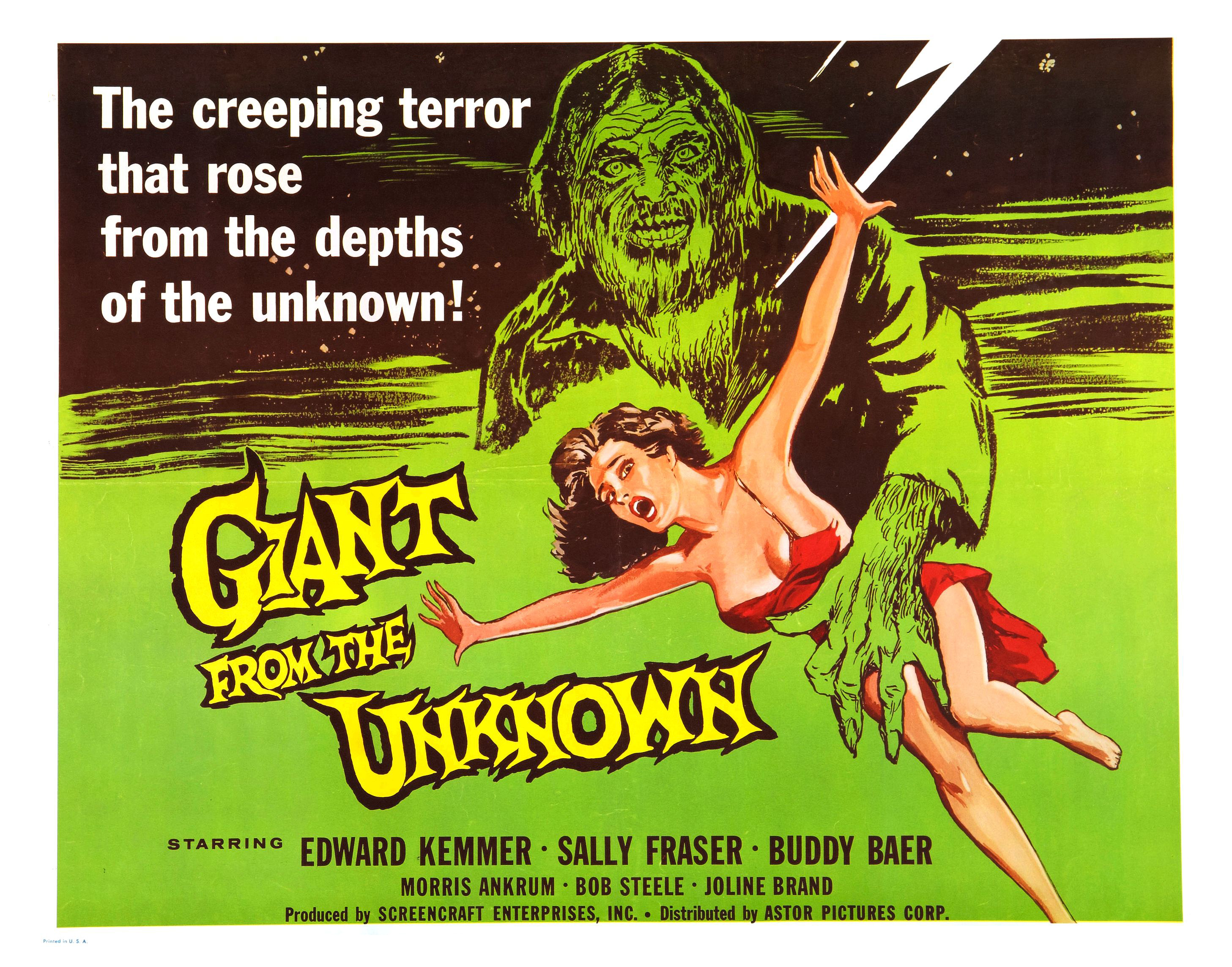
Giant from the Unknown (1958)
At first glance, the poster for Giant from the Unknown seems like a random collection of typographical styles, two primary colours and one secondary colour, a damsel in distress, and a lightning effect that appears to have been included for no particular reason at all. And that’s without the titular giant’s werewolf-like appearance (“My, what a lot of chest hair you have.” “All the better to frighten you, my dear… hopefully”). But it’s a poster that is deceptively effective – or effectively deceptive? – and which uses the apparently random nature of its elements to provide a strangely compelling overall image.
The movie itself is about – and I quote – “A very large, degenerate, Spanish conqueror [who] is freed from suspended animation by lightning and goes on a killing spree in a small town.” So that explains the lightning bolt. Then there’s the depiction of the Giant (who we now know is from Spain and not the Unknown – wherever that is). The artist has come up with an image that, ultimately, is misleading, but with its unruly hair and wild-eyed stare, and allied to a hairy, sharp-nailed hand, is much more of a beast than a giant. Fortunately he’s also proportionately bigger than the woman he’s menacing (though you do have to wonder what his little finger is doing). He’s a commanding figure when all’s said and done, and his stare seems to be directed right at you, which is unnerving considering he’s just an image on a poster.
The woman he’s towering over should be more eye-catching, what with her flimsy red dress, splash of hair, petrified gaze, and exposed flesh. The artist has seen fit to remove the strap from over the woman’s right shoulder, an excision that is at once exploitative and also a way to further highlight her vulnerability. The Giant doesn’t exactly look lascivious, but the inference is clear: that flimsy red dress won’t be there for long once he catches her. Of course, this is from 1958, and there was absolutely no chance of the poster image being replicated within the movie, but certain target audiences of the time would have hoped like crazy that it was.
The largely green background aids the two central images to stand out more, and gives the title a chance to “pop”, it’s sharp-edges and crowded conjoined lettering serving to accentuate the strangeness of the movie. (It’s also interesting to speculate that the woman is reaching desperately to grab the word “the” and maybe save herself.) Above the title is the movie’s tagline, a typical piece of hyperbole that even moviegoers of the time wouldn’t have been fooled by. The typeface used is unexpectedly dull, and doesn’t fit the random nature of the other elements – unless that’s the point of it, and a touch of random dullness was somehow a requirement.
The remaining type details the main cast members, and is in a more traditional black. But there’s an obvious – glaringly obvious – omission: the name of the director (in this case Richard E. Cunha, who was also the movie’s DoP). Either this was a tremendous oversight, or a deliberate decision by Screencraft Enterprises, Inc.; either way, not seeing a director’s name on a poster doesn’t exactly add confidence in the finished product’s likelihood of being good/entertaining/worth seeing, even if it is called Giant from the Mountain.
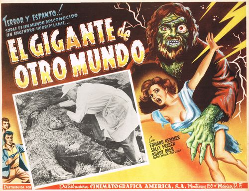
But all in all, this is a poster that, while largely generic for the time it was produced, exerts a strange fascination, and has an odd hypnotic nature to it. It’s a diamond in the rough, a poster that’s truly from the Unknown, and a better advert for the movie than it perhaps deserves. It’s certainly better than this Mexican lobby card that was used (note the difference between the artist’s impression and the actual Giant):
Agree? Disagree? Feel free to let me know.
