
Tags
Australian Outback, Costumes, Draq queens, Guy Pearce, Hugo Weaving, Poster of the week, Terence Stamp, Tour bus
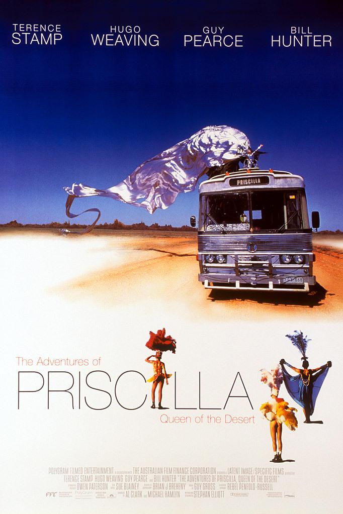
When considering this particular poster for The Adventures of Priscilla, Queen of the Desert, one thing is obvious: it’s so much subtler than some of the other versions out there. It takes one of the movie’s most iconic images and makes it the centrepiece, and does so in such a way that it highlights the exuberance contained within the movie itself, and the striking nature of the costumes. That massively extended, billowing train of silver fabric is also a bold statement of intent, a signal to prospective viewers that, just as they haven’t seen this kind of imagery before, so the movie will offer other sights they won’t have witnessed before (not the least of which will be the sight of Hugo Weaving in full on drag queen make up). This vision of excess and casual effrontery is impressive for its juxtaposition with the rather more solid and slightly battered presence of Priscilla herself, the tour bus seen making its way across the Australian Outback. By providing an apparent contrast between the expressive freedom of the costume, and the bulky shell of the tour bus, it’s takes a second to realise that in terms of the overall image there’s a connection that allows each to be an extension of the other; after all, they are both silver in colour.
Above them both is the poster’s boldest and most dramatic element: the dark blue sky against which the costume is framed. That much blue – taking up over a third of the poster – seems like it should be a bad idea, but with the principal cast members’ names arraigned across the top of the poster, their presence undercuts and softens the harsh nature of the blue sky. It also draws the attention to the sloping nature of Terence Stamp’s name, something that is at odds with the uniformity of the other three names. It’s a slight difference, and one that would probably go unnoticed at first glance, but it’s there, and little quirks such as this one always make a poster that much more interesting. In contrast, the lettering used for the title is split in such a way that the overlong (and somewhat clunky) title is rendered more palatable to the eye than if it had taken up more space. The reduction of all the words except for Priscilla works despite their almost being lost against the white sandy backdrop. And with the name Priscilla being given “star billing”, the importance of the tour bus to the story is reinforced by its name being on its own destination panel as well.
However, and despite the very good work on display across much of the poster, it does get some things wrong – three of them to be precise. The inclusion of what amounts to tiny doll representations of the characters played by Terence Stamp (black head-dress), Hugo Weaving (red head-dress), and Guy Pearce (tanned legs and shiny buttocks), is something of a design faux pas (darlings). Each image looks like the kind of scale size action figure available in a collector’s set, or as an offer from a cereal packet (send in six tokens to get the set!). Two are awkwardly placed and detract from the overall effect the poster is aiming for, and appear to have been included as a way of filling what would otherwise have been more blank space. Weaving’s place as the second I in Priscilla at least gives his figure a purpose, but it’s still an unnecessary one; it would have been better not to have included them at all. It’s still an evocative and attractive poster, though, and it uses its other elements to better, and more persuasive effect. (And better still, there aren’t any ping pong balls to explain away.)
