
Tags
George Sanders, Ingrid Bergman, Movie poster, Poster of the week, Roberto Rossellini, Viaggio in Italia
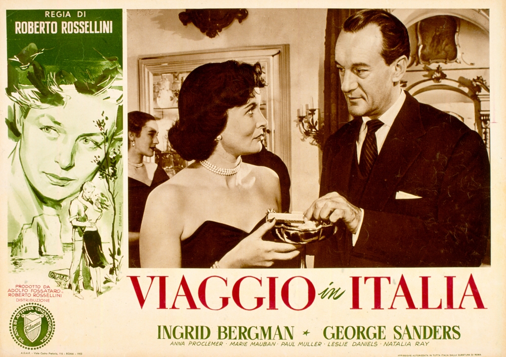
Journey to Italy (1954)
One of a multitude of poster designs created for the movie, this particular example is striking for a number of reasons, not least it’s decision to represent its leading lady with a less than flattering illustration. Bergman was still a big star in ’54, even if she had left her family for Rossellini, the movie’s director. This was the third film they made together, and its tale of a ruined marriage was reflected in the compositional choices made for this poster.
On the left is that curious representation of Bergman, her gaze drawn by something we can’t see, her pensive expression making it hard to work out what she’s thinking. Below her we see a young couple embracing – is she remembering this, is it part of her past with her husband, or is it something she sought but never found? (The answer can be found in the movie.) And above her, merging with her hair, a gondola that’s broken in two. An obvious metaphor perhaps, but not so obvious at first glance.
And then there’s that central image, a still taken from the movie itself, with Sanders in full on predatory mode, his gaze fixed on the young woman in such a way that his intentions couldn’t be any clearer. He’s sizing her up, thinking ahead maybe to when he can be alone with her. But look closely at the young woman and she’s looking at him right back, aware of the significance of his attention but unafraid, challenging him perhaps, or ready to acquiesce. Either way, she’s on an equal footing with him.
The movie’s original Italian title, at once a literal statement of its subject matter and a cogent summing up of what happens to Bergman and Sanders as their trip threatens to unravel them as individuals and as a couple, is mostly in vibrant red, highlighting the passion that lurks below the surface of both characters.
With so much information packed into one apparently pedestrian looking poster, it’s a testament to its designer – whoever they were – that it belies its commonplace appearance and is far more subtle and effective than it looks a first.
Agree? Disagree? Feel free to let me know.
