Tags
Clint Eastwood, Lee Van Cleef, Movie poster, Poster of the week, Sequel, Sergio Leone, Tag line, Western
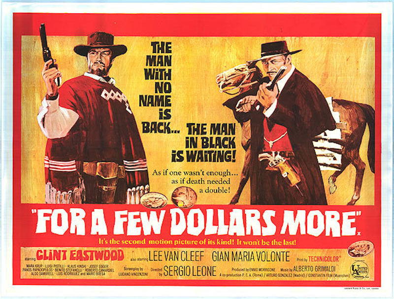
For a Few Dollars More (1965)
The sequel to Sergio Leone’s surprise hit, A Fistful of Dollars (1964), had several interesting posters designed for it at the time of its release, but this one is interesting for a couple of reasons.
The first thing to realise is that this is very much a poster that follows on from its predecessor, both in terms of design and reference. The image of Clint Eastwood is taken from the poster for A Fistful of Dollars (though just what’s going on with his left eye is a little strange), and the third tag line below the title is an updated version of a similar tag line from the first movie – that one read, “It’s the first motion picture of its kind! It won’t be the last!” It’s not often you see that kind of continuity in movie posters, but it’s a nice touch (even if it is bragging a little).
The principal tag line is urgent and attention grabbing, a bold statement of intent, and promising a showdown that will be exciting and dramatic. However, the description of Lee Van Cleef’s character – the man in black – is undermined by the poster’s image of him in very obviously brown coat and trousers and red waistcoat (though perhaps the artist was working from an early character or costume design). Van Cleef’s horse, clumsily included behind him, is there to show off the range of his arsenal, giving a clear indication (despite its positioning) of the danger facing the Man With No Name, and adding to the sense of threat in the main tag line.
There are other elements that don’t work as well – the gold coins dotted around, the slightly awkward second tag line – and at first glance it’s not as bold or inventive as some other posters for Westerns, but its warm tones and straightforward imagery work well enough to draw the eye more than once, and in its way, proves unexpectedly evocative.
Agree? Disagree? Feel free to let me know.