
A Countess from Hong Kong (1967)
Chaplin’s final movie wasn’t the well-received swan song he may have hoped for, and it does try to tell a modern story in an old-fashioned way that doesn’t work for the most part, but this poster captures some of the light-hearted fun he was aiming for.
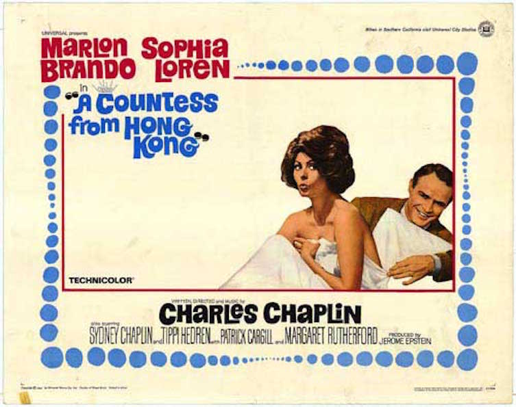
It’s a very Sixties poster, with lots of space left unused, and a slightly trippy feel to the border, the blue bubbles reducing and expanding for no particular reason but still suiting the design. The break at the top left for the stars’ names and the title disrupts the pattern, but it’s a break that doesn’t upset the overall style. Having the stars’ names in red makes for an obvious focus, and they pop out from the pale yellow background like an alert.
The images of Loren and Brando are appealing, especially Loren’s pout, though whether she’s doing so out of surprise or distaste is hard to tell at first thanks to the direction in which her eyes are looking, while Brando’s grin speaks of a man enjoying himself immensely (and if you’re sharing romantic scenes with Sophia Loren, why not?). They seem to be enjoying each other’s company, and it’s clear that they’re relaxed and comfortable with each other. It’s a lovely image, the kind it’s easy to imagine two lovers sharing. And then there’s the inclusion of Brando’s hand and arm, as he attempts to pull away the sheet from Loren’s upper half; it’s a neat touch, and explains the look on Loren’s face.
Below the image are the remaining credits, with Chaplin’s name highlighted in black, and then the supporting cast (also in black). With the bright, primary colours used elsewhere, it’s a bit of a surprise to see black employed so much, though it does make Chaplin’s name stand out (which may have been the intention). All in all, though, this is a fun poster to look at, and it brings together its few elements to surprisingly good effect.
Agree? Disagree? Feel free to let me know.
