In the Sixties, there were a plethora of adventure comedies born out of the success of the James Bond movies, and Masquerade was one of them. The movie itself is a spirited, engaging romp that takes a while to get going, but once it does, it’s hugely enjoyable. There are no such problems with the poster, though, as it happily tells you all you need to know about the movie and right from the first glance.
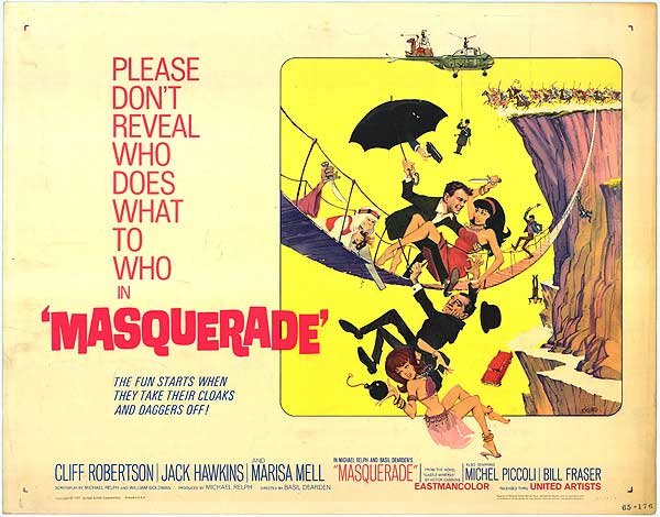
Like many similar-themed movies of the period, Masquerade‘s poster revels in a sense of uproarious fun that it hopes will attract viewers to its cause. There’s a lot going on, both here and in the movie, and the poster is a more than adequate reflection of the exploits that Cliff Robertson, Marisa Mell etc. get up to. From the very top of the image where we find an Arab sheik astride a camel settled on the tail of a helicopter, to the bottom where we see a dangling belly dancer juggling a bomb, the poster is practically yelling at us, “This movie is so much fun!” By carefully recreating the mood of the movie, the poster acts as an extension of the movie, and reinforces the idea that the viewer will have a whale of a time.
But there are plenty of strange things going on in the poster as well, things that easily draw the eye and furrow the brow. For one there’s the hand with the gun appearing from within the umbrella held by Cliff Robertson. Then there’s the disembodied arm seen to the right of the image and emerging from the bridge brandishing a blade. Why both of these elements are present is a puzzle as they have no equivalent in the movie, and their very random nature seems to point to the artist having a) free rein over the poster’s content, or b) been given some very bizarre, but specific instructions (or maybe he saw a different version of the movie).
There are other strange elements, all of which – when taken by themselves – leads to the inevitable conclusion that no small measure of anarchy was required in the creation of the poster. There’s the man plummeting head first (from the bridge?) whose identity is too obscure to recognise. There’s the man dangling from the helicopter, who’s equally hard to identify; the rush of horsemen seemingly intent on hurtling over the edge of the cliff; the red car that has left the cliff road; and the man hanging off the bridge and seemingly about to join the horsemen and the red car. All humorous elements, and all in service to the notion that there will be an awful lot of unintentonal and accidental deaths in the movie (which is funny, right? Well, of course it is).
But hang on, there’s romance on display as well, represented by Robertson’s deferential, protective attitude towards his glamorous co-star, Miss Mell. And yet, once again, malice and potential death aren’t too far away: she’s trying to stab him! The poster hints at a love/hate relationship (even though it’s obvious she’ll fall into his arms by the end of the movie), and Robertson’s grin surely means he’s not worried by her attempt to kill him, but again, it’s all part of the fun.
The various elements that go to making up the main image are crammed together in a relatively small space, but with enough space deployed to stop it all from looking too messy. To the left is one of those requests that were born in the Fifties, a plea from the producers meant to play on the goodwill of the audience, but also meant to imply that there was something so strange/wonderful/impressive that the audience would want to tell everyone about it. But here this intention is undermined by the completion of the tagline (or the second part), that mentions the removal of “cloaks and daggers”. It’s a smart and witty line, and again serves as a reminder: “this movie is so much fun!”
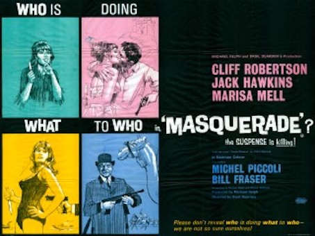
The text is an awkward mix of styles and colours, but fortunately the main credits and the way they’re listed don’t detract from the overall effect of the poster, although it would have been nice to see Michael Relph and Basil Dearden – the co-conspirators if you like on this project – given more prominence. But this poster isn’t bothered about the dry, academic stuff, this poster is all about giving its target or expected audience as good a time looking at it, as they’ll have a good time watching the movie. And for the most part, it succeeds, unlike this British example from the same year: