At first glance, the poster for Julie appears to lack anything that would make the movie a must-see, but that would be doing it a disservice, because while it does seem like it’s not even trying, there’s much more going on than you might be aware of.
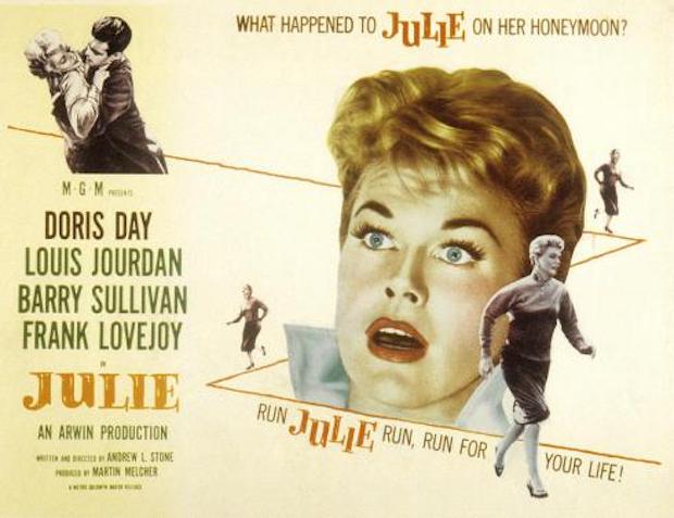
A thriller where Day’s terrified wife tries to escape the murderous clutches of her husband (played by Louis Jourdan), the poster adopts a psychological approach to the plot that actually makes the movie a more enticing prospect than it actually is. First, there’s the image of Julie and husband Lyle shown in the top left hand corner. There’s a possibility that they’re enjoying a romantic clinch, but upon closer inspection it’s clear that Day is trying to resist Jourdan’s “advances”. It’s all you need to realise that something’s not quite right between them, and it acts as a kind of shorthand for the central dynamic that the movie will expand on.
But where the poster really excels is with its depiction of Day running – for her life – along the zigzag line that dominates the poster (even more so than Day’s shocked face). With her efforts to escape Jourdan precipitated by that dangerous embrace, the poster shows her running away from him, and getting further and further away, but it also highlights her fear and distress at the situation she’s found herself in. Her body language makes it all too obvious. This is the crux of the movie: Julie’s attempt to escape from Lyle, to save herself, and the poster and its kinetic imagery perfectly encapsulates the urgency of the character’s need to find safety.
Less successful – or necessary – is the inclusion of Day’s face and its shocked expression. There’s a phrase: “over-egging the pudding” that applies perfectly here, as Day’s head takes up too much room on the poster as a whole, and almost takes attention away from the clever inclusion of the fleeing Julie and her descent of the zigzag line. She looks like she’s just been told something so shocking that she doesn’t know quite how to respond to it, and while it’s easy to understand the image’s inclusion, it dampens the carefully constructed impact of the rest of the poster.
For the rest of the poster, it’s business as usual, with the four main cast members listed on the left and Day’s name given a slight twist to differentiate her from everyone else (black lettering not green). The title is given a pleasing orange tone to temper the awkward font used, and there’s the unsurprising highlighting of Arwin Productions, Doris Day’s own production company. And only then do writer/director Andrew L. Stone and producer Martin Melcher get a look in.
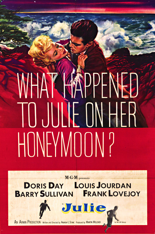
Lastly, there’s the tagline, a question designed to pique the potential audience’s interest, and one whose answer can be construed as “something bad” (as though the images of Day running for her life weren’t a big enough clue). It’s the kind of question that will always get people thinking, and hopefully intrigued enough to watch the movie. Overall it’s a poster that successfully advertises the movie it’s been tasked with promoting, and it does so in a far more subtle, and impressive way than this one: