
The Rocky Horror Picture Show (1975)
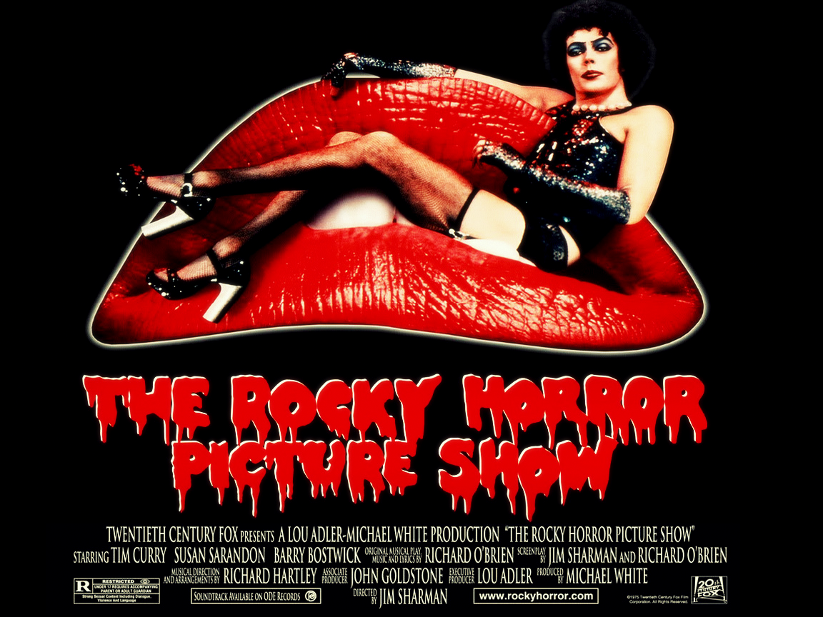
There were many posters created to promote Richard O’Brien’s affectionate tribute to 30’s horror and 50’s sci-fi, but this is one of the best. For its time, the movie was a slightly subversive treat, its air of permissive sexuality (in any form) allied to some great song and dance numbers. Now, almost forty years on, it’s less shocking, but it’s become perhaps the cult movie around the world.
Looking at the poster now it doesn’t have the same effect it would have done back in 1975. The sight of Tim Curry in make up, shiny basque, stockings and high heels no longer has that risqué quality that intrigued audiences who hadn’t seen the stage show, but it’s still an arresting image, a bold statement of intent that hasn’t lost its impact entirely. His haughty, scornful look is another great touch, challenging the potential viewer as if to say, “Do you have what it takes to watch this movie?”
And then there are the lips – courtesy of Patricia Quinn, Magenta in the movie – a now iconic image that is recognised everywhere. On their own they’re like a fetish object, full and curvy and inviting and infused with an indefinable promise of things to cum. With Tim Curry as Frank-N-Furter draped across them, they become even more erotically charged, the combination of willing lips and waiting body making the movie’s invitation to “Don’t dream it, be it” all the more alluring. It’s a powerful merger of two already compelling images, and is extremely effective.
Lastly, there’s the title itself, a dripping, blood-red example of the kind of title graphic used in the 40’s, a fond recreation of a style that represented shock and horror and terror “unlike anything seen before”. And with a black background that allows everything else to stand out in sharp relief, this is a poster that draws the eye and makes it hard to look away.
Agree? Disagree? Feel free to let me know.
