
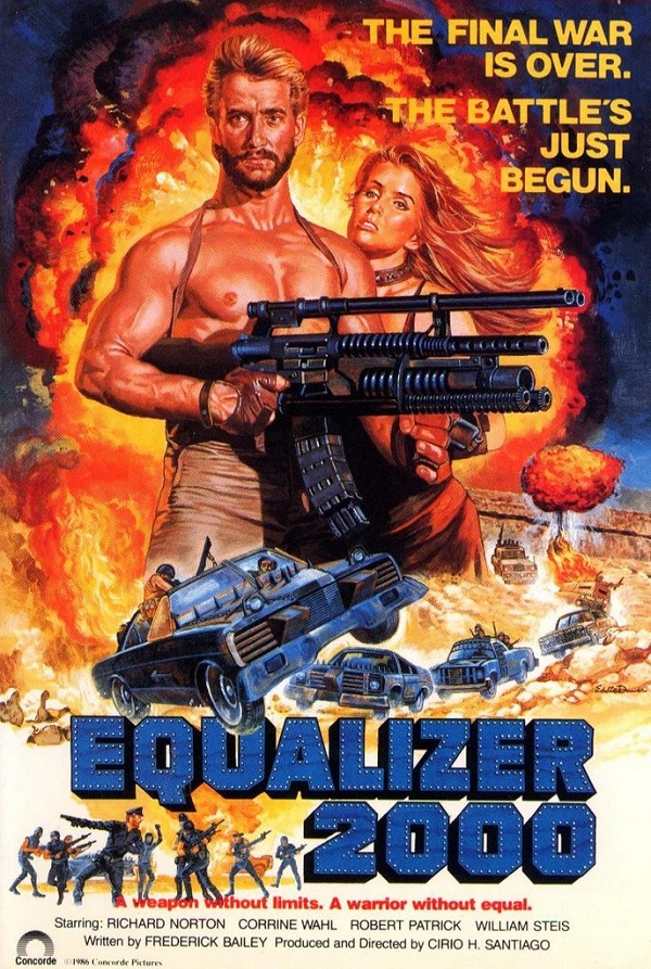
Wait a minute (you may be thinking). What’s this? A poster for a low-budget Eighties Mad Max rip off? Has Poster of the Week been hijacked by someone with a fetish for beefcake and outsized weaponry? (Not this week.) No, the truth is, sometimes a poster can be enjoyed – admired, even – for what it gets wrong, just as much as for what it gets right. The poster for Cirio H. Santiago’s Equalizer 2000 is one such example: on the face of it, absurdly generic for the time, but upon closer inspection revealing a variety of unexpected pleasures. It’s a poster that’s not just saying, “Watch this movie!”, it’s also a poster that’s saying, “My designer was bored when they got this job, and they decided to have some fun with it!” Of course, this last may not be true at all, but the alternative is even worse: this is the best the artist could do.
First up is the volcanic explosion erupting behind our hero and his significant other. It’s an enormous fireball, sending out smoke and flames and debris in every direction. But is this the work of the title weapon, or is this a case of visual hyperbole? Will there really be an explosion of this magnitude actually in the movie (and will everyone run away from it in the poorly composited foreground?). The obvious answer is, you have to ask? So, already the artist is making the movie seem bigger and more impressive than it actually is. But this is what he or she is meant to do. Should we be blaming them straight away for such blatant misrepresentation? Well, to be fair, no. It’s a big explosion used to fill a large part of the poster and to provide the hero and the girl he just met at the beach with an exciting backdrop against which to pose. But there are subtle things wrong with both of them, things that again make you wonder if the artist was having a bad day at the easel.
The woman’s face is worrying. It’s an odd mix of angles and curves, hinting that she was perhaps a forceps baby, but definitely looking as if the artist completed one side, went away for a few drinks, and then came back to finish off a little the worse for wear. And then there’s the blond-maned, chiselled hero, clutching the titular weapon like a model posing for the front cover of American Hunter. But hold on a minute. Doesn’t his right breast look a little feminine, a little too rounded to be – you know – his? The more you look at it, the more it looks like it’s not meant to be there. It’s as if the artist, unable to provide cleavage for the woman looking to enter a 21st century beauty pageant, decided there was going to be at least one exposed breast in this poster – and if it had to be on the man then so be it.
The best has been saved for last, though. Below the beginning of the title is a group of people caught in various poses. Some are pointing with rifles, some seem to be playing their rifles like guitars, and the figure on the far left could well be playing air drums. But if anything, they look like they’re anticipating Madonna’s plea from Vogue (released in 1990): “Don’t just stand there, let’s get to it/Strike a pose, there’s nothing to it”. They’re a post-apocalyptic dance group with a hint of camp (that cap) and a striking lack of co-ordination. They’re also the most obvious indication that the artist, whoever he or she may be, wasn’t approaching this particular assignment with all the dedication and skill that they (hopefully) possessed. And for that, Poster of the Week salutes them all the more.
